ART POP / POP ART: Genesis P-Orridge and Throbbing Gristle

The Birth of a Proto-Industrial Provocateur

Having grown up around the bleak industrial landscape of Hull in the late 1960s, a young Neil Andrew Megson, later to become Genesis P-Orridge, found himself at the Hull School of Art. Amid the pollution-stained buildings and dockyard silhouettes, this artistic institution became the crucible where Megson’s transformative journey began, a journey that would eventually lead to pioneering work in industrial music, performance art, and radical explorations of identity. Perhaps the most extreme example of the experience of art school manifesting in popular (sic) music.

The port city’s stark contrasts, its bleak post-war architecture juxtaposed against a vibrant underground arts scene provided the perfect backdrop for Megson’s early artistic development. Here, surrounded by the rhythmic machinery of Hull’s factories and the distant calls of ships, the foundations were laid for what would become a revolutionary artistic vision that challenged conventional boundaries of music, gender, and consciousness.

“I never wanted to be an artist in the conventional sense,” P-Orridge would later reflect. “I was more interested in using whatever medium seemed most effective to challenge control structures and question the assumptions underpinning society.”

At Hull, P-Orridge encountered the writings of William S. Burroughs and Brion Gysin, whose cut-up technique would become a foundational methodology not only in P-Orridge’s literary experiments but eventually in the sonic assaults of Throbbing Gristle. The technique involving the physical cutting up and rearranging of text to create new meanings represented a form of artistic détournement that challenged linear narrative and conventional meaning.

Perhaps most significantly, Hull provided P-Orridge with a first taste of institutional resistance to provocative art. While studying there, P-Orridge began mail art projects and early performance pieces that deliberately pushed boundaries of taste and acceptability. These early forays into confrontational art would establish patterns that would define the rest of P-Orridge’s career.

It was during the Hull years that P-Orridge formed COUM Transmissions with Cosey Fanni Tutti in 1969. Initially conceived as a fluid musical and performance art collective, COUM represented a direct application of P-Orridge’s art school philosophy: art should disrupt, challenge and provoke rather than merely decorate or entertain.

The influence of Fluxus, the avant-garde art movement that emphasised the artistic process over finished products, was evident in COUM’s approach. Like many art school graduates who formed bands in this period, P-Orridge saw little distinction between visual art, performance, and music; all were simply different vehicles for expressing ideas and challenging established norms. The entire Art School system served as an incubator for artists and creators to produce work for a burgeoning post-war consumer society

COUM’s performances grew increasingly provocative, incorporating elements of self-mutilation, pornography, and occult symbolism. Their development paralleled similar explorations in Vienna Actionism and other radical performance art movements, but with a distinctly British working-class inflection that added both grit and humour to their provocations.

The culmination of COUM’s art school-inspired approach came with the infamous “Prostitution” exhibition at London’s Institute of Contemporary Arts in 1976. The exhibition, which included pornographic images of COUM member Cosey Fanni Tutti from adult magazines alongside used tampons and other provocative items, caused a national scandal. Conservative MP Nicholas Fairbairn famously denounced the group as “wreckers of civilisation,” a title P-Orridge and company wore with pride.

When COUM Transmissions evolved into Throbbing Gristle in 1976, it represented not an abandonment of art school principles but their logical extension into sound. The four members—Genesis P-Orridge, Cosey Fanni Tutti, Chris Carter, and Peter “Sleazy” Christopherson approached music not as trained musicians but as conceptual artists working in sound.

Throbbing Gristle’s sonic palette of distorted electronics, found sounds, atonal improvisations, and disturbing samples directly reflected art school methodologies. Their approach to music production paralleled the mixed-media assemblages and collages taught in art foundation courses. The band’s very name, Yorkshire slang for an erection, indicated their continued commitment to provocation and their working-class roots.

P-Orridge explained their approach: “We wanted to see if one could make music like an art movement, like Dada or Surrealism, rather than as entertainment… We were interested in information war, in using sound as a weapon, as a tool for change.”

The group’s establishment of Industrial Records and their coining of the term “industrial music” represented a conceptual art move as much as a musical one. The label’s logo, a photograph of the Auschwitz crematorium and slogan “Industrial Music for Industrial People” explicitly positioned their work as a commentary on post-industrial Britain and the mechanisation of society.

Beyond their own creative output, P-Orridge and Throbbing Gristle became nexus points for a wider network of art school graduates working across disciplines. Their association with publications like RE/Search helped disseminate ideas from the European avant-garde and postmodern theory into underground music circles.

P-Orridge, in particular, became a conduit through which concepts from critical theory, occultism, and poststructuralism entered the post-punk musical landscape. The band’s Industrial Records label released work by fellow art school provocateurs like Monte Cazazza and SPK, creating what amounted to a distributed art movement operating under the guise of a record label. This intellectual approach distinguished Throbbing Gristle from many of their contemporaries. While punk often expressed its dissatisfaction through direct, emotional expressions of anger, TG’s approach was more analytical, using strategies of détournement, appropriation, and conceptual framing derived directly from their art school backgrounds.

After Throbbing Gristle disbanded in 1981, P-Orridge continued to apply art school methodologies in the formation of Psychic TV and the Temple of Psychick Youth (TOPY). These projects further developed the idea of erasing boundaries between art, music and life, now central to P-Orridge’s philosophy.

TOPY, in particular, functioned as a kind of alternative art school in itself, with P-Orridge as the provocateur-teacher at its centre. Through publications, rituals, and networking, TOPY disseminated techniques of collage, sigil magic (itself a form of symbolic visual art), and conscious mythmaking to a generation of followers.

In these later projects, the influence of P-Orridge’s art school background remained evident. The cut-up technique first encountered through Burroughs and Gysin became central to TOPY’s magical practices. The network’s visual aesthetic, a mixture of occult symbolism, industrial imagery, and pornography drew on the same transgressive visual language developed during the COUM/Throbbing Gristle years.

Perhaps the most profound expression of P-Orridge’s art school thinking came in the later Pandrogeny Project, undertaken with second wife Lady Jaye Breyer P-Orridge. This project, which involved both partners modifying their bodies through plastic surgery to resemble one another, represented the ultimate extension of art school principles into life itself.

The project explicitly referenced conceptual art precedents like Duchamp’s alter ego Rrose Sélavy and drew on theoretical frameworks around gender and identity that had become staples of advanced art school education by the 1990s. In becoming the artwork, P-Orridge fulfilled the ultimate art school ambition of erasing the boundary between art and life.

P-Orridge described the project as “breaking DNA control,” a phrase that encapsulated their lifelong artistic project of challenging biological, social, and cultural determinism, a project that began in the studios and classrooms of Hull School of Art.

Genesis P-Orridge and Throbbing Gristle exemplify how art school education provided not just technical skills but conceptual frameworks that musicians could deploy to revolutionary effect. Unlike many rock musicians who attended art school but ultimately produced conventional music, TG maintained an uncompromising commitment to the avant-garde principles they encountered in their education.

Their influence extends far beyond the immediate industrial music scene they helped create. The analytical, theory-informed approach to making music pioneered by Throbbing Gristle became a template for generations of experimental musicians who approached their work as conceptual art rather than mere entertainment.

When P-Orridge died in March 2020 (from leukaemia), the obituaries rightly positioned h/er not just as a musician but as an artist whose primary medium happened to include sound. In this, the art school had done its job, not producing a conventional artist, but nurturing a creative revolutionary who used every available tool to challenge, provoke, and transform.

The story of Genesis P-Orridge and Throbbing Gristle reminds us yet again that sometimes the most profound musical innovations come not from conservatories or traditional music education, but from the conceptually rich, boundary-pushing environment of the art school. In their noise, distortion, and transgression, we can hear the echoes of critiques first encountered in the classrooms and studios of provincial British art schools transformed into sounds that would change musical history forever.

Art Pop / Pop Art: a study of the influences of art school, famous artists and movements on pop and rock music. Those institutions where failure is motivation, where the eccentric and pretentious emerge into the fascinating space where art and music meet.
ART POP / POP ART: Brit Pop & The YBAs

Or How The ‘Young British Artists’ Shaped Brit Pop’s Visual Punch

In the crestfallen capital of post-Thatcher Britain, a gang of art school chancers were regurgitating ideas from Duchamp, the Sixties pop artists and sculptors and flogging them to Charles Saatchi. Simultaneously a surge of British Indie and alternative sounding guitar bands were getting more airplay on the radio, particularly the BBC under the reformational stewardship of Matthew Bannister who had recruited a number of new DJs to reboot Radio One in an edgier style.

What nobody predicted was how the parallel universes of art and pop would once again collide to create the defining visual grammar of 90s British music.

Dance Moves, Dead Sharks & Unmade Beds

The romance began, as these things often do, in a pub. The Groucho Club, to be precise, where Damien Hirst, not yet the multi-millionaire formaldehyde merchant fell in with Alex James and the Blur contingent. Before long, Hirst was directing their “Country House” video: a technicolor romp through English eccentricity that matched the band’s own savage pastiche of national identity.

But it was Hirst’s work for The Fat of the Land that truly codified the YBA-pop connection. That fluorescent green crab on The Prodigy’s 1997 album wasn’t just a cover it was a declaration of intent. Like Liam Howlett’s sonic assaults, Hirst’s visual sensibility took the familiar and made it menacing. Both operated in the sweet spot between attraction and repulsion. Both understood that England’s green and pleasant land had mutated into something altogether more radioactive.

Flat People Deep Impact

If Hirst brought biological horror to pop’s visual palette, Julian Opie brought clinical detachment. His now-iconic portraits of Blur for their “Best Of” compilation reduced the band to cartoon glyphs a style later ripped off by every advertising agency with a MacBook and a deadline.

“I wanted something that looked like it could be a road sign” – Julian Opie.

What he delivered was the perfect visual metaphor for Britpop itself: simplified, bold, immediately recognizable, yet somehow hollow at its core.

The genius of Opie’s approach wasn’t lost on other acts. When Pulp needed artwork that captured their own arch commentary on British life, they turned to Blue Source and Peter Saville designers who shared the YBA knack for elevating the everyday to art status without sacrificing its essential seediness.

White Cubists

The cross-pollination went beyond album covers. Rachel Whiteread’s concrete casts of negative spaces found their musical equivalent in Radiohead’s OK Computer both capturing the uncanny valley between the familiar and the alienating. Meanwhile, Gavin Turk’s bronze sculptures disguised as trash bags offered a perfect visual companion to Elastica’s brief, brilliant dissection of punk’s corpse.

What united the YBAs and their musical counterparts wasn’t just postcodes or drug dealers. It was attitude, that peculiarly British talent for elevating amateurism to high concept. Both scenes took working-class signifiers, ran them through an art school mangle, and sold them back to the middle classes as an authentic experience.

The Britpop bands, like the YBAs, understood that in post-Empire Britain, nostalgia was the most profitable natural resource. Both mined it ruthlessly while pretending to critique it. Both ended up with Turner Prizes, front covers, and country houses. Both eventually collapsed under the stellar weight of their own contradictions.

Pickled For Posterity

If art is about preservation, then the YBA-Britpop alliance succeeded wildly. While the music industry was still trying to shift plastic discs, artists like Sam Taylor-Wood (who would later direct videos for The Pet Shop Boys) and Tracey Emin (whose neon scrawls would adorn countless indie venues later London train stations) were already thinking about legacy.

The ultimate YBA contribution to British music wasn’t aesthetic but commercial, they taught bands that provocation plus self-mythologising equals longevity. When Albarn and Hirst finally opened their short-lived restaurant Pharmacy in Notting Hill, it wasn’t just a business venture but a perfect symbol: both scenes had transformed from rebellion to institution, from outsider art to investment opportunity.

Two decades on, as YBA works and fetch obscene sums at auction, the true legacy emerges. What seemed like a movement was really just a moment when Britain briefly convinced itself that its cultural decline could be repackaged as ironic ascendancy. The artwork remains, like Hirst’s shark, suspended in time not quite dead, not quite alive, but impossible to ignore.

Art Pop / Pop Art: a study of the influences of art school, famous artists and movements on pop and rock music. Those institutions where failure is motivation, where the eccentric and pretentious emerge into the fascinating space where art and music meet.

ART POP / POP ART: John Lennon & Yoko Ono

Or Lennon’s Other Revolution: How Yoko Changed Everything.

When John Lennon first encountered Yoko Ono at London’s Indica Gallery in November 1966, he was still the cheeky, acerbic Beatle, trapped in a suburban existence that was slowly suffocating his rebellious spirit. What happened next fundamentally altered not just Lennon’s musical trajectory but his entire philosophical outlook on life, art, and politics, a transformation that continues to reverberate through popular culture decades later.

Ono wasn’t just Lennon’s lover and eventual wife; she was his artistic conscience, political awakening, and spiritual guide. The sneering British music press – and the majority of Beatles fans – initially dismissed her as the dragon lady who broke up the Fab Four. How simplistic that view seems now. In fact I’ve heard people say since that Yoko didn’t ruin John’s career, he ruined hers.

Lennon, before Yoko, was drifting. The moptop façade had worn paper-thin. The man who’d once proclaimed the Beatles “more popular than Jesus” was living in a psychological prison of his own making in Weybridge, searching for meaning beyond the endless machinery of Beatlemania.

Enter Ono, already an established avant-garde artist, with her conceptual installations and performance pieces that challenged conventional thinking. She didn’t need Lennon’s fame; she had her own artistic vision that predated their meeting. Her work, exploring themes of audience participation, peace activism, and feminist perspectives, provided Lennon with an intellectual framework his previous life had lacked.

The influence was immediate and profound. Listen to “Revolution 9” on the White Album, a sound collage that bears Ono’s experimental fingerprints. Compare early Beatles tracks with the raw emotional honesty of “Cold Turkey” or “Mother.” This wasn’t simply a stylistic shift; it was Lennon finding his authentic voice under Ono’s guidance.

Their collaborative albums, particularly “Unfinished Music No. 1: Two Virgins” and “Wedding Album” shocked audiences expecting conventional pop. Critics howled, but that was precisely the point. Lennon was shedding his moptop skin, and Ono was providing the knife.

Most significantly, Ono awakened Lennon’s political consciousness. Their bed-ins for peace, billboard campaigns, and outspoken opposition to the Vietnam War weren’t mere publicity stunts, they reflected Ono’s longstanding artistic engagement with peace activism, now amplified through Lennon’s platform.

While much attention focuses on how Ono changed Lennon, less discussed is how their collaboration transformed her work. Her avant-garde sensibilities found new expression through pop music’s accessibility, creating a unique fusion that neither could have achieved alone.

Were there missteps? Certainly. The self-indulgence occasionally bordered on narcissism. But their partnership produced something genuinely revolutionary: art that refused to separate the personal from the political, that insisted music could change consciousness.

Decades later, the easy narrative that Ono was some kind of manipulative force still persists in some quarters. The reality was far more complex and interesting, a genuine artistic partnership that pushed both participants toward their most challenging work.

In Lennon’s final interviews, he repeatedly credited Ono with his intellectual and spiritual rebirth. The evidence is in the music from the primal therapy-influenced screams of “Well Well Well” to the tender vulnerability of “Love.” Lennon with The Beatles gave us brilliant pop. Lennon with Ono gave us something harder to categorize but sophisticated and ultimately more human.

Perhaps that’s Ono’s most profound influence she helped transform Lennon from a rock star into an artist in the fullest sense of the term.​​​​​​​​​​​​​​​​

John Lennon studied at Liverpool College of Art 1957-60
Yoko Ono studied art, film making and experimental at Gakushuin University (Tokyo) and Sarah Lawrence College (New York) and a course taught by John Cage at New School For Social Research.

Art Pop / Pop Art: a study of the influences of art school, famous artists and movements on pop and rock music. Those institutions where failure is motivation, where the eccentric and pretentious emerge into the fascinating space where art and music meet.

POP ART: New Order Blue Monday FAC72-600!

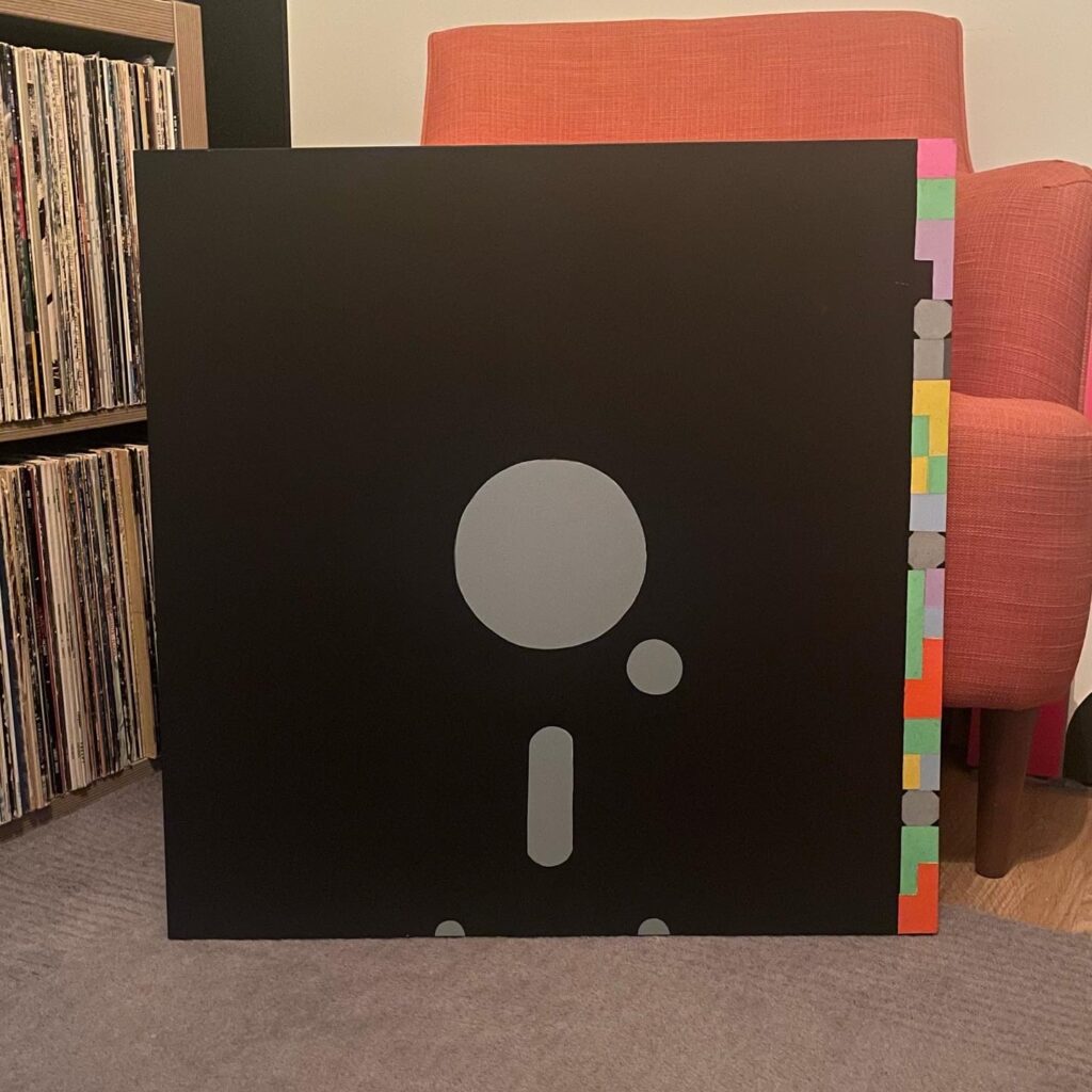
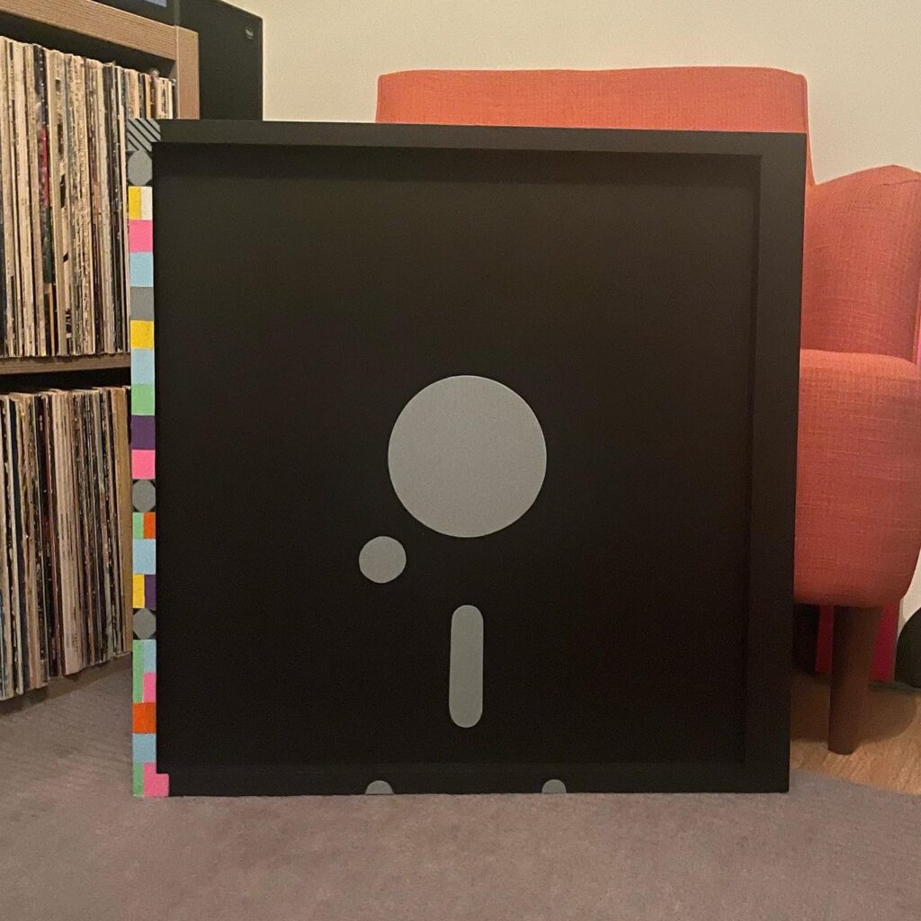
Another from my series of iconic Seventies & Eighties Punk Rock and New Wave record sleeves reimagined as standout Pop Art to show in an installation or hang in your space.

New Order – Blue Monday FAC72 12″ Vinyl Single (1983)

600mm acrylic painting on MDF with pine former.

New Order Blue Monday Factory Records FAC72-600 Pop Art


New Order’s Blue Monday: A New Pop Art Revolution

Dive into the iconic world of New Order’s groundbreaking single through a stunning 600mm pop art interpretation that celebrates the legendary Blue Monday sleeve design.

This revolutionary artwork captures the essence of Peter Saville’s innovative design – a hand painted visual homage to the most famous 12″ single in music history. The piece reimagines the original floppy disk-inspired sleeve, breaking down its intricate colour-coded messaging into a bold pop art statement.

Artistic Highlights:

  • Inspired by the original 1983 Factory Records release
  • Painted on large 600mm MDF with a substantial pine former
  • Stand alone as an installation or part of a Pop Art display
  • Hang in your space, its a stand-out art piece
  • Faithfully recreated design which is different on each side
  • Explores the unique color-coding system that made the original sleeve legendary
  • Transforms the innovative technical design into a vibrant artistic statement
  • Celebrates the intersection of music, technology, graphic design and now ART!

The artwork pays tribute to Saville’s groundbreaking concept – a sleeve that was more than just packaging, but a coded message decipherable through a complex colour wheel. Each colour block tells a story, reflecting the innovative spirit of New Order’s most iconic track.

New Order Blue Monday FAC72-600B Pop Art


A unique piece that bridges music history and contemporary art, this large-scale painting captures the revolutionary spirit of Blue Monday – a track that redefined electronic music and graphic design in one extraordinary moment.