While the world waits as the United States and Israel rains missiles on Iran and Iran rains missiles on its neighbours I’m reminded of this Pop Art painting in the permanent collection at the Pallant House Gallery in Chichester, West Sussex. United Kingdom.
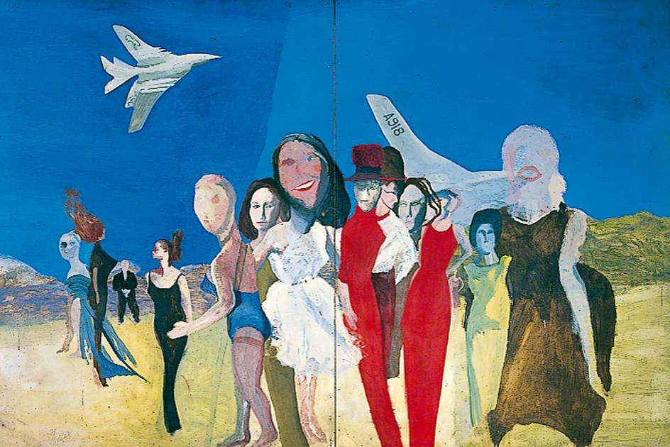
Somewhere between the optimism of early Sixties Pop Art and the shadow cast by the hydrogen bomb sits Waiting Women and Two Nuclear Bombers (Handley Page Victors), painted in 1962 by Colin Self. It is a strange, poised work. Bright on the surface, quietly uneasy underneath.
1962 is not just a date in an art catalogue for me. It is the year I was born. That makes the painting feel less like distant history and more like a snapshot taken at the exact moment my own life begins. Britain a nuclear Superpower was entering the decade of The Beatles, Carnaby Street and colour television. Yet it was also the year of the Cuban Missile Crisis, when the United States and the Soviet Union came within days of nuclear war.
Self captured that contradiction before it had even settled into the culture.
The image itself is deceptively simple. Women stand in a flattened, stylised landscape while, above them, two Handley Page Victor aircraft cross the sky. The Victor was one of Britain’s V-force nuclear bombers, designed in the 1950s to carry atomic weapons deep into Soviet territory. Alongside the Vulcan and the Valiant it formed the backbone of the United Kingdom’s airborne nuclear deterrent until the Royal Navy’s Polaris submarines took over the role at the end of the 1960s.
The Victor itself was a remarkable aircraft. With its crescent shaped wing and high mounted tailplane it looked unlike anything else flying at the time. Even now it has an elegance. Self clearly recognised that. In the painting the bombers are sleek, almost beautiful silhouettes. They drift across the sky with the calm assurance of machines built to deliver unimaginable destruction.
That juxtaposition hits me in a personal way. My grandfather flew as a Flight Engineer in RAF Handley Page Halifax aircraft during the Second World War. The Halifax was a heavy bomber of an earlier generation, blunt nosed and purposeful, built for long night raids over occupied Europe. The men who flew them faced an average operational tour survival rate that was frighteningly low. To see the Victor, twenty years later, rendered with the polish of Pop Art glamour brings home how quickly aviation moved from wartime necessity to Cold War deterrence.
Below the aircraft stand the “waiting women” of the title. They are elegant figures, almost mannequin like, reminiscent of the female silhouettes used in early Sixties fashion illustration. They do not react to the bombers. They simply stand, composed and still. My grandmother Iris used to wait with other wives for their loved ones’ aircraft to return, the pilots used to ‘buzz’ the school when they returned to Tarrant Rushton.
The word “waiting” matters.
In 1962 Britain’s nuclear bombers were maintained on high readiness, able to take off quickly if war broke out. Deterrence depended on the idea that the aircraft were always ready to fly. The Cold War was therefore defined not by constant conflict between nuclear powers but by a prolonged stress position of poised anticipation.
Self’s painting captures that psychological condition with surprising accuracy.
Nothing dramatic happens in the image. The aircraft do not dive or attack. There is no explosion. No siren. Just two machines passing quietly overhead while figures remain suspended in a moment that never quite resolves.
Seen now, more than sixty years later, the painting has acquired a renewed relevance. The geopolitical landscape has shifted again. In Europe and the MIddle East nuclear armed states are involved in active conflicts or strategic confrontations. Military aircraft patrol contested borders. Political rhetoric has sharpened. Once again there is talk, however cautious, about nuclear escalation.
The uncomfortable truth is that the world still lives in the same suspended condition Self painted in 1962. The weapons exist. The delivery systems are maintained. The calculations continue.
Pop Art often celebrated the surfaces of modern life. The bright packaging, the advertisements, the sleek industrial design. British mid-century artists such as Peter Blake, Derek Boshier and Richard Hamilton found inspiration in popular culture and the everyday imagery of the new consumer society. Self shared that visual language but his subject matter was often darker.
He dropped the bomb into Pop Art.
That is what makes Waiting Women and Two Nuclear Bombers such an intriguing work. It sits between glamour and annihilation. The sky is clear, the aircraft are elegant, the figures calm. Yet the title quietly reminds us what those machines were built to carry.
More than sixty years after it was painted, the picture still feels suspended on that precipice. The bombers glide overhead. The women wait.