ART POP / POP ART: Peter Saville, Joy Division & New Order

The Man Who Framed Post-Punk: How Peter Saville’s art history and graphic aesthetic defined the visual language of Manchester’s most enigmatic bands

In the damp, grey streets of late-seventies Manchester, a revolution was brewing. Not the kind involving barricades and manifestos, but something far more enduring: a marriage of sound and vision that would define an era. While Ian Curtis’ baritone and Bernard Sumner’s clinical guitar lines carved out new sonic territories, another figure, working in silence with Letraset and photographic plates – was busy creating the visual alphabet through which their music would speak to the world.

Peter Saville, 1978 Polytechnic graphic design graduate, typography obsessive, and Factory Records’ design director never actually listened to Joy Division’s debut album before creating its now-iconic sleeve.

“I was given the diagram by Bernard, I had no bloody idea it was a visualization of pulsar waves from a dying star. I just thought it looked… correct.” Peter Saville.

“Correct” is perhaps the understatement of the decade. Reversed so it became white on black and reduced in size, that stark, minimalist rendering of radio waves from pulsar CP 1919 (originally published in the Cambridge Encyclopedia of Astronomy) adorning Joy Division’s Unknown Pleasures has become one of music’s most recognisable and relentlessly appropriated images, a visual shorthand for post-punk industrial decay that adorns everything from t-shirts worn by teenagers who weren’t born when Curtis died to coffee mugs cluttering the desks of advertising executives.

The beauty of Saville’s approach was its magnificent detachment. While his contemporaries were slapping together ransom-note typography and day-glo splashes to capture punk’s anarchic spirit, Saville looked elsewhere – to European modernism, to the Bauhaus, to suprematism, futurism and constructivism. His influences weren’t the Sex Pistols but Fortunato Depero, Jan Tschichold and Herbert Bayer. The result was a visual language that felt both timeless and startlingly new: clinical, austere, and brutally elegant. If you’d never been to art school or studied art history this stuff was totally new and refreshing.

“The thing about Factory was that nobody told me what to do. Tony Wilson just handed me a chequebook and said ‘Make something appropriate.’ Can you imagine that happening now?” Peter Saville.

This freedom allowed Saville to create a body of work that functioned as a perfect visual analogue to the music it contained. The frosty minimalism of Joy Division’s “Closer” sleeve featuring a Bernard Pierre Wolff photograph of the Appiani family tomb in Genoa seemed to anticipate the tragedy of Curtis’s suicide rather than react to it. The sleeve was designed before the singer’s death, yet its imagery seemed eerily prophetic.

When Joy Division metamorphosed into New Order following Curtis’s death, Saville’s aesthetic evolved alongside them. The band’s gradual embrace of electronics and dance music found its visual counterpart in Saville’s increasing use of vibrant color and an almost fetishistic approach to production techniques.

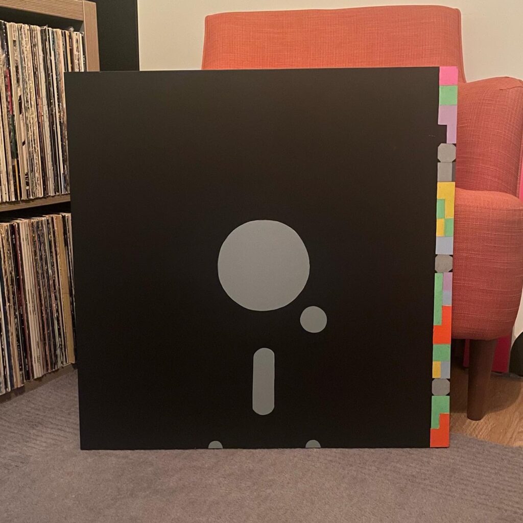
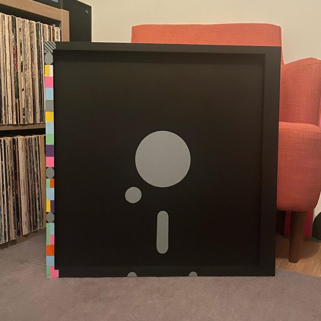
“Blue Monday,” New Order’s seminal 1983 12-inch single, came housed in a sleeve that mimicked a 5¼-inch floppy disk, complete with die-cut holes and coded colour blocks. It cost so much to produce that Factory reportedly lost money on each copy sold, despite it becoming the best-selling 12-inch single of all time. When mentioned to Saville nowadays he shrugs with indifference:

“I wasn’t running a business, was I? I was making something beautiful.”

This beautiful impracticality became something of a Saville trademark. For New Order’s “Power, Corruption and Lies” album, he appropriated a classical 19th-century floral painting by Henri Fantin-Latour and juxtaposed it with a colour-coded alphabet of his own devising a system so arcane that even the band couldn’t decipher it without the provided key. The result was a tension between romanticism and modernism that perfectly mirrored New Order’s own fusion of emotional intensity and mechanical precision.

Throughout the ’80s, as New Order’s sound incorporated more elements of New York club culture and Italian disco, Saville’s designs became increasingly sophisticated. The “Technique” sleeve featured saturated Mediterranean blues and architectural elements that nodded to the album’s Ibiza influences, while “Republic” showcased Saville’s growing interest in digital design techniques.

What makes Saville’s work with both bands so influential is not just its striking appearance but its philosophical underpinnings. In an era when most record sleeves were exercises in literal-minded marketing, screaming the band’s name and image at potential buyers, Saville’s designs operated on the radical assumption that the audience was intelligent enough to meet the work halfway.

“I wasn’t interested in selling records,” I was interested in making objects that belonged in the world.” This approach transformed album covers from mere packaging into cultural artifacts in their own right, objects that demanded the same serious engagement as the music they contained.

Four decades on, the partnership between these Manchester bands and their reluctant visual architect remains one of pop culture’s most fruitful collaborations, a case study in how design can amplify rather than merely illustrate musical ideas. In an age of streaming and digital ephemera, when album artwork has been reduced to a postage stamp-sized afterthought, Saville’s monumental sleeves for Joy Division and New Order feel like transmissions from a more visually literate time.

Now adorning tee shirts and mugs, Saville’s designs have assumed a life of their own. “That’s the thing about symbols, once you release them into the world, they don’t belong to you anymore. They have their own lives.”

Much like the music they were created to accompany, Saville’s designs have achieved that rarest of cultural feats, they’ve become both of their time and completely outside it.

Peter Saville studied graphic design at Manchester Polytechnic 1975-78.

Art Pop / Pop Art: a study of the influences of art school, famous artists and movements on pop and rock music. Those institutions where failure is motivation, where the eccentric and pretentious emerge into the fascinating space where art and music meet.

TESTIMONIAL: Rick Buckler, The Jam.

Is there a better three album run than The Jam’s All Mod Cons, Setting Sons & Sound Affects? Then there’s the singles. A canon of seven inch vinyl to match The Beatles & The ‘Stones. In fact no band released a better collection of B-Sides before or since. The Butterfly Collector is regarded by many as the greatest of all time. Pow

For a few years ‘The best f***ing band in the world’ John Weller’s infamous live introduction, were indeed that. Bang

Honed by constant live gigging at the hottest venues in ‘town, The Jam emerged as ‘straight-tied-Jam-shoed’ Punk Mod Power Pop style icons in 1977 on the crest of the Punk & New Wave Revolution. Danny Baker said it best, there would be no better fledgling Punk & New Wave era film than through the eyes of The Jam. A sonic A-Bomb In Wardour Street their looks, politics and energy made them Immediate darlings of the NME with an easy transition to cathode ray tube and a virtual 1978-82 BBC Top Of The Pops residency. The tightest of three pieces, where there is nowhere to hide.. Wham

Near the end they headlined the first episode of The Tube playing “Ghosts”, “In The Crowd”, “A Town Called Malice”, “This Is The Modern World”, “Move On Up”, “The Great Depression”, “Beat Surrender”, “Precious” a diverse and virtuoso 8 Track performance. Direction

Weller’s rug pull in 1982 meant a beat generation kept a candle alight for a reunion. But we all know the redux is never quite as good as the original. So those memories were never corrupted. Reaction

On the passing of the band’s drummer Rick Buckler, a brief testimonial of one of the most vital bands who have accompanied my life and millions of others having emerged for any child of the Sixties at such an influential teen-age. Creation

Brighton Rocked. RIP Rick.

The Jam 1978

POP ART: New Order Blue Monday FAC72-600!

Another from my series of iconic Seventies & Eighties Punk Rock and New Wave record sleeves reimagined as standout Pop Art to show in an installation or hang in your space.

New Order – Blue Monday FAC72 12″ Vinyl Single (1983)

600mm acrylic painting on MDF with pine former.

New Order Blue Monday Factory Records FAC72-600 Pop Art


New Order’s Blue Monday: A New Pop Art Revolution

Dive into the iconic world of New Order’s groundbreaking single through a stunning 600mm pop art interpretation that celebrates the legendary Blue Monday sleeve design.

This revolutionary artwork captures the essence of Peter Saville’s innovative design – a hand painted visual homage to the most famous 12″ single in music history. The piece reimagines the original floppy disk-inspired sleeve, breaking down its intricate colour-coded messaging into a bold pop art statement.

Artistic Highlights:

  • Inspired by the original 1983 Factory Records release
  • Painted on large 600mm MDF with a substantial pine former
  • Stand alone as an installation or part of a Pop Art display
  • Hang in your space, its a stand-out art piece
  • Faithfully recreated design which is different on each side
  • Explores the unique color-coding system that made the original sleeve legendary
  • Transforms the innovative technical design into a vibrant artistic statement
  • Celebrates the intersection of music, technology, graphic design and now ART!

The artwork pays tribute to Saville’s groundbreaking concept – a sleeve that was more than just packaging, but a coded message decipherable through a complex colour wheel. Each colour block tells a story, reflecting the innovative spirit of New Order’s most iconic track.

New Order Blue Monday FAC72-600B Pop Art


A unique piece that bridges music history and contemporary art, this large-scale painting captures the revolutionary spirit of Blue Monday – a track that redefined electronic music and graphic design in one extraordinary moment.

POP ART: U.K.Subs Another Kind Of Blues

Another from my series of iconic Seventies & Eighties Punk Rock and New Wave record sleeves reimagined as standout Pop Art to show in an installation or hang in your space.

U.K. Subs – Another Kind Of Blues (1979)

Description: 600mm MDF with Pine Former. Acrylic Paint. 

UK Subs Pop Art


Few punk album covers are as instantly recognizable as the sleeve for the U.K. Subs’ debut album, Another Kind of Blues. Released in 1979, the record’s artwork became a visual anthem for the punk ethos, raw, bold, and unapologetic. Now, this iconic blue sleeve art is being reimagined as large-scale Pop Art, a 600mm celebration of punk history transformed into a striking new medium.

Revisiting an Icon – The original artwork, with its distressed texture, stark imagery, and raw aesthetic, perfectly encapsulated the grit and urgency of punk rock. The World War One Tank Driver Safety Goggles, reflected both the energy of the music and the band’s focus. It wasn’t just an album cover, it was a statement of intent.

My painted reinterpretation magnifies this classic design, scaling it up to 600mm and infusing it with the vibrant sensibilities of Pop Art. Bold, saturated colours are a facsimile of the original, and textures are replicated at the new large scale. This is Another Kind of Blues as you’ve never seen it before—a fusion of punk’s rebellion and Pop Art’s playful edge but wartime connotations capture the latent energy stored in the vinyl groove. 

Why Another Kind of Blues? The U.K. Subs’ debut album wasn’t just another punk record—it was a blueprint for a movement. Its themes of disillusionment and defiance resonate just as strongly today, and its artwork remains a cultural touchstone. This creative project explores how that punk ethos translates into the bold, ironic language of Pop Art, creating something that’s both a tribute to the past and a celebration of reinvention.

Experience the Art of Punk – This large-scale reimagining isn’t just for die-hard U.K. Subs fans, it’s for anyone who appreciates the power of art to provoke, inspire, and redefine cultural boundaries. The 600mm scale adds a monumental quality to the work, demanding attention and inviting viewers to experience Another Kind of Blues in a new, electrifying context.

This unique artwork forms part of my series of Punk Rock & New Wave record sleeves as 600mm Pop Art paintings. This body of work is set to be exhibited in Autumn 2025. 

Because the punk ethic never dies, it evolves.