ART POP / POP ART: The Clash Cut And Paste Revolution

As the amber lights of The Rainbow dimmed on a hot night in May 1976, few in the perspiring audience realised they were witnessing more than just another gig. The Clash, in their first major London appearance promoting White Riot while supporting the The Jam, Buzzcocks and Subway Sect represented something beyond mere musical rebellion. In the jagged guitar work of Mick Jones and the snarling bass lines of Paul Simonon lay the foundations of a visual and conceptual revolution that owed as much to the corridors of Britain’s art schools as it did to the streets of Notting Hill.

The conventional narrative of punk rock often emphasises its working-class roots, positioning the movement as a visceral reaction against both the excesses of progressive rock and the stifling economic conditions of 1970s Britain. Yet beneath this compelling but simplified account lies a more nuanced story, one in which formal artistic training and calculated aesthetic choices played roles as crucial as raw anger and three-chord progressions.

Paul Simonon’s journey to becoming the iconic perfect cheek-boned bassist of The Clash began not with a guitar in his hands but with charcoal and canvas. His time at Byam Shaw School of Art in London, though brief, was highly influential and established a visual sensibility that would later define the band’s aesthetic as much as their sound.

“I was always drawing, even before music came along, that was my thing. I’d spend hours sketching the streets, the people, trying to capture something real about London that wasn’t in the tourist brochures.” Paul Simonon 1991.

At Byam Shaw, Simonon encountered formal artistic disciplines while maintaining his outsider’s perspective. Though he departed after just a year, frustrated by what he perceived as the institution’s disconnect from the urgent social realities of mid-1970s London, the techniques he absorbed proved transformative. His understanding of composition, negative space, and visual impact would later inform everything from The Clash’s stage presence to their iconic album artwork.

Malcolm McLaren, who through his partnership with Vivienne Westwood ran the Sex boutique in Soho, a place where punk band members congregated and the future Sex Pistols recruited noted: “Paul brought something different to punk, an actual artist’s eye. He understood intuitively how to construct an image that would provoke and endure. That’s not accidental; that’s training.”

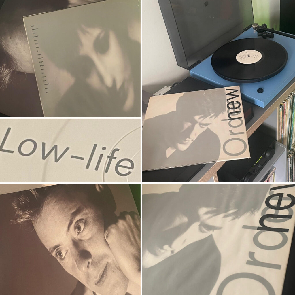
This training manifested most visibly in Simonon’s approach to the bass guitar itself. Unlike many musicians who viewed their instruments purely as sonic tools, he approached his Fender Precision Bass (and occasional Rickenbacker 4001) as a visual element, a prop in a carefully constructed tableau. His famous bass-smashing moment, captured on the cover of “London Calling,” demonstrates this synthesis perfectly. The moment, often mistaken for spontaneous rage, was in fact a considered piece of performance art that Simonon later acknowledged drew from his understanding of compositional drama.

“I knew exactly what I was doing,” he admitted years later. “It wasn’t just anger, though there was plenty of that. It was about creating something visually powerful, something people would remember.”

While Simonon brought the raw visual power of street art and expressionism to The Clash, Mick Jones arrived with a different artistic heritage. His time at Hornsey College of Art, though similarly abbreviated, exposed him to post-war modernist thought that profoundly shaped his approach to songwriting and performance.

Hornsey had established itself as a hotbed of radical artistic thought following the famous student occupation of 1968, when students and faculty seized control of the college for six weeks, demanding fundamental reforms to art education. Though Jones arrived after this watershed moment, the institution retained its reputation for encouraging experimental approaches that questioned established boundaries between artistic disciplines.

“At Hornsey, they were teaching us that everything connected, art wasn’t just painting pictures to hang on walls; it was about communication, about challenging people to see things differently. That’s exactly what we were trying to do with The Clash.” Mick Jones.

This modernist, interdisciplinary approach shaped Jones’s guitar style and songwriting. His compositions frequently juxtaposed seemingly incompatible elements such as reggae rhythms against hard rock guitar lines, poetic social commentary against street slang, creating a collage effect that mirrored the cut-and-paste aesthetic of the band’s visual presentation.

Professor Brian Fielding, who taught at Hornsey during Jones’s brief tenure, observed: “Mick wasn’t our most technically accomplished student, but he grasped something essential about modernism the idea that art gains power through juxtaposition and re-contextualisation. When The Clash combined rockabilly with political manifestos or dub reggae with punk energy, that was pure modernist technique.”

No examination of The Clash’s artistic foundations would be complete without acknowledging the profound influence of artist, journalist and activist Caroline Coon. Though not formally their teacher in an institutional sense, Coon became a critical mentor figure whose background in fine art and radical politics helped shape the band’s direction.

After studying at Central Saint Martins in the 1960s, Coon had established herself as both a painter and a counter-cultural journalist when she encountered The Clash in their formative stages. Recognising their potential, she became their manager and de facto artistic director.

“Caroline understood exactly what we were trying to become before we did, she saw that punk wasn’t just about making noise; it was about creating a complete alternative language, visual, musical, political, everything.” Joe Strummer.

Coon brought rigorous artistic thinking to the band’s presentation. Her formal training enabled her to articulate visual strategies that amplified their political message. Under her guidance, The Clash developed a cohesive aesthetic that drew from Russian Constructivism, Jamaica’s political poster art, and American abstract expressionism, synthesising these influences into something that felt simultaneously revolutionary and accessible.

“I was simply applying what I’d learned as an art student,” Coon later explained modestly. “Art is most powerful when it connects with people’s lives, when it speaks to real conditions. The Clash had something urgent to say about those conditions, and my contribution was helping them find the visual vocabulary to say it.”

What distinguished The Clash from many of their punk contemporaries was their sophisticated understanding of bricolage, the postmodern technique of constructing new meaning through the recombination of existing cultural elements. This approach, central to the teaching at both Byam Shaw and Hornsey during the period, became fundamental to The Clash’s artistic strategy.

Simonon’s hand-painted shirts and customised instruments, Jones’s collage-inspired songwriting, and the band’s repurposing of military and workwear fashion all demonstrated bricolage in action. They appropriated symbols from across the cultural spectrum, from RAF target roundels to American western imagery, reconfiguring them to create new, subversive meanings.

This wasn’t merely fashion; it was applied semiotics. As cultural theorist Dick Hebdige would later observe in his seminal work “Subculture: The Meaning of Style,” The Clash’s visual presentation constituted “a form of consumer resistance” in which commercial objects were “worn and displayed in a way that subverted their original meaning.”

Bernie Rhodes, who managed the band after Coon’s departure, recognised the strategic value of this approach: “Most bands just wanted to make records. The Clash understood they were creating a complete cultural intervention. Every photograph, every poster, every stage set was carefully considered. That came directly from Mick and Paul’s art school background.” Evidenced also by the fury surrounding the release of Remote Control by CBS without their approval and subsequent rejection of this in the lyrics of Complete Control.

By the time The Clash released “London Calling” in 1979, the artistic influences that had shaped their development had cohered into a singular vision. The album’s iconic cover featuring Simonon smashing his bass on stage, was deliberately modelled after Elvis Presley’s debut album, creating a multi-layered visual statement about rock history and punk’s position within it.

Graphic designer Ray Lowry, who created the cover, worked closely with the band to realise this concept. “They weren’t like other musicians I’d worked with,” Lowry later recalled. “They understood design; they could talk about typography and composition. They knew exactly the historical references they wanted to invoke and subvert.”

Inside, the music demonstrated how completely Jones and Simonon had absorbed and transformed their artistic influences. Songs like “Lost in the Supermarket” applied situationist critiques of consumer culture that might have come straight from a Hornsey College lecture hall. “The Guns of Brixton” reflected Simonon’s ability to translate the visual immediacy of his art school training into urgent sonic landscapes.

In the decades following The Clash’s dissolution, both Jones and Simonon continued to demonstrate the lasting impact of their artistic foundations. Jones’s work with Big Audio Dynamite pioneered the integration of sampling and video art into rock music, while Simonon returned explicitly to the visual arts, exhibiting paintings that reflected his continuing engagement with urban landscapes and social commentary.

Their influence extended far beyond their own careers. The art school to punk pipeline they exemplified became a recognised pathway in British music, with institutions like Saint Martins, Goldsmiths, and the Royal College of Art producing successive generations of musicians who approached popular music as a multi-disciplinary art form rather than mere entertainment.

As writer Jon Savage noted: “The crucial contribution of The Clash was demonstrating that popular music could be simultaneously accessible and intellectually sophisticated, visceral and visually literate. That’s the art school legacy in action.”

In today’s fragmented cultural landscape, where musicians routinely control every aspect of their presentation across multiple media platforms, The Clash’s integrated artistic approach seems remarkably prescient. What appeared revolutionary in 1976, the idea that a band should consider every aspect of their output as part of a cohesive artistic statement has become standard practice.

This transformation owes much to those afternoons Simonon spent sketching at Byam Shaw, to Jones’s exposure to modernist theory at Hornsey, and to their collective willingness to apply formal artistic training to the raw materials of punk rock. In doing so, they helped establish popular music as a legitimate field for serious artistic expression, a cultural battlefield where trained artists could deploy their skills in service of authentic communication rather than academic abstraction.

The legacy of The Clash reminds us that the most enduring cultural revolutions often occur at the intersection of formal training and raw expression, where the techniques of the academy meet the urgency of the streets, creating something neither could produce alone.

Art Pop / Pop Art: a study of the influences of art school, famous artists and movements on pop and rock music. Those institutions where failure is motivation, where the eccentric and pretentious emerge into the fascinating space where art and music meet.

ART POP / POP ART: David Bowie, Art Classes & Derek Boshier

The Art School Dandy. Bowie’s Brush With Bohemia.

There was always something different about David Bowie, wasn’t there? While his contemporaries were busy being rock stars, he was busy being something else entirely: an art project with a guitar. As the rest of rock’s aristocracy draped themselves in velvet and attitude, young David Jones was meticulously crafting personas with the same care a painter applies to canvas or a sculptor to stone. And why wouldn’t he? The lad was steeped in art school sensibilities before he ever picked up a microphone.

When Bowie space-walked into our consciousness in the late Sixties, he brought with him the baggage of Bromley Technical High School, where his art teacher Owen Frampton (incredibly the father of “Frampton Comes Alive” Pete, as cosmic coincidence would have it) had stuffed the boy’s head with possibilities. It was here that our man first encountered the heady brew of visual thinking that would define his career. While most pop stars were channeling Elvis and Chuck Berry, Bowie was communing with the ghosts of Marcel Duchamp and Kurt Schwitters.

“I’ve always been a visual thinker, the music was always just one part of the whole package. I needed the visual element to complete the circuit.” David Bowie.

And complete it he did, in a series of personas that functioned less as costumes and more as living exhibitions of performance art: Ziggy Stardust, Aladdin Sane, the Thin White Duke. Each one a walking gallery installation, meticulously curated down to the last detail.

But it was his relationship with the British Pop Art movement that truly illuminated Bowie’s approach. Enter Derek Boshier, the pioneering artist whose conceptual thinking provided the spark for one of Bowie’s most iconic album sleeves.

Boshier, a graduate of the Royal College of Art and contemporary of David Hockney, had been pushing the boundaries of Pop Art since the early Sixties. By the time he encountered Bowie in the mid-Seventies, both men were operating in that fertile territory where high art and pop culture collide with the force of subatomic particles in CERN’s hadron collider.

The concept for “Heroes” that stark, Eno-drenched masterpiece of 1977, came directly from Boshier’s fascination with gesture and posture. The now iconic image of Bowie, arm raised in a peculiar mime salute that’s neither fascist nor friendly, was Boshier’s suggestion: a visual quotation of Erich Heckel’s painting “Roquairol.” It’s the kind of art-historical reference that would fly over the heads of most rock stars, but for Bowie, it was the nectar of Zeus.

“David understood exactly what I was trying to do, most musicians want to look cool or dangerous. David wanted to look interesting. That’s the art school influence right there choosing the intellectually provocative over the merely attractive.” Derek Boshier.

This wasn’t just about album covers, either. When Bowie moved to the Brutalist rebuilt concrete city of Berlin in the late Seventies, he wasn’t just running from cocaine and Los Angeles; he was deliberately placing himself in the epicentre of European expressionism. While holed up in that apartment above the auto parts shop, he wasn’t just sharing with Iggy Pop or recording with Eno; he was making pilgrimages to the Brücke Museum, communing with the ghosts of German expressionism.

The Berlin trilogy of “Low,” “Heroes,” and “Lodger” wasn’t just a musical departure; it was Bowie’s most explicit attempt to translate the fractured perspectives of expressionist art into sound. Listen to the instrumental second side of “Low” and you will ‘hear’ the angular distortions of Kirchner or the colour explosions of Nolde translated into synthesiser washes and oblique rhythms.

Even his collaborators were chosen with an art school sensibility. Brian Eno wasn’t just a sonic innovator; he was a graduate of the Winchester School of Art and a student of cybernetic theory and systems thinking. Their collaborations were less traditional songwriting sessions and more like conceptual art happenings, with Eno’s Oblique Strategies cards, themselves pure art school, directing the creative flow.

“The thing about David is that he approached recording studios the way other artists approach galleries. Each album was an installation, a complete environment with its own rules and internal logic.” Tony Visconti Record Producer.

This approach reached its zenith with Boshier’s involvement in the “Lodger” sleeve, an elaborate piece of conceptual art disguised as an album cover. The distorted image of Bowie falling, the deliberate reference to Polaroid manipulation techniques this wasn’t just packaging; it was a manifesto.

Throughout the Eighties, as Bowie’s commercial star rose and his artistic credibility occasionally wobbled, the art school influence remained his secret weapon. Even at his most commercial, during the “Let’s Dance” period, there was always something slightly off-kilter about his presentation a knowing wink to the cognoscenti that this, too, was performance art.

By the time he re-emerged with the industrial crunch of “Outside” in 1995, Bowie had circled back to his art school roots with a vengeance. Collaborating with Brian Eno again, he created not just an album but a complete fictional world populated by characters like Nathan Adler and Baby Grace Blue a concept album that owed more to installation art than it did to “The Rise and Fall of Ziggy Stardust.”

For his part, Boshier remained a touchstone throughout Bowie’s career, the connection to an art school sensibility that never left him. Their collaborations from “Heroes” through to Bowie’s later years represented one of pop music’s most enduring dialogues between rock and visual art.

In an era when most rock stars were content to be rock stars, Bowie remained defiantly, stubbornly, gloriously an art student at heart the smartest kid in the classroom who never stopped asking “what if?” While others were content to give the audience what they wanted, Bowie insisted on giving them what they didn’t know they needed.

His final album, “Blackstar,” released just days before his death in 2016, was perhaps his most complete art statement; a multimedia farewell that incorporated music, video, graphic design, and performance into a single, devastating whole. The falling astronaut, the blind prophet, the button-eyed specter weren’t just music video conceits; they were the culmination of a lifetime spent at the intersection of rock and conceptual art.

David Bowie wasn’t just influenced by art school thinking; he was its greatest ambassador in the realm of popular music. He took the experimental, boundary-pushing ethos of the art school and smuggled it into the mainstream inside trojan horses made of glitter, lightning bolts, and a space travelling Pierrot.

As we approach the tenth anniversary of his departure from this particular dimension, it’s worth remembering that Bowie’s greatest creation wasn’t Ziggy or the Thin White Duke or even his fabulous canon. It was the concept of David Bowie himself, the ultimate mixed-media art project, a half-century in the making, that changed not just music but the very idea of what a pop star could be.

For that, we have the art schools to thank. Not bad for an education that most parents would have considered a waste of time, eh?

__

Art Pop / Pop Art: a study of the influences of art school, famous artists and movements on pop and rock music. Those institutions where failure is motivation, where the eccentric and pretentious emerge into the fascinating space where art and music meet.

RETROSPECTIVE: Forty Years Of New Order Low-Life

A Retrospective Look at New Order’s “Low-Life” (1985)

New Order - Low Life (1985) Fact 100 Factory Records First Pressing


In the polarised Great Britain of the mid-Eighties New Order’s “Low-Life” arrived like a sonic manifesto that bridged the chasm between post-punk’s introspection (see Unknown Pleasures) and the hedonistic pulse of the Eighties synth pop ‘pre-Rave’ dance floor. Forty years on, Fact 100 their beautiful and innovative Saville Associates designed third album stands as the moment when the long shadows of Joy Division were replaced by high hopes and their own distinctive path.

From the opening salvo of “Love Vigilantes,” it’s abundantly clear that Bernard Sumner and company had left behind the transitionary austere monochrome of “Movement.” Here was a band finally comfortable in their own skin, marrying melancholy with euphoria in a manner that imitators have never managed to replicate.

The record’s crown jewel remains “The Perfect Kiss,” a glorious collision of Stephen Morris’s metronomic percussion, Hooky’s high-slung bass melodies, and Sumner’s deceptively simple lyrical confessionals. A band now operating at the zenith of their powers, an unforgettable riff, unconventional and essential. I cannot move on without mentioning the epic and lauded ten minute Jonathan Demme close up music video of this single.

“Sub-culture” and “Face Up” showcase Gillian Gilbert’s increasingly vital synth work, while the hauntingly beautiful “Elegia” demonstrates that the band could still conjure the spectral atmospherics of their previous incarnation, aka Closer side 2, when the mood took them.

What’s most striking about “Low-Life” now is how modern it still sounds. While their contemporaries were mired in the production excesses of the mid-Eighties multi-tracking electronic new toys, Factory Records’ finest were crafting a blueprint that would inform alternative dance music for decades to come. There’s a directness and humanity to these tracks that transcends the often clinical, technology-obsessed approach of the era.

Sumner’s vocals, once derided as weak, off-key and amateurish by the more unforgiving critics including the mighty NME now seem perfectly pitched, vulnerable yet determined, the voice of a reluctant frontman who discovered he had plenty to say after all – the aforementioned humanity perhaps.

“Low-Life” captures New Order at the precise moment they became truly indispensable, the exact point where they ceased to be a fascinating curiosity and blossomed into genuine innovators. It’s the sound of a group of working-class northerners reinventing pop music on their own gloriously idiosyncratic terms.

Forty years on, and where has that disappeared? “Low-Life” towers over the landscape of British music like the Haçienda’s rugged concrete pillars once dominated Manchester’s skyline. Essential listening and definitely in my Top 20 albums of all time.

ART POP / POP ART: Brian Eno & Tom Phillips

Or ‘Two Brain’ Brian Eno’s Art School Daydreaming

In the pantheon of rock’s cerebral mavericks, Brian Peter George Jean-Baptiste de la Salle Eno AKA Brian Eno or just plain Eno stands as our premier egghead-in-residence, the boffin who turned knob-twiddling into an art form, and made the recording studio a canvas rather than a mere tool. While lesser mortals bang away at their instruments with workmanlike dedication, Eno approaches music as just another colour on his palette.

The roots of Eno’s glorious dilettantism lie not in the cramped smoky clubs of London but in the rarefied air of art school conceptualism. Before he became the feather-boa’d synth wizard of Roxy Music, before he produced landmark albums for everyone from Talking Heads to U2, before he invented ambient music while flat on his back after being walloped by a taxi, young Brian was just another paint-splattered art student at Ipswich’s Suffolk College, soaking up ideas that would later transform rock music.

“Art school didn’t teach me how to paint, it taught me how to think about why I might want to paint in the first place.” – Brian Eno.

This intellectual approach, questioning the very foundations of why we make art became the cornerstone of his musical methodology, a perpetual askance glance at rock’s tedious conventions.

At Ipswich, Eno fell under the spell of teacher and mentor Tom Phillips, a walking encyclopedia of avant-garde approaches whose influence on our hero cannot be overstated. Phillips; painter, composer, translator, and all-round Renaissance gadabout introduced the young Eno to the work of John Cage, to the mind-bending possibilities of chance operations and indeterminacy. Phillips’ own masterwork, “A Humument,” in which he transformed a Victorian novel into a series of visual poems by painting over the text, leaving selected words visible, demonstrated how one might create new meaning by obscuring the old, a strategy Eno would later deploy in his oblique collaborations with David Bowie.

“Tom showed me that art wasn’t about technical skill, it was about context, about framing experiences.” This revelation liberated the technically limited Eno, allowing him to approach music as conceptual art rather than a craft to be mastered. When he later joined Roxy Music, he proudly proclaimed his musical illiteracy as a virtue rather than a handicap.

The conceptual art movement that dominated British art schools in the late ’60s provided Eno with his intellectual toolkit. Here was an approach that valued ideas over execution, process over product, and systems over virtuosity, catnip for a mind as restlessly curious as Eno’s. From conceptualism came his fascination with self-generating systems, with setting up musical experiments and then stepping back to see what might happen. His famous Oblique Strategies cards (created with artist Peter Schmidt) with those cryptic injunctions like “Honour thy error as a hidden intention” or “Emphasise differences” are pure conceptual art, placing process above outcome.

While most rock musicians have historically treated their art school past as a brief bohemian holiday before getting down to the serious business of power chords and stadium tours, Eno has remained defiantly committed to the art school perspective. His collaborative approach, turning musicians into components in his sonic experiments derives directly from the workshop methodologies of art school. When he produced Talking Heads’ “Remain in Light,” he was essentially running the band through a series of conceptual exercises, treating David Byrne and company as materials rather than auteurs.

Even Eno’s celebrated ambient works, gossamer soundscapes made for the comedown room, can be traced back to the “expanded cinema” experiments he witnessed as an art student. These multimedia environments, combining film, light shows, and sound, were attempts to create immersive experiences rather than discrete works of art. When Eno later described ambient music as being “as ignorable as it is interesting,” he was channeling the art school notion that art need not demand attention but might instead modify an environment.

What separates Eno from the legions of other art school graduates who’ve strayed into rock’s territory is his ability to translate rarefied conceptual approaches into works that connect emotionally. His productions for U2 may have been informed by systems thinking and process art, but they also made the Irish bombast merchants sound bloody enormous. His solo works might be exercises in cybernetic theory, but they’re also strangely moving, capturing melancholy and wonder in their abstract washes.

In an age when rock has largely abandoned its art school flirtations in favour of earnest authenticity or technical showboating, Eno remains our most eloquent reminder that popular music can be a laboratory for ideas as well as emotions. The art school influence that formed him, that combination of intellectual rigour and playful experimentation continues to inform his work, whether he’s producing pop stars or creating video installations.

As we face another decade of dreary singer-songwriters emoting over acoustic guitars, we need Eno’s art school sensibility more than ever. With Eno, thinking about music can be as revolutionary as playing it.

Brian Eno attended Ipswich Art School, Winchester College of Art 1964-66 & 1966-69.

Art Pop / Pop Art: a study of the influences of art school, famous artists and movements on pop and rock music. Those institutions where failure is motivation, where the eccentric and pretentious emerge into the fascinating space where art and music meet.

ART POP / POP ART: Jerry Dammers’ Multi-Cultural Vision

Or Rude Boy Revolution: Jerry Dammers Two Tone Vision.

In the drab concrete wasteland of late-70s Coventry, while the rest of Britain was busy ripping its clothes and safety-pinning them back together again, a bespectacled keyboard player with a vision was plotting a different kind of revolution. One that would eventually come dressed in sharp suits, pork pie hats and checkerboard patterns.

Jerry Dammers the dentally challenged architect of Two Tone Records, founder of The Specials, and perhaps the most criminally underappreciated musical visionary of his generation didn’t stumble upon his aesthetic by accident. The roots of Two Tone’s striking visual identity and multicultural musical fusion can be traced directly to Room 057 of Lanchester Polytechnic’s art department, where young Dammers spent his days absorbing influences that would later explode into a cultural phenomenon.

The Art School Radical

Lanchester Poly (now Coventry University) in the mid-70s was hardly Central Saint Martins, but what it lacked in glamour it made up for in gritty authenticity. While Malcolm McLaren and Jamie Reid were cooking up the Sex Pistols’ confrontational visuals in London, Dammers was in Coventry, quietly developing his own radical visual language.

“Art school was where I learned about Constructivism and Bauhaus,” Dammers once explained in a rare interview. “That black and white check pattern came directly from studying those movements, simple, bold, impossible to ignore.”

The checkerboard motif that became Two Tone’s signature wasn’t just visually striking, it was loaded with meaning. Black and white squares existing side by side, neither dominating the other. In Thatcher’s Britain, with racial tensions simmering and the National Front on the march, Dammers’ art school education gave him the tools to create a powerful visual metaphor for racial unity.

His tutors recall a serious, somewhat detached student whose sketchbooks were filled with record sleeve concepts years before he had a record label to release them on. While other students were making self-indulgent installations, Dammers was obsessively designing logos, posters, and manifestos for a cultural movement that existed only in his imagination.

The Coventry Sound System

If art school provided the visual framework, Coventry’s streets supplied the soundtrack. The city’s substantial Jamaican community had brought with them a rich musical heritage that fascinated Dammers. He spent countless nights in West Indian blues clubs, absorbing the hypnotic rhythms of ska and rocksteady, watching how the music created community in the dingy basements of a city best known for being bombed to smithereens in WWII.

“The thing about those Jamaican sounds,” recalls Neville Staple, who would later join Dammers in The Specials, “was that they were already fusion music. Ska itself came from Jamaicans late-night listening to American R&B on crackling radio stations and reinterpreting it through their own cultural lens.”

This was the critical insight that Dammers took from those nights, that musical cross-pollination wasn’t appropriation but conversation. The idea that white punks and black skinheads could find common ground on the dance floor became the foundation of the Two Tone philosophy. A near identical philosophy being formed by Joe Strummer, the white man In Hammersmith Palais.

The Poly Basement Tapes

Lanchester Poly’s dingy rehearsal rooms became the laboratory where Dammers conducted his grand experiment. The Automatics (later renamed The Specials) began as a ragtag collective of art students and local musicians, with Dammers as the unsmiling conductor, pushing his bandmates to fuse punk’s energy with ska’s rhythmic sophistication.

It wasn’t always harmonious. Punk purists thought the ska elements were gimmicky; traditionalists found the punk influence sacrilegious. But Dammers, with the single-minded determination of the true art school obsessive, drove the band forward through sheer force of will.

“Jerry would bring these complicated charts to rehearsal,” remembers original Specials guitarist Lynval Golding. “Most of us couldn’t read music that well, but he had this complete vision in his head. Sometimes we’d spend hours on just two bars of a song until it had exactly the tension he was looking for.”

That tension between disciplines, between cultures, between chaos and control became the defining characteristic of The Specials’ sound. It was the musical equivalent of a Bauhaus design: stripped down to its essential elements, each serving a specific purpose, no ornamentation for its own sake.

The Birth Of Two Tone

When Dammers finally launched Two Tone Records in 1979, it emerged fully formed, with an aesthetic coherence that betrayed its art school origins. Everything from the label’s logo to the bands’ uniforms to the stark black and white promotional photos spoke of a unified vision that was simultaneously retro and futuristic.

The label’s first release, “Gangsters” by The Specials, was pressed with an initial run of just 5,000 copies. Dammers personally designed the sleeve, a stark black and white affair featuring Walt Jabsco, the label’s rude boy mascot adapted from a photograph of Peter Tosh. It sold out immediately, and the Two Tone revolution was underway.

What followed was a brief but incandescent moment in British music history. The Selecter, Madness, The Beat, and others joined the Two Tone stable, each putting their own spin on the fusion sound Dammers had pioneered. For a glorious 18 months, these bands dominated the music charts, bringing their message of racial unity to Top of the Pops while the country burned with riot and discontent.

The sad irony is that Dammers’ art school training, which gave him the tools to create Two Tone’s unified aesthetic, also contained the seeds of the movement’s demise. Like so many art school idealists before him, from Brian Eno to Pete Townshend, Dammers couldn’t stop evolving while the movement he’d created crystalized around him.

By the time of The Specials’ masterpiece “Ghost Town” a harrowing sonic portrait of urban decay that hit number one during the 1981 riots Dammers was already restless, pushing toward more experimental sounds that left both bandmates and audience bewildered.

When The Specials inevitably fractured, Dammers formed the jazz-influenced Special AKA, creating the anti-apartheid anthem “Free Nelson Mandela.” It was another masterpiece of political pop, but by then the Two Tone moment had passed. The art student had moved on to new experiments while his classmates were still copying his previous breakthrough.

Legacy

Today, Lanchester Polytechnic is long gone, absorbed into Coventry University. The concrete brutalism of 1970s Coventry has been softened by redevelopment. And Jerry Dammers has become something of a recluse, occasionally emerging for DJ sets of obscure jazz and world music.

But the impact of that collision; between art school theory and street-level reality, between black and white musical traditions, between design and visceral energy continues to reverberate. From the multicultural dance collectives of the 90s to the post-genre experiments of today’s London scene, Dammers’ Two Tone vision has proven remarkably prescient.

Perhaps the most telling testament to Dammers’ achievement is that the checkerboard pattern he adapted from his art school studies has transcended its origins to become a universal signifier of ska music across the globe. From Tokyo to Mexico City, bands still don pork pie hats and two-tone suits to pay homage to the vision of a serious young art student from Coventry who dared to imagine that black and white could create something more powerful together than apart.

In an age of algorithmic playlists and frictionless fusion, it’s worth remembering that Two Tone wasn’t just about mixing musical styles. It was a complete artistic statement; visual, musical, political and crafted with the disciplined vision of a true art school radical. And somewhere in a dusty archive at Coventry University, there may still exist the student sketches where Jerry Dammers first dreamed it all up, years before the first needle dropped on “Gangsters” and changed British music forever.

“The thing about Jerry, is that he was never just a musician. He was always creating this whole world with its own rules and values. That’s what you got from him being an art student he saw the big picture while the rest of us were just trying to get a gig on Saturday night.” Neville Staples.

In that sense, Two Tone was perhaps one of the greatest art school movements in British pop, marginally less famous than the one that gave us the Sex Pistols, but in many ways more enduring. After all, McLaren, Lydon and Pistols told us there was “No Future.” Dammers and his Two Tone multi-cultural vision insisted there could be if only we were brave enough to imagine it together.

Jerry Dammers attended Lanchester Polytechnic, Coventry, 1972-1975

Art Pop / Pop Art: a study of the influences of art school, famous artists and movements on pop and rock music. Those institutions where failure is motivation, where the eccentric and pretentious emerge into the fascinating space where art and music meet.

ART POP / POP ART: The Bryan Ferry – Richard Hamilton Pop Art Axis

Or the glamour and concept alliance that shaped pop culture’s visual aesthetic.

In the pantheon of British art-rock partnerships, none carries quite the heavyweight intellectual punch nor the sly wit of the decades long association between Roxy Music’s dandy-in-chief Bryan Ferry and the godfather of British pop art, Richard Hamilton. While other rock stars dabbled in art school pretensions before scuttling back to three-chord thrashings when the going got conceptually tough, Ferry, ever the immaculate contrarian, took the scenic route, transforming himself from Hamilton’s eager student into a living canvas that reflected his mentor’s most audacious ideas about art, commerce and the slippery space between.

Back in the linoleum corridors of Newcastle University’s fine art department in the mid-1960s, before glam had even begun to glitter, young Bryan was absorbing Hamilton’s radical postmodernism like a shark-eyed sponge in a stylish blazer. Hamilton, already famous for his 1956 collage “Just what is it that makes today’s homes so different, so appealing?” that paradigm-shattering mash-up of consumer culture was quietly planting seeds in Ferry’s fertile imagination. What Hamilton offered wasn’t just art theory, but an escape route from the grey industrial North, a passport to a world where high concept and low culture could dance an elegant tango.

“Richard taught me to think about the whole package, the idea that presentation and context were as important as content. That was revolutionary in the ’60s. He made me understand that the frame around the picture was part of the picture.”

What a picture Ferry went on to paint. When Roxy Music erupted into the stagnant pool of early ’70s rock like some bizarrely elegant alien invasion, the Hamilton influence was everywhere. From the name a take on cinema brands of the era, the band’s self-titled 1972 debut album with its airbrushed model cover (simultaneously celebrating and critiquing glamour), to the meticulous attention paid to every visual detail of their stage presentation. Ferry wasn’t just fronting a band; he was curating a multi-sensory installation that Hamilton would have understood implicitly.

Let’s linger on that debut album sleeve for a moment, a veritable manifesto of pop art principles wrapped around twelve inches of vinyl. The cover, with model Kari-Ann Muller striking a classic 1950s pin-up pose in a candy-pink and blue airbrushed dreamscape, is Hamilton’s lessons made flesh. It’s nostalgic yet futuristic, glamorous yet ironic, handcrafted yet mechanical. The hyper-real airbrushing technique (executed by Ferry’s art school colleague Nicholas de Ville) creates that same uncanny advertising sheen that Hamilton had been deconstructing since the ’50s. The key difference? While Hamilton was exposing the artifice of consumer culture, Ferry was gleefully embracing it with a knowing wink that transformed potential kitsch into high concept.

“We were interested in creating a new kind of sleeve. Something that commented on the history of glamour photography while participating in it. Richard had shown me that you could reference the past without being trapped by it.” Bryan Ferry.

Hamilton himself was delighted by the album’s visual approach. “Bryan understood something I’d been trying to articulate for years,” he told me. “That in consumer culture, parody and celebration are not opposites but parts of the same continuum.”

For “For Your Pleasure” in 1973, the Hamilton influence grew even more pronounced. The cover featured model Amanda Lear (rumored to be Salvador Dalí’s muse) in leather, clutching a snarling black panther on a leash against a nocturnal cityscape, a hyper-stylized, almost surreal tableau that pushed the interplay between high and low culture even further. The nighttime setting, the fashion model posing as dominatrix, the tamed wild animal all created a collage effect that was pure Hamilton in its juxtaposition of seemingly unrelated elements to create new meanings.

“The second album cover was like a film still from a movie that didn’t exist, that’s something Richard taught me, the power of the implied narrative, the story that exists in the viewer’s imagination.” Bryan Ferry.

The cover’s most Hamiltonian feature was its self-referential quality, with the Roxy Music logo appearing as a neon sign within the image itself, a meta touch that collapsed the distance between the product and its packaging. This was pop art’s self-referencing loop in action: the band becoming part of their own iconography even as they were creating it.

These weren’t mere record sleeves they were manifestos of intent, visual thesis statements that positioned Roxy Music not just as musicians but as cultural curators. In both covers, Ferry was applying Hamilton’s lessons about the erosion of boundaries between advertising, art, and mass media, creating images that functioned simultaneously as commercial packaging and conceptual art pieces.

The irony, of course and with these two, irony is always lurking like a well-dressed assassin, is that while Hamilton was deconstructing consumer culture, Ferry was busy constructing himself as the ultimate luxury consumer item. “I’ve always been a product, just one with exceptional quality control.”

Hamilton watched his protégé’s rise with wry amusement commenting, “Bryan understood something essential about modern art, that it’s not about authenticity anymore, but about the manipulation of surfaces and signs.” Coming from another artist, this might have sounded like criticism. From Hamilton, it was the highest form of praise.

The two men’s aesthetic overlap found its most explicit expression in the cover art for Roxy Music’s 1979 album “Manifesto,” where the mannequin theme seemed to directly reference Hamilton’s explorations of the artificial and the constructed. But their most profound connection wasn’t in the obvious visual quotations, but in their shared understanding that in late-capitalism, style isn’t superficial it’s the substance itself.

While punk’s angry children were spitting at the system, Ferry and Hamilton were doing something far more subversive: they were reflecting it back at itself, distorted just enough to reveal its beautiful absurdity. Hamilton’s collages and Ferry’s croon both presented a world of perfect surfaces with just enough disruption to make you question everything you were seeing and hearing.

“We were never interested in shocking people, shock is too easy, too temporary. We wanted to seduce people into thinking differently.” Bryan Ferry.

As the decades rolled by, the student arguably overtook the master in terms of cultural impact, with Ferry’s suave persona infiltrating popular consciousness far beyond Hamilton’s art-world fame. Yet Hamilton never seemed to resent his former pupil’s celebrity. “Bryan took my ideas dancing and I rather like the places they’ve been.”

Their relationship endured until Hamilton’s death in 2011, a rare example of an artistic influence that evolved into something like friendship, albeit one conducted with very British reserve. Ferry’s touching statement after Hamilton’s passing, “he taught me to think, not what to think” perhaps best captures what made their connection so fruitful.

In an age where most rock stars’ art school backgrounds amount to little more than convenient biography footnotes, the Ferry-Hamilton axis stands as something far more profound: a genuine intellectual exchange that helped shape the visual grammar of pop culture. Their shared obsession with nostalgia, glamour, irony and artifice created a feedback loop between fine art and pop music that we’re still hearing and seeing today.

Next time you’re watching some elegantly disheveled pop star deconstructing celebrity while simultaneously embodying it, spare a thought for the dandy and the professor from Newcastle who wrote that playbook decades ago and played it with infinitely more style.

Bryan Ferry attended Newcastle College of Art, 1964-1968

Art Pop / Pop Art: a study of the influences of art school, famous artists and movements on pop and rock music. Those institutions where failure is motivation, where the eccentric and pretentious emerge into the fascinating space where art and music meet.

POP ART: New Order Blue Monday FAC72-600!

Another from my series of iconic Seventies & Eighties Punk Rock and New Wave record sleeves reimagined as standout Pop Art to show in an installation or hang in your space.

New Order – Blue Monday FAC72 12″ Vinyl Single (1983)

600mm acrylic painting on MDF with pine former.

New Order Blue Monday Factory Records FAC72-600 Pop Art


New Order’s Blue Monday: A New Pop Art Revolution

Dive into the iconic world of New Order’s groundbreaking single through a stunning 600mm pop art interpretation that celebrates the legendary Blue Monday sleeve design.

This revolutionary artwork captures the essence of Peter Saville’s innovative design – a hand painted visual homage to the most famous 12″ single in music history. The piece reimagines the original floppy disk-inspired sleeve, breaking down its intricate colour-coded messaging into a bold pop art statement.

Artistic Highlights:

  • Inspired by the original 1983 Factory Records release
  • Painted on large 600mm MDF with a substantial pine former
  • Stand alone as an installation or part of a Pop Art display
  • Hang in your space, its a stand-out art piece
  • Faithfully recreated design which is different on each side
  • Explores the unique color-coding system that made the original sleeve legendary
  • Transforms the innovative technical design into a vibrant artistic statement
  • Celebrates the intersection of music, technology, graphic design and now ART!

The artwork pays tribute to Saville’s groundbreaking concept – a sleeve that was more than just packaging, but a coded message decipherable through a complex colour wheel. Each colour block tells a story, reflecting the innovative spirit of New Order’s most iconic track.

New Order Blue Monday FAC72-600B Pop Art


A unique piece that bridges music history and contemporary art, this large-scale painting captures the revolutionary spirit of Blue Monday – a track that redefined electronic music and graphic design in one extraordinary moment.