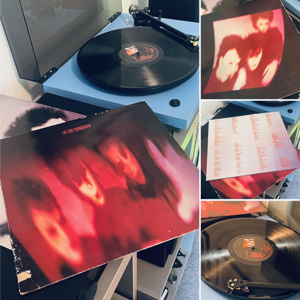
Four decades on, Robert Smith’s darkest hour remains a towering monolith of despair
The year is 1982. A pre-Falklands War Thatcher’s Britain is strangling itself, unemployment queues stretch round the block, at RAK studios – the production home of Mickie Most… a mentally exhausted The Cure trio including an actually suicidal Robert Smith are busy raiding the local off-licence and dropping LSD while constructing Pornography. An album set to be a valedictory, instead the fourth of many but in retrospect the most unforgiving album in their catalogue. This is not a weeping song, it’s a weeping album of relentless despair deep in the trenches. I’m trying to think of more angst ridden vinyl before this, Leonard Cohen? he doesn’t touch the sides.
To pin down Pornography’s genre is like trying to nail jelly to the wall blindfolded. Is it goth? Well, it certainly helped birth the movement, though Smith and co. were likely too busy drowning in their own existential mire to notice they were creating a blueprint for a thousand even paler imitators. Post-punk seems closer to the mark, the album shares DNA with the abrasive experimentation of Wire and the introverted intensity of Joy Division, yet it possesses a peculiar self aware grandiosity that sometimes flirts with progressive rock’s theatrical impulses.
The opener, “One Hundred Years,” remains one of the most genuinely unsettling pieces of music committed to vinyl as confirmed by a thousand other reviews over the decades. Simon Gallup’s bass doesn’t so much play as it lurches, each note feeling like a death rattle echoing through a Victorian mausoleum. Lol Tolhurst’s drums don’t keep time, they mark the countdown to apocalypse with Swiss precision. Over it all, Smith’s open but discordant guitar work writhes and contorts like something in its final death throes, whilst his vocals deliver pronouncements of doom with the authority of a biblical prophet having a particularly bad day, ‘Stroking your hair while the patriots are shot’. Cheery.
Smith’s lyrics here read like dispatches from a post-nuclear wasteland, all “caressing an old man” and visions of flesh rotting in slow motion. “It doesn’t matter if we all die,” he intones with the casual indifference of someone reading the shipping forecast, before launching into imagery that makes JG Ballard’s crash fetishists seem positively life-affirming. The repeated invocation of “ambition” becomes less a call to achievement than a bitter mockery of human striving in the face of inevitable decay. It’s dystopian poetry delivered with the matter-of-fact brutality that only someone contemporaneously truly acquainted with despair could muster.
The album’s themes are hardly subtle. Death, execution, decay, sexual obsession, and psychological collapse aren’t just lyrical preoccupations here, they’re the very fabric from which the music is woven. The title track itself is a gruelling eight-minute descent into total madness.
What’s remarkable, and this is an album that has needed the space of time to fully appreciate – but listening back now, is how individual virtuosity serves the album’s suffocating atmosphere rather than showing off for its own sake. A polar opposite of prog. Gallup’s bass playing is masterful, his lines on “The Hanging Garden” provide both melodic anchor and rhythmic propulsion whilst never losing sight of the song’s essential bleakness. Lol Tolhurst, soon to eschew drums for keyboards, proves his worth with drumming that’s both primitive and sophisticated, knowing precisely when to pummel and when to restrain.
You’re drawn into the narrative so deeply that by the time The Hanging Garden begins the assumption is hung as in executed, then you think well, The Hanging Gardens of Babylon were decorative – but by the end you’re covering your face as the animals die. Oh well.
Pornography exists in its own ecosystem, hermetically sealed from the outside world. It’s an album that doesn’t court your affection so much as dare you to spend time in its company. The fact that it spawned a thousand goth clubs and launched a million black-clad disciples is almost beside the point, this is music that transcends subcultural boundaries through sheer force of vision.
Four decades later, as Britain – indeed the world once again finds itself wrestling with its demons, Pornography sounds less like a relic of its time and more like a prophetic statement. It remains The Cure’s most uncompromising work, a 43-minute journey into the abyss that somehow manages to be simultaneously utterly miserable and strangely life-affirming. A album that could leave you with a thousand yard stare. Give me your eyes that I might see, a blind man kissing my hand.
Essential listening, but if you’ve just begun a course of anti-depressants read the side effects first.
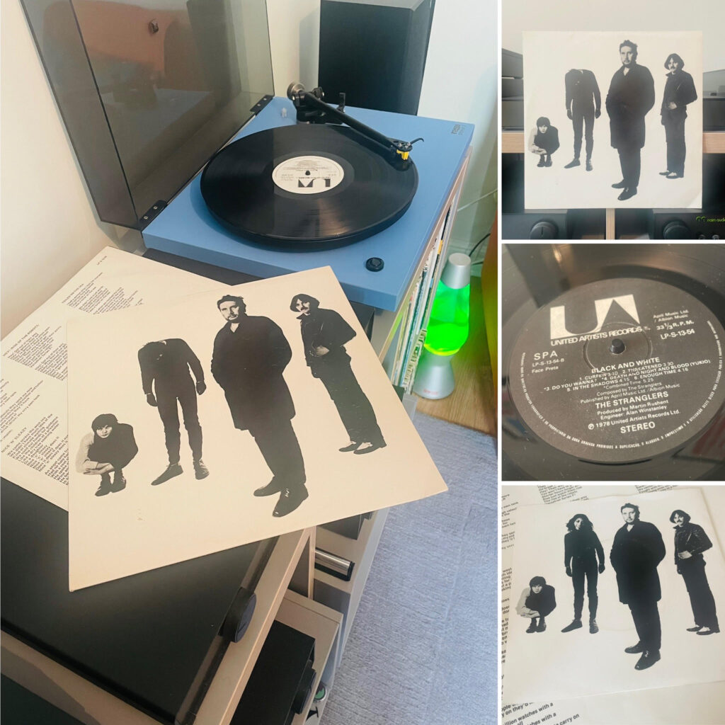
The Stranglers’ genre-defying third album Black and White.
‘The album’s greatest achievement, visible only in retrospect, is how it managed to bridge multiple worlds simultaneously. It’s European art-rock disguised as British punk, progressive complexity wrapped in new wave accessibility, academic sophistication delivered with street-level aggression. This wasn’t difficult third album confusion, it was cultural synthesis of the highest order.‘
The Stranglers in their original line-up have always been an awkward bunch to pin down. Too clever by half for the three-chord merchants, too hard for the art school crowd, and now, nearly five decades later, it’s clear that with Black and White, they were mapping out musical territory that the rest of us are still catching up to. This third LP finds Hugh Cornwell and his merry band of misanthropes wandering off into uncharted territory.
Make no mistake about it, this was never your standard punk fare, and time has only made that more obvious. The album’s position in their canon is rather like that of The Beatles’ Sgt. Pepper or Bowie’s Low – it’s when the band stopped being what people expected and took a hard fork and became something else entirely. Where Rattus Norvegicus and No More Heroes could still be filed under “angry young men with guitars,” Black and White reveals The Stranglers as something far more prescient: a band of genuine musical ability who understood that punk’s three-chord limitations were a creative dead end. Dave Greenfield’s keyboards, which seemed so alien to punk orthodoxy in 1978, now sound like a direct line to everything from Joy Division’s atmospheric menace to Depeche Mode’s electronic romanticism.
The album’s opener sets a tone that, viewed from today’s perspective, feels remarkably contemporary. There’s a European sensibility at work here that becomes more significant when you consider Cornwell’s academic background, his time pursuing doctoral studies in Sweden had clearly broadened his musical horizons beyond the parochial concerns of British punk. This is music that breathes Continental air, influenced as much by krautrock and European art movements as by the Ramones or The Sex Pistols. It’s telling that while their punk contemporaries were busy becoming parodies of themselves, The Stranglers were quietly absorbing influences from across the North Sea. “Let me tell you about Sweden!”
The musical sophistication that seemed so controversial at the time now appears as the album’s greatest strength. Jean-Jacques Burnel’s bass doesn’t just anchor these songs; it prowls through them with a melodic complexity that prefigures the art-rock basslines of bands like Radiohead. His French background, combined with Cornwell’s Scandinavian academic experience, created a cultural perspective that was uniquely European within the context of British punk, something that seemed like pretension in 1978 but reads as genuine cosmopolitanism today.
Which brings us to the question of genre, now settled by history’s verdict. This wasn’t punk, it was post-punk before the term existed, nascent yet to be defined new wave, and death and night and blood darkwave a full decade before any Goths claimed it. The progressive rock DNA in instrumental passages and influences that so scandalised the Peaches punk faithful in 1978 now seem like natural evolution rather than betrayal. There’s art-rock sensibilities that align them more to Bryan Ferry’s Roxy Music than Brian James’ era The Damned. When viewed alongside the career trajectories of contemporaries who stayed “pure,” The Stranglers’ willingness to embrace musical sophistication looks like wisdom rather than sell-out.
The pre-Stranglers ice-cream selling Jet Black’s drumming is phenomenal and displays the kind of precision that made contemporaries envious and now sounds like a masterclass in restraint and power. His technical ability, which punk doctrine suggested was somehow inauthentic, has aged far better than the amateur enthusiasm of many of his contemporaries. This was always about more than attitude, it was about creating something genuinely new from the wreckage of rock orthodoxy.
The production, courtesy of Martin Rushent, has aged remarkably well. That claustrophobic intensity, the sense of menace lurking in the spaces between notes, a kind of negative space threat, points directly towards the atmospheric post-punk that would dominate the early eighties. Rushent understood what The Stranglers were reaching for, a sound that was simultaneously ancient and futuristic, rooted in European classical traditions but pointing towards electronic possibilities.
The European influences run deeper than mere musical technique. Cornwell’s academic sojourn in Sweden exposed him to Nordic social democratic thinking, Scandinavian cultural pessimism, and a Continental intellectual tradition that was light-years removed from punk’s British working-class romanticism. You can hear it in the album’s lyrical sophistication, its philosophical undertones, its refusal to offer simple answers to complex questions. This wasn’t just rebellion, it was critique, informed by a broader cultural perspective than most British bands or songwriters could muster.
Lyrically, the album now reads as remarkably prescient social commentary rather than simple provocation. The themes of dystopian late stage capitalism, existential threat, social breakdown and cultural exhaustion that seemed left field shocking in 1978 now feel like accurate prophecy. The Stranglers weren’t just chronicling the decline of British society, they were anticipating the cultural fragmentation and the rise and fall of the Internet and social media that would define the following decades.
The album’s greatest achievement, visible only in retrospect, is how it managed to bridge multiple worlds simultaneously. It’s European art-rock disguised as British punk, progressive complexity wrapped in new wave accessibility, academic sophistication delivered with street-level aggression. This wasn’t difficult third album confusion, it was cultural synthesis of the highest order.
Looking back across the landscape of late-seventies music, Black and White now appears as one of the most innovative albums of its era. While The Clash were already retreating into reggae and rockabilly nostalgia and The Sex Pistols had combusted spectacularly, The Stranglers were quietly creating a template for alternative music that would influence generations of musicians. From the atmospheric post-punk of Joy Division to the electronic experimentation of Kraftwerk’s British disciples, the DNA of Black and White can be traced through decades of innovative music.
In the end, history has vindicated The Stranglers’ refusal to stay within punk’s narrow confines. What seemed like betrayal in 1978 now looks like vision, a recognition that musical progress required synthesis rather than purity, sophistication rather than simplicity, European cosmopolitanism rather than parochial nationalism. Hugh Cornwell’s Swedish academic experience, Jean-Jacques Burnel’s French cultural background, and the band’s collective refusal to be constrained by British musical traditions created something genuinely unique in the landscape of late-seventies music.
Black and White remains uncomfortable listening, but for different reasons now. In an era of algorithmic predictability and focus-grouped lo-fi rebellion, there’s something genuinely subversive about music that refuses easy categorisation. The Stranglers were always outsiders, even within punk’s supposedly inclusive chaos. With Black and White, they staked out territory so far from any mainstream that it took many decades to recognise its importance. Uncomfortable listening for uncomfortable times, which is exactly as it should be, and exactly why it matters more today than ever. What’s that in the shadows?
Eighteen Months of Madness in the Heart of Hollywood. The ex-Beatle’s wildest period yet – sex, booze, and Rock’n’Roll excess that nearly destroyed a legend.
Right, so you think you know John Lennon? The peaceful Beatle, the ‘Bed-In’ revolutionary, the bloke who gave us “Imagine”? Well, think again, because between October 1973 and early 1975, our John went completely barmy in Los Angeles – and we do mean completely. They’re calling it his “Lost Weekend,” though at eighteen months, it’s more like a lost year and a half.
It all started when Yoko threw him out of their Dakota apartment. Yes, you heard right – she actually booted him out, told him to go find himself or some such psychological bollocks. “Go away and have your midlife crisis somewhere else,” was apparently the gist of it. So off trots Lennon to La-La Land with May Pang, Yoko’s 23-year-old assistant, who’d been hand-picked by Mrs Lennon herself to keep an eye on her wayward husband.
What followed was a period of such spectacular debauchery that even Keith Moon would’ve raised an eyebrow. Lennon, aged 33 and supposedly a reformed character, promptly went completely off the rails in the most American way possible.
First stop was a beach house in Santa Monica that quickly became legendary for all the wrong reasons. Lennon surrounded himself with a motley crew of musicians, hangers-on, and fellow piss heads who turned the place into something resembling a Rock’n’Roll commune crossed with a rehabilitation centre – except nobody was trying to get clean.
The core gang included Harry Nilsson (already well on his way to drinking himself to death), Ringo Starr (taking a break from his own marriage difficulties), Keith Moon (just because), and a rotating cast of session musicians, groupies, and general wastrels. They called themselves “The Hollywood Vampires” – which tells you everything you need to know about their priorities.
Days would start around noon with cocaine and brandy, move on to more serious drinking by mid-afternoon, and end with everyone unconscious in various compromising positions around dawn. Lennon, who’d supposedly given up the hard stuff years earlier, was necking everything he could get his hands on – whisky, vodka, tequila, you name it. The man who once sang about peace and love was now starting fights in nightclubs and getting thrown out of venues across Los Angeles.
The nadir came in March 1974 at the Troubadour club, where Lennon and Nilsson had gone to catch an Ann Peebles show. Both absolutely legless, they proceeded to heckle the poor woman throughout her set. When staff tried to quiet them down, Lennon apparently shouted something unrepeatable about the management’s parentage and stormed off to the toilets.
But here’s where it gets properly weird – instead of using the gents, our revolutionary hero decided to relieve himself in a cupboard, emerging with a sanitary towel stuck to his forehead like some demented tribal marking. The press had a field day, of course. “BEATLE JOHN’S TOILET SCANDAL” screamed the headlines, and suddenly the man who’d once been the most respected musician in the world was reduced to a laughing stock.
The incident became symbolic of everything wrong with Lennon’s LA period. Here was a bloke who’d written some of the most important songs of the decade, reduced to pissing in cupboards and wearing feminine hygiene products as headgear. It was pathetic, really.
Amazingly, amidst all this chaos, Lennon was still trying to make music. The problem was, he was too pissed most of the time to do it properly. Recording sessions for what would become “Walls and Bridges” were exercises in frustration, with Lennon turning up hours late, completely bladdered, and unable to remember lyrics he’d written the day before.
Producer Jack Douglas later described the sessions as “like trying to record with a very talented ghost who kept disappearing.” Lennon would start a take, wander off mid-song, and return hours later having forgotten what they were working on. It’s a miracle the album turned out as well as it did.
The saving grace was May Pang, who somehow managed to keep some semblance of order in the chaos. Twenty years younger than Lennon and completely out of her depth, she nevertheless became his anchor during this period. She’d drag him out of bars, clean him up for recording sessions, and generally prevent him from killing himself through sheer stupidity.
If you want to know how mental things got, consider this: Lennon thought it would be a brilliant idea to record an album of Rock’n’Roll covers with Phil Spector producing. Yes, that Phil Spector – the gun-toting maniac who was already showing signs of the complete breakdown that would later land him in prison for murder.
The sessions, held at various LA studios throughout 1974, were legendary for their dysfunction. Spector would turn up armed (literally), paranoid, and completely controlling. Lennon, meanwhile, was usually drunk and belligerent. The two would spend hours arguing about arrangements while session musicians sat around collecting overtime pay.
One session ended with Spector firing a gun in the studio and then disappearing with the master tapes, leaving Lennon with nothing to show for weeks of work. It was like something out of a Martin Scorsese film, except it was real life and nobody was laughing.
The thing is, beneath all the chaos and self-destruction, you could sense Lennon was actually quite miserable. This wasn’t the joyful excess of a rock star living it up – this was the desperate flailing of a man who’d lost his way completely.
Friends from the period describe him as paranoid, lonely, and increasingly aware that he was making a complete tit of himself. The press coverage was universally awful, his music was suffering, and worst of all, he was alienating himself from the son he claimed to love more than anything.
Julian was still back in England with Cynthia, and Lennon’s contact with the boy was sporadic at best. When he did ring, he was often too drunk to hold a proper conversation. It’s heartbreaking, really – here was a man who’d sung about love and peace, completely unable to maintain relationships with the people who mattered most to him.
The long and winding road back… By late 1974, even Lennon’s legendary constitution was showing signs of wear. He’d put on weight, looked terrible in photos, and was developing a reputation as one of Hollywood’s most unreliable talents. Studio executives were starting to avoid him, club owners were banning him, and his behaviour was becoming genuinely concerning to those around him.
The wake-up call came when he collapsed during a recording session, apparently from exhaustion and alcohol poisoning. Rushed to hospital, he spent several days recovering while doctors told him in no uncertain terms that his lifestyle was unsustainable.
It was then that May Pang apparently sat him down for a serious conversation about his future. According to those close to the situation, she basically told him he could continue on his current path and probably die, or he could sort himself out and try to salvage something from the wreckage of his life.
The irony is that throughout this entire period, Lennon was in regular contact with Yoko back in New York. She’d ring him every few days, ostensibly to check on his wellbeing but apparently also to monitor his behaviour. Some cynics suggest the whole “Lost Weekend” was orchestrated by Yoko from the beginning – a way of letting Lennon get all his middle-aged rebellion out of his system while keeping him on a very long leash.
Whether that’s true or not, by early 1975 it was clear that Lennon was ready to return to New York and his wife. The LA experiment had run its course, leaving behind a trail of damaged relationships, wasted opportunities, and some genuinely questionable musical decisions.
But here’s the thing – as much as the Lost Weekend period was a disaster in human terms, it also produced some of Lennon’s most honest and vulnerable music. “Walls and Bridges” contains some genuinely affecting songs about loneliness and regret, while the eventually completed “Rock’n’Roll” album, despite its troubled genesis, showed Lennon reconnecting with his musical roots in ways that would influence his later work.
So what do we make of John Lennon’s Lost Weekend? Was it a necessary period of self-exploration, or just eighteen months of expensive self-indulgence? The truth, as usual, probably lies somewhere in between.
On one hand, it’s hard to have much sympathy for a millionaire rock star whose idea of finding himself involves drinking himself senseless in beach houses while his assistant-turned-girlfriend cleans up after him. The whole thing reeks of middle-class privilege and self-pity taken to absurd extremes.
On the other hand, there’s something genuinely tragic about watching one of the most important artists of his generation lose himself so completely. Lennon’s music had always been about honesty and emotional truth, and in some perverse way, his LA breakdown was probably the most honest thing he’d done in years.
The period also demonstrated something important about the nature of creativity and self-destruction in rock music. While the myth of the tortured artist is largely bollocks, there’s no denying that some of our greatest musicians have produced their most powerful work while falling apart personally. Lennon’s Lost Weekend wasn’t pleasant to witness, but it was undeniably real in a way that his more controlled periods sometimes weren’t.
Perhaps most importantly, it showed that even John Lennon – the man who’d helped change popular music forever – was still fundamentally human, still capable of making spectacular mistakes and learning from them. The fact that he eventually sorted himself out, returned to New York, and spent his final years as a devoted father and husband suggests that the Lost Weekend, for all its chaos, might have been a necessary part of his journey.
Whether it was worth eighteen months of madness is another question entirely. But then again, that’s Rock’n’Roll for you – never simple, never clean, and never quite what you expect from the outside.
Whatever gets you thru the night eh?
*The author wishes to acknowledge that this piece is based on publicly available information and interviews from the period, and that some details remain disputed by those involved.
#nowplaying John Lennon – Walls and Bridges (1974)
Having grown up around the bleak industrial landscape of Hull in the late 1960s, a young Neil Andrew Megson, later to become Genesis P-Orridge, found himself at the Hull School of Art. Amid the pollution-stained buildings and dockyard silhouettes, this artistic institution became the crucible where Megson’s transformative journey began, a journey that would eventually lead to pioneering work in industrial music, performance art, and radical explorations of identity. Perhaps the most extreme example of the experience of art school manifesting in popular (sic) music.
The port city’s stark contrasts, its bleak post-war architecture juxtaposed against a vibrant underground arts scene provided the perfect backdrop for Megson’s early artistic development. Here, surrounded by the rhythmic machinery of Hull’s factories and the distant calls of ships, the foundations were laid for what would become a revolutionary artistic vision that challenged conventional boundaries of music, gender, and consciousness.
“I never wanted to be an artist in the conventional sense,” P-Orridge would later reflect. “I was more interested in using whatever medium seemed most effective to challenge control structures and question the assumptions underpinning society.”
At Hull, P-Orridge encountered the writings of William S. Burroughs and Brion Gysin, whose cut-up technique would become a foundational methodology not only in P-Orridge’s literary experiments but eventually in the sonic assaults of Throbbing Gristle. The technique involving the physical cutting up and rearranging of text to create new meanings represented a form of artistic détournement that challenged linear narrative and conventional meaning.
Perhaps most significantly, Hull provided P-Orridge with a first taste of institutional resistance to provocative art. While studying there, P-Orridge began mail art projects and early performance pieces that deliberately pushed boundaries of taste and acceptability. These early forays into confrontational art would establish patterns that would define the rest of P-Orridge’s career.
It was during the Hull years that P-Orridge formed COUM Transmissions with Cosey Fanni Tutti in 1969. Initially conceived as a fluid musical and performance art collective, COUM represented a direct application of P-Orridge’s art school philosophy: art should disrupt, challenge and provoke rather than merely decorate or entertain.
The influence of Fluxus, the avant-garde art movement that emphasised the artistic process over finished products, was evident in COUM’s approach. Like many art school graduates who formed bands in this period, P-Orridge saw little distinction between visual art, performance, and music; all were simply different vehicles for expressing ideas and challenging established norms. The entire Art School system served as an incubator for artists and creators to produce work for a burgeoning post-war consumer society
COUM’s performances grew increasingly provocative, incorporating elements of self-mutilation, pornography, and occult symbolism. Their development paralleled similar explorations in Vienna Actionism and other radical performance art movements, but with a distinctly British working-class inflection that added both grit and humour to their provocations.
The culmination of COUM’s art school-inspired approach came with the infamous “Prostitution” exhibition at London’s Institute of Contemporary Arts in 1976. The exhibition, which included pornographic images of COUM member Cosey Fanni Tutti from adult magazines alongside used tampons and other provocative items, caused a national scandal. Conservative MP Nicholas Fairbairn famously denounced the group as “wreckers of civilisation,” a title P-Orridge and company wore with pride.
When COUM Transmissions evolved into Throbbing Gristle in 1976, it represented not an abandonment of art school principles but their logical extension into sound. The four members—Genesis P-Orridge, Cosey Fanni Tutti, Chris Carter, and Peter “Sleazy” Christopherson approached music not as trained musicians but as conceptual artists working in sound.
Throbbing Gristle’s sonic palette of distorted electronics, found sounds, atonal improvisations, and disturbing samples directly reflected art school methodologies. Their approach to music production paralleled the mixed-media assemblages and collages taught in art foundation courses. The band’s very name, Yorkshire slang for an erection, indicated their continued commitment to provocation and their working-class roots.
P-Orridge explained their approach: “We wanted to see if one could make music like an art movement, like Dada or Surrealism, rather than as entertainment… We were interested in information war, in using sound as a weapon, as a tool for change.”
The group’s establishment of Industrial Records and their coining of the term “industrial music” represented a conceptual art move as much as a musical one. The label’s logo, a photograph of the Auschwitz crematorium and slogan “Industrial Music for Industrial People” explicitly positioned their work as a commentary on post-industrial Britain and the mechanisation of society.
Beyond their own creative output, P-Orridge and Throbbing Gristle became nexus points for a wider network of art school graduates working across disciplines. Their association with publications like RE/Search helped disseminate ideas from the European avant-garde and postmodern theory into underground music circles.
P-Orridge, in particular, became a conduit through which concepts from critical theory, occultism, and poststructuralism entered the post-punk musical landscape. The band’s Industrial Records label released work by fellow art school provocateurs like Monte Cazazza and SPK, creating what amounted to a distributed art movement operating under the guise of a record label. This intellectual approach distinguished Throbbing Gristle from many of their contemporaries. While punk often expressed its dissatisfaction through direct, emotional expressions of anger, TG’s approach was more analytical, using strategies of détournement, appropriation, and conceptual framing derived directly from their art school backgrounds.
After Throbbing Gristle disbanded in 1981, P-Orridge continued to apply art school methodologies in the formation of Psychic TV and the Temple of Psychick Youth (TOPY). These projects further developed the idea of erasing boundaries between art, music and life, now central to P-Orridge’s philosophy.
TOPY, in particular, functioned as a kind of alternative art school in itself, with P-Orridge as the provocateur-teacher at its centre. Through publications, rituals, and networking, TOPY disseminated techniques of collage, sigil magic (itself a form of symbolic visual art), and conscious mythmaking to a generation of followers.
In these later projects, the influence of P-Orridge’s art school background remained evident. The cut-up technique first encountered through Burroughs and Gysin became central to TOPY’s magical practices. The network’s visual aesthetic, a mixture of occult symbolism, industrial imagery, and pornography drew on the same transgressive visual language developed during the COUM/Throbbing Gristle years.
Perhaps the most profound expression of P-Orridge’s art school thinking came in the later Pandrogeny Project, undertaken with second wife Lady Jaye Breyer P-Orridge. This project, which involved both partners modifying their bodies through plastic surgery to resemble one another, represented the ultimate extension of art school principles into life itself.
The project explicitly referenced conceptual art precedents like Duchamp’s alter ego Rrose Sélavy and drew on theoretical frameworks around gender and identity that had become staples of advanced art school education by the 1990s. In becoming the artwork, P-Orridge fulfilled the ultimate art school ambition of erasing the boundary between art and life.
P-Orridge described the project as “breaking DNA control,” a phrase that encapsulated their lifelong artistic project of challenging biological, social, and cultural determinism, a project that began in the studios and classrooms of Hull School of Art.
Genesis P-Orridge and Throbbing Gristle exemplify how art school education provided not just technical skills but conceptual frameworks that musicians could deploy to revolutionary effect. Unlike many rock musicians who attended art school but ultimately produced conventional music, TG maintained an uncompromising commitment to the avant-garde principles they encountered in their education.
Their influence extends far beyond the immediate industrial music scene they helped create. The analytical, theory-informed approach to making music pioneered by Throbbing Gristle became a template for generations of experimental musicians who approached their work as conceptual art rather than mere entertainment.
When P-Orridge died in March 2020 (from leukaemia), the obituaries rightly positioned h/er not just as a musician but as an artist whose primary medium happened to include sound. In this, the art school had done its job, not producing a conventional artist, but nurturing a creative revolutionary who used every available tool to challenge, provoke, and transform.
The story of Genesis P-Orridge and Throbbing Gristle reminds us yet again that sometimes the most profound musical innovations come not from conservatories or traditional music education, but from the conceptually rich, boundary-pushing environment of the art school. In their noise, distortion, and transgression, we can hear the echoes of critiques first encountered in the classrooms and studios of provincial British art schools transformed into sounds that would change musical history forever.
—
Art Pop / Pop Art: a study of the influences of art school, famous artists and movements on pop and rock music. Those institutions where failure is motivation, where the eccentric and pretentious emerge into the fascinating space where art and music meet.
As the amber lights of The Rainbow dimmed on a hot night in May 1976, few in the perspiring audience realised they were witnessing more than just another gig. The Clash, in their first major London appearance promoting White Riot while supporting the The Jam, Buzzcocks and Subway Sect represented something beyond mere musical rebellion. In the jagged guitar work of Mick Jones and the snarling bass lines of Paul Simonon lay the foundations of a visual and conceptual revolution that owed as much to the corridors of Britain’s art schools as it did to the streets of Notting Hill.
The conventional narrative of punk rock often emphasises its working-class roots, positioning the movement as a visceral reaction against both the excesses of progressive rock and the stifling economic conditions of 1970s Britain. Yet beneath this compelling but simplified account lies a more nuanced story, one in which formal artistic training and calculated aesthetic choices played roles as crucial as raw anger and three-chord progressions.
Paul Simonon’s journey to becoming the iconic perfect cheek-boned bassist of The Clash began not with a guitar in his hands but with charcoal and canvas. His time at Byam Shaw School of Art in London, though brief, was highly influential and established a visual sensibility that would later define the band’s aesthetic as much as their sound.
“I was always drawing, even before music came along, that was my thing. I’d spend hours sketching the streets, the people, trying to capture something real about London that wasn’t in the tourist brochures.” Paul Simonon 1991.
At Byam Shaw, Simonon encountered formal artistic disciplines while maintaining his outsider’s perspective. Though he departed after just a year, frustrated by what he perceived as the institution’s disconnect from the urgent social realities of mid-1970s London, the techniques he absorbed proved transformative. His understanding of composition, negative space, and visual impact would later inform everything from The Clash’s stage presence to their iconic album artwork.
Malcolm McLaren, who through his partnership with Vivienne Westwood ran the Sex boutique in Soho, a place where punk band members congregated and the future Sex Pistols recruited noted: “Paul brought something different to punk, an actual artist’s eye. He understood intuitively how to construct an image that would provoke and endure. That’s not accidental; that’s training.”
This training manifested most visibly in Simonon’s approach to the bass guitar itself. Unlike many musicians who viewed their instruments purely as sonic tools, he approached his Fender Precision Bass (and occasional Rickenbacker 4001) as a visual element, a prop in a carefully constructed tableau. His famous bass-smashing moment, captured on the cover of “London Calling,” demonstrates this synthesis perfectly. The moment, often mistaken for spontaneous rage, was in fact a considered piece of performance art that Simonon later acknowledged drew from his understanding of compositional drama.
“I knew exactly what I was doing,” he admitted years later. “It wasn’t just anger, though there was plenty of that. It was about creating something visually powerful, something people would remember.”
While Simonon brought the raw visual power of street art and expressionism to The Clash, Mick Jones arrived with a different artistic heritage. His time at Hornsey College of Art, though similarly abbreviated, exposed him to post-war modernist thought that profoundly shaped his approach to songwriting and performance.
Hornsey had established itself as a hotbed of radical artistic thought following the famous student occupation of 1968, when students and faculty seized control of the college for six weeks, demanding fundamental reforms to art education. Though Jones arrived after this watershed moment, the institution retained its reputation for encouraging experimental approaches that questioned established boundaries between artistic disciplines.
“At Hornsey, they were teaching us that everything connected, art wasn’t just painting pictures to hang on walls; it was about communication, about challenging people to see things differently. That’s exactly what we were trying to do with The Clash.” Mick Jones.
This modernist, interdisciplinary approach shaped Jones’s guitar style and songwriting. His compositions frequently juxtaposed seemingly incompatible elements such as reggae rhythms against hard rock guitar lines, poetic social commentary against street slang, creating a collage effect that mirrored the cut-and-paste aesthetic of the band’s visual presentation.
Professor Brian Fielding, who taught at Hornsey during Jones’s brief tenure, observed: “Mick wasn’t our most technically accomplished student, but he grasped something essential about modernism the idea that art gains power through juxtaposition and re-contextualisation. When The Clash combined rockabilly with political manifestos or dub reggae with punk energy, that was pure modernist technique.”
No examination of The Clash’s artistic foundations would be complete without acknowledging the profound influence of artist, journalist and activist Caroline Coon. Though not formally their teacher in an institutional sense, Coon became a critical mentor figure whose background in fine art and radical politics helped shape the band’s direction.
After studying at Central Saint Martins in the 1960s, Coon had established herself as both a painter and a counter-cultural journalist when she encountered The Clash in their formative stages. Recognising their potential, she became their manager and de facto artistic director.
“Caroline understood exactly what we were trying to become before we did, she saw that punk wasn’t just about making noise; it was about creating a complete alternative language, visual, musical, political, everything.” Joe Strummer.
Coon brought rigorous artistic thinking to the band’s presentation. Her formal training enabled her to articulate visual strategies that amplified their political message. Under her guidance, The Clash developed a cohesive aesthetic that drew from Russian Constructivism, Jamaica’s political poster art, and American abstract expressionism, synthesising these influences into something that felt simultaneously revolutionary and accessible.
“I was simply applying what I’d learned as an art student,” Coon later explained modestly. “Art is most powerful when it connects with people’s lives, when it speaks to real conditions. The Clash had something urgent to say about those conditions, and my contribution was helping them find the visual vocabulary to say it.”
What distinguished The Clash from many of their punk contemporaries was their sophisticated understanding of bricolage, the postmodern technique of constructing new meaning through the recombination of existing cultural elements. This approach, central to the teaching at both Byam Shaw and Hornsey during the period, became fundamental to The Clash’s artistic strategy.
Simonon’s hand-painted shirts and customised instruments, Jones’s collage-inspired songwriting, and the band’s repurposing of military and workwear fashion all demonstrated bricolage in action. They appropriated symbols from across the cultural spectrum, from RAF target roundels to American western imagery, reconfiguring them to create new, subversive meanings.
This wasn’t merely fashion; it was applied semiotics. As cultural theorist Dick Hebdige would later observe in his seminal work “Subculture: The Meaning of Style,” The Clash’s visual presentation constituted “a form of consumer resistance” in which commercial objects were “worn and displayed in a way that subverted their original meaning.”
Bernie Rhodes, who managed the band after Coon’s departure, recognised the strategic value of this approach: “Most bands just wanted to make records. The Clash understood they were creating a complete cultural intervention. Every photograph, every poster, every stage set was carefully considered. That came directly from Mick and Paul’s art school background.” Evidenced also by the fury surrounding the release of Remote Control by CBS without their approval and subsequent rejection of this in the lyrics of Complete Control.
By the time The Clash released “London Calling” in 1979, the artistic influences that had shaped their development had cohered into a singular vision. The album’s iconic cover featuring Simonon smashing his bass on stage, was deliberately modelled after Elvis Presley’s debut album, creating a multi-layered visual statement about rock history and punk’s position within it.
Graphic designer Ray Lowry, who created the cover, worked closely with the band to realise this concept. “They weren’t like other musicians I’d worked with,” Lowry later recalled. “They understood design; they could talk about typography and composition. They knew exactly the historical references they wanted to invoke and subvert.”
Inside, the music demonstrated how completely Jones and Simonon had absorbed and transformed their artistic influences. Songs like “Lost in the Supermarket” applied situationist critiques of consumer culture that might have come straight from a Hornsey College lecture hall. “The Guns of Brixton” reflected Simonon’s ability to translate the visual immediacy of his art school training into urgent sonic landscapes.
In the decades following The Clash’s dissolution, both Jones and Simonon continued to demonstrate the lasting impact of their artistic foundations. Jones’s work with Big Audio Dynamite pioneered the integration of sampling and video art into rock music, while Simonon returned explicitly to the visual arts, exhibiting paintings that reflected his continuing engagement with urban landscapes and social commentary.
Their influence extended far beyond their own careers. The art school to punk pipeline they exemplified became a recognised pathway in British music, with institutions like Saint Martins, Goldsmiths, and the Royal College of Art producing successive generations of musicians who approached popular music as a multi-disciplinary art form rather than mere entertainment.
As writer Jon Savage noted: “The crucial contribution of The Clash was demonstrating that popular music could be simultaneously accessible and intellectually sophisticated, visceral and visually literate. That’s the art school legacy in action.”
In today’s fragmented cultural landscape, where musicians routinely control every aspect of their presentation across multiple media platforms, The Clash’s integrated artistic approach seems remarkably prescient. What appeared revolutionary in 1976, the idea that a band should consider every aspect of their output as part of a cohesive artistic statement has become standard practice.
This transformation owes much to those afternoons Simonon spent sketching at Byam Shaw, to Jones’s exposure to modernist theory at Hornsey, and to their collective willingness to apply formal artistic training to the raw materials of punk rock. In doing so, they helped establish popular music as a legitimate field for serious artistic expression, a cultural battlefield where trained artists could deploy their skills in service of authentic communication rather than academic abstraction.
The legacy of The Clash reminds us that the most enduring cultural revolutions often occur at the intersection of formal training and raw expression, where the techniques of the academy meet the urgency of the streets, creating something neither could produce alone.
—
Art Pop / Pop Art: a study of the influences of art school, famous artists and movements on pop and rock music. Those institutions where failure is motivation, where the eccentric and pretentious emerge into the fascinating space where art and music meet.
There was always something different about David Bowie, wasn’t there? While his contemporaries were busy being rock stars, he was busy being something else entirely: an art project with a guitar. As the rest of rock’s aristocracy draped themselves in velvet and attitude, young David Jones was meticulously crafting personas with the same care a painter applies to canvas or a sculptor to stone. And why wouldn’t he? The lad was steeped in art school sensibilities before he ever picked up a microphone.
When Bowie space-walked into our consciousness in the late Sixties, he brought with him the baggage of Bromley Technical High School, where his art teacher Owen Frampton (incredibly the father of “Frampton Comes Alive” Pete, as cosmic coincidence would have it) had stuffed the boy’s head with possibilities. It was here that our man first encountered the heady brew of visual thinking that would define his career. While most pop stars were channeling Elvis and Chuck Berry, Bowie was communing with the ghosts of Marcel Duchamp and Kurt Schwitters.
“I’ve always been a visual thinker, the music was always just one part of the whole package. I needed the visual element to complete the circuit.” David Bowie.
And complete it he did, in a series of personas that functioned less as costumes and more as living exhibitions of performance art: Ziggy Stardust, Aladdin Sane, the Thin White Duke. Each one a walking gallery installation, meticulously curated down to the last detail.
But it was his relationship with the British Pop Art movement that truly illuminated Bowie’s approach. Enter Derek Boshier, the pioneering artist whose conceptual thinking provided the spark for one of Bowie’s most iconic album sleeves.
Boshier, a graduate of the Royal College of Art and contemporary of David Hockney, had been pushing the boundaries of Pop Art since the early Sixties. By the time he encountered Bowie in the mid-Seventies, both men were operating in that fertile territory where high art and pop culture collide with the force of subatomic particles in CERN’s hadron collider.
The concept for “Heroes” that stark, Eno-drenched masterpiece of 1977, came directly from Boshier’s fascination with gesture and posture. The now iconic image of Bowie, arm raised in a peculiar mime salute that’s neither fascist nor friendly, was Boshier’s suggestion: a visual quotation of Erich Heckel’s painting “Roquairol.” It’s the kind of art-historical reference that would fly over the heads of most rock stars, but for Bowie, it was the nectar of Zeus.
“David understood exactly what I was trying to do, most musicians want to look cool or dangerous. David wanted to look interesting. That’s the art school influence right there choosing the intellectually provocative over the merely attractive.” Derek Boshier.
This wasn’t just about album covers, either. When Bowie moved to the Brutalist rebuilt concrete city of Berlin in the late Seventies, he wasn’t just running from cocaine and Los Angeles; he was deliberately placing himself in the epicentre of European expressionism. While holed up in that apartment above the auto parts shop, he wasn’t just sharing with Iggy Pop or recording with Eno; he was making pilgrimages to the Brücke Museum, communing with the ghosts of German expressionism.
The Berlin trilogy of “Low,” “Heroes,” and “Lodger” wasn’t just a musical departure; it was Bowie’s most explicit attempt to translate the fractured perspectives of expressionist art into sound. Listen to the instrumental second side of “Low” and you will ‘hear’ the angular distortions of Kirchner or the colour explosions of Nolde translated into synthesiser washes and oblique rhythms.
Even his collaborators were chosen with an art school sensibility. Brian Eno wasn’t just a sonic innovator; he was a graduate of the Winchester School of Art and a student of cybernetic theory and systems thinking. Their collaborations were less traditional songwriting sessions and more like conceptual art happenings, with Eno’s Oblique Strategies cards, themselves pure art school, directing the creative flow.
“The thing about David is that he approached recording studios the way other artists approach galleries. Each album was an installation, a complete environment with its own rules and internal logic.” Tony Visconti Record Producer.
This approach reached its zenith with Boshier’s involvement in the “Lodger” sleeve, an elaborate piece of conceptual art disguised as an album cover. The distorted image of Bowie falling, the deliberate reference to Polaroid manipulation techniques this wasn’t just packaging; it was a manifesto.
Throughout the Eighties, as Bowie’s commercial star rose and his artistic credibility occasionally wobbled, the art school influence remained his secret weapon. Even at his most commercial, during the “Let’s Dance” period, there was always something slightly off-kilter about his presentation a knowing wink to the cognoscenti that this, too, was performance art.
By the time he re-emerged with the industrial crunch of “Outside” in 1995, Bowie had circled back to his art school roots with a vengeance. Collaborating with Brian Eno again, he created not just an album but a complete fictional world populated by characters like Nathan Adler and Baby Grace Blue a concept album that owed more to installation art than it did to “The Rise and Fall of Ziggy Stardust.”
For his part, Boshier remained a touchstone throughout Bowie’s career, the connection to an art school sensibility that never left him. Their collaborations from “Heroes” through to Bowie’s later years represented one of pop music’s most enduring dialogues between rock and visual art.
In an era when most rock stars were content to be rock stars, Bowie remained defiantly, stubbornly, gloriously an art student at heart the smartest kid in the classroom who never stopped asking “what if?” While others were content to give the audience what they wanted, Bowie insisted on giving them what they didn’t know they needed.
His final album, “Blackstar,” released just days before his death in 2016, was perhaps his most complete art statement; a multimedia farewell that incorporated music, video, graphic design, and performance into a single, devastating whole. The falling astronaut, the blind prophet, the button-eyed specter weren’t just music video conceits; they were the culmination of a lifetime spent at the intersection of rock and conceptual art.
David Bowie wasn’t just influenced by art school thinking; he was its greatest ambassador in the realm of popular music. He took the experimental, boundary-pushing ethos of the art school and smuggled it into the mainstream inside trojan horses made of glitter, lightning bolts, and a space travelling Pierrot.
As we approach the tenth anniversary of his departure from this particular dimension, it’s worth remembering that Bowie’s greatest creation wasn’t Ziggy or the Thin White Duke or even his fabulous canon. It was the concept of David Bowie himself, the ultimate mixed-media art project, a half-century in the making, that changed not just music but the very idea of what a pop star could be.
For that, we have the art schools to thank. Not bad for an education that most parents would have considered a waste of time, eh?
__
Art Pop / Pop Art: a study of the influences of art school, famous artists and movements on pop and rock music. Those institutions where failure is motivation, where the eccentric and pretentious emerge into the fascinating space where art and music meet.
The Artistic Bond Between Ian Dury and Peter Blake.
In the vibrant landscape of post-war British art and music, few creative partnerships have been as meaningful yet understated as the one between punk & new wave pioneer Ian Dury and pop art master Sir Peter Blake. Their collaboration bridged the worlds of fine art and popular music, creating a visual and sonic language that celebrated British culture in absolute eccentric glory.
The foundation of their relationship was built at the Royal College of Art in London, where Blake taught in the painting school during the early 1960s. Among his students was a young Ian Dury, who enrolled to study painting before his musical career took flight. This teacher-student relationship evolved into a friendship and creative partnership that would span decades.
Blake, already known for his pop art style and collage techniques, recognised in Dury a kindred spirit who appreciated the beauty in everyday British imagery and vernacular. Both artists shared an affection for music hall traditions, seaside entertainment, and the rich tapestry of working-class British life.
Their most famous collaboration came in 1977 when Blake designed the iconic cover for Dury’s album “New Boots and Panties!!” with his band The Blockheads. The cover featured Dury and his son Baxter standing outside a clothing shop in London’s East End, capturing the authenticity and unpretentious quality that characterized both artists’ work.
This wasn’t Blake’s first venture into album artwork, he had already created the legendary collage for The Beatles’ “Sgt. Pepper’s Lonely Hearts Club Band” a decade earlier. However, his work with Dury reflected a different sensibility: less psychedelic fantasia and more urban realism, though both shared a deep appreciation for cultural references and visual richness.
The visual aesthetic Blake helped create for Dury became part of the artist’s signature style, combining elements of music hall, fairground art, and British seaside postcards with the energy of punk. This visual language perfectly complemented Dury’s lyrics, which celebrated similar themes with linguistic dexterity and wit.
What bound Blake and Dury together was more than just a professional relationship, it was a shared artistic philosophy, a Pop Art manifesto:
Democratic Art – Both believed in art that spoke to ordinary people without condescension. Blake’s pop art embraced everyday imagery and commercial design, while Dury’s music combined highbrow wordplay with the rhythms and language of the street.
British Cultural Heritage – They shared a deep appreciation for distinctly British forms of entertainment and expression from music hall traditions to seaside amusements, fairgrounds, and the rich lexicon of Cockney rhyming slang.
Visual Storytelling – Both artists were masterful visual storytellers. Blake through his intricate collages and paintings, Dury through his character-driven narratives and vivid lyrical portraits.
Authenticity – Neither artist was interested in pretension. Blake’s work celebrated real people and places, while Dury’s songs gave voice to characters often overlooked in popular music.
The visual language they developed together helped define Dury’s public persona as an artist deeply rooted in British tradition yet thoroughly modern in his sensibilities. Blake, for his part, continued to be inspired by music throughout his career. Having worked with Dury, he went on to create artwork for other British musicians, including Paul Weller, Oasis, and The Who. His experience collaborating with Dury undoubtedly informed these later musical partnerships. Ian Dury’s painting style very similar to Blake’s, in fact they could be confused.
The Blake-Dury collaboration represents an important moment in British cultural history, a time when the boundaries between “high” and “low” art were being deliberately blurred, and when artists were reclaiming and celebrating aspects of British culture that had been previously dismissed as vulgar or trivial. Evidenced in the 1962 BBC TV episode of ‘Monitor’ a previously establishment series reserved for fine art and classical music sensibilities showing a laid back, montage style documentary by Ken Russell dedicated to pioneering Pop Artists; Peter Blake, Derek Boshier, Pauline Boty & Peter Philips. These occasional media break outs preparing the ground for later.
Their partnership demonstrated how visual art and music could reinforce and elevate each other. Blake’s artwork didn’t simply influence Dury’s music it contextualised it, providing literary-visual pop art inspired cues that enhanced the listener’s understanding of the musical content. For me, the Blake-Dury relationship is the epitome of Pop Art and Art Pop, Blake’s influence was so essential to Dury I don’t believe he would have existed or been anywhere near as popular without. In perspective, the surprising statistic that Dury was the U.K.’s biggest selling pop artist in 1978.
Today, their collaboration stands as a testament to the power of cross-disciplinary artistic partnerships. The visual language they developed together continues to influence album artwork and the presentation of musical personas, while their shared appreciation for the vernacular aspects of British culture has helped shape subsequent generations of British artists and musicians.
In a cultural landscape increasingly dominated by global influences, the Blake-Dury partnership reminds us of the rich creative potential that can emerge from deeply local inspirations proving that the most universal art often comes from the most specific cultural contexts.
Their legacy lives on in their shared vision of an art that speaks to and celebrates the lives, language, and experiences of ordinary people an artistic philosophy as relevant today as it was when a young Ian Dury first sat in Peter Blake’s classroom at the Royal College of Art.
Ian Dury Royal College of Art, 1964-1967.
—
Art Pop / Pop Art: a study of the influences of art school, famous artists and movements on pop and rock music. Those institutions where failure is motivation, where the eccentric and pretentious emerge into the fascinating space where art and music meet.
The Visual Voltage Behind Buzzcocks – Malcolm Garrett and Linder Sterling’s Punk Palette
Manchester’s Buzzcocks stand as pioneers who somehow managed to marry the razor-slash aesthetic of the punk rock movement with actual tunes you could whistle. But behind every great band lurks an equally significant visual identity, and in the case of Pete Shelley and Howard Devoto’s brainchild, two art school provocateurs provided the images that would become as iconic as the music itself.
Malcolm Garrett and Linder Sterling are two names that should be etched into the consciousness of anyone who gives a toss about the intersection of music and visual art. While the Buzzcocks were busy crafting their uniquely melodic brand of sonic assault, these two were creating the visual language that would become inseparable from the band’s identity.
Malcolm Garrett, the man responsible for the band’s sleeves from 1977 onwards, didn’t just design record covers, he created a visual manifesto. His approach was clinical, almost surgical in its precision. Taking the sterile aesthetic of Swiss typography and dragging it kicking and screaming into Manchester’s nascent punk scene, Garrett’s work for Buzzcocks represents a pivotal moment in graphic design history.
The sleeves for the “Singles Going Steady” series remain a masterclass in stripped-back modernism. Garrett employed a rigorous grid system, clean sans-serif typography, and a restricted colour palette that made most of his contemporaries look like they were still stuck in some psychedelic hangover. His work screamed “modern” in an era where that word actually meant something.
“I was interested in communication rather than decoration, the Swiss Style had this clinical precision that seemed perfectly suited to the music, technical, sharp, but with an underlying emotion.” Malcolm Garrett.
Garrett’s use of bold colours against stark backgrounds, his meticulous placement of text, and his incorporation of technical drawing elements reflected Buzzcocks’ own musical approach that is technically precise but emotionally raw. His sleeves for “Orgasm Addict,” “What Do I Get?” and “Ever Fallen in Love” remain some of the most instantly recognisable artifacts of the punk era, utilising negative space and bold color blocking that would influence generations of designers to come.
If Garrett provided the architectural framework for Buzzcocks’ visual identity, Linder Sterling (then working under the single name, Linder) supplied the provocative, confrontational imagery that adorned it. Her most famous work for the band and the cover of “Orgasm Addict” remains one of punk’s most startling visual statements.
A naked female torso with an iron for a head and grinning mouths for nipples , it’s a cutting commentary on the objectification of women that’s lost none of its power to shock and provoke. Created with the simple tools of scissors and glue, Linder’s photomontage technique drew from Dada and Surrealism but was unmistakably of its time.
“I was interested in creating a kind of visual violence, taking the language of advertising and pornography and turning it back on itself. These were images that were supposed to be consumed passively, but I wanted to make them impossible to consume without thought.” Linder Sterling.
Linder’s work employed the cut-up technique that William Burroughs had brought to literature and that Buzzcocks themselves were experimenting with musically. Her collages juxtaposed images from men’s magazines, women’s magazines, and domestic appliance catalogues to create jarring, unsettling combinations that exposed the underlying mechanics of consumer culture.
What united Garrett and Linder was their shared background in the Manchester art school scene and their commitment to modernism in its most aggressive form. Both rejected the prevailing hippie aesthetic that had dominated music visuals for the previous decade, instead embracing a stark, forward-looking approach that was perfectly in tune with Buzzcocks’ own musical leanings.
While the Sex Pistols’ visual identity (courtesy of Jamie Reid) embraced anarchic chaos and The Clash leaned into a revolutionary pastiche, Buzzcocks’ artwork was clinical, precise, and oddly timeless. Garrett and Linder were creating a new visual language that would go on to influence everything from Factory Records’ output to the entire field of digital design.
Garrett’s work for the band employed techniques borrowed from industrial signage and technical drawing an approach that complemented the band’s music, which similarly combined mechanical precision with raw emotion. His bold use of colour and his embrace of negative space made Buzzcocks’ releases instantly recognizable in the racks.
Linder’s feminist-informed montage work, meanwhile, provided the perfect visual counterpoint to Pete Shelley’s sexually ambiguous lyrics. Her images challenged the viewer in much the same way that Shelley’s songs did thus forcing a reconsideration of established norms around gender and sexuality.
The influence of Garrett and Linder’s work for Buzzcocks cannot be overstated. Garrett would go on to design for Duran Duran, Orchestral Manoeuvres In The Dark (OMD), Magazine, and Simple Minds, bringing his clinical approach to the emerging new wave scene. His pioneering use of computer design in the early 1980s would cement his place as one of the most forward-thinking designers of his generation.
Linder, meanwhile, continued her confrontational art practice while also fronting her own post-punk outfit, Ludus. Her feminist photomontage work presaged the appropriation art movement of the 1980s and continues to be exhibited in major galleries worldwide. I’ve since appropriated her Orgasm Addict design as a large scale acrylic. Meta.
But it’s their work with Buzzcocks that remains their most potent legacy, a perfect marriage of sound and vision that defined an era. While the band delivered their urgent, lovelorn punk anthems, Garrett and Linder provided the visual context that amplified their message and helped cement their place in music history.
In an era when album artwork has been reduced to a tiny square on a streaming platform, it’s worth remembering a time when the visual component of music was just as important as the sounds themselves. Garrett and Linder didn’t just create images to accompany Buzzcocks’ music, they created a complete audiovisual experience that defined the band’s identity as much as Shelley’s buzzsaw guitar and lovelorn lyrics.
As we continue to pick through the remains of punk and its associated guerrilla marketing for inspiration and meaning, the work of these two visual artists serves as a reminder that the movement was about more than just three chords and the truth, it was a complete aesthetic revolution that transformed how we see as well as how we hear. And in that visual revolution, Malcolm Garrett and Linder Sterling were right at the extreme edge, scissors and Letraset in hand, ready to cut up the past and paste together the future.
—
Art Pop / Pop Art: a study of the influences of art school, famous artists and movements on pop and rock music. Those institutions where failure is motivation, where the eccentric and pretentious emerge into the fascinating space where art and music meet.
Art School Confidential: How Life Study Shaped Jarvis Cocker’s Lyrical Lens
In the dimly-lit environs of Sheffield’s musical underbelly, where Northern realism collides with kitchen-sink dramatics and the dole queue stretched as far as the eye can see, Jarvis Cocker emerged as our most unlikely pop star; gangly, bespectacled and armed with a deadly arsenal of observation that would make a CCTV operator blush with inadequacy.
The secret weapon in Cocker’s considerable arsenal? The eventual fine art education that taught him to observe, document and dissect the mundane with surgical precision before transforming it into pop gold.
While lesser mortals merely glanced at their surroundings, young Jarvis perched behind those NHS specs like some kind of sociological bird-watcher was learning to truly see. Central Saint Martins wasn’t just teaching him how to sketch life study; they were training him in the art of unflinching observation that would later define Pulp’s greatest moments.
“The art school experience fundamentally changed how I wrote, You’re taught to notice everything – the way light falls across someone’s face, how people hold themselves when they think nobody’s watching, the telling details that reveal who someone really is.”
Life study teaches you to notice fine details; how people smile or frown, hold themselves, details of dress and undress, it’s this heightened state of awareness that bleeds into every aspect of Pulp’s peak-era output. Those magnificently detailed character studies populated by horny teenagers, bored housewives, and suburban libertines didn’t emerge from thin air, they were sketched from life with the same attention to detail that Cocker once applied to his drawing pad.
The Saint Martins influence manifests most powerfully in Cocker’s ability to render the most microscopic details of class, desire and desperation in photographic clarity. Where other songwriters might paint with broad strokes, Jarvis works with a fine-tipped pen, capturing the exact shade of someone’s disappointment, the precise angle of their social climbing, the specific temperature of their desire.
Consider the gallery of characters populating Pulp’s Nineties breakthrough albums each rendered with such specific detail you can practically smell their aftershave and perfume. From the minutiae of architecture to the psychological implications of furniture choices, nothing escapes Jarvis’s artistic gaze. These aren’t just songs; they’re life studies set to music.
The art school influence extends beyond mere observation into the realm of presentation. Cocker’s stage persona – part awkward lecturer, part deranged librarian, part suburban Casanova – is performance art disguised as pop stardom. Those infamous hand gestures, like some demented semaphore system, transform him into a living sculpture, his lanky frame carving modernist shapes against the backdrop of Britpop excess.
At art school he learned that context is everything and he took that lesson and applied it to pop music. He understood that the stage was simply another gallery space, and he was the exhibit.
This approach elevated Pulp beyond their contemporaries. While Oasis was content to recycle Beatles licks and Manchester swagger, while Blur played artful dress-up with British archetypes, Cocker was creating something more lasting, documentary evidence of a Britain caught between aspiration and reality, dressed in charity shop polyester and food bank desperation.
The irony, of course, is that the very institution that gave Cocker his observational superpowers would later become the subject of his most scathing critiques. The class tourism, the voyeuristic slumming, the commodification of experience, all art school staples that Jarvis would later dissect with forensic precision on the band’s landmark Different Class album.
Three decades on from their commercial peak, what remains most striking about Pulp’s output is its documentary quality those perfectly preserved specimens of British life, pinned under glass like butterflies in a natural history museum. Each character study, each social observation, each domestic drama unfolds with the precision of a well-composed photograph. We see how Ray Davies now had real competition.
Without those formative years spent learning to really look at the world, Jarvis Cocker might have been just another indie also-ran albeit a committed one given the extreme length of time between the first and second Peel Session . Instead, art school gave us pop’s most brilliant observer – a gangly, bespectacled Baudelaire of the British suburbs, sketching studies that capture the extraordinary hidden within the ordinary.
In the end, that may be Cocker’s greatest achievement – teaching a generation of listeners to see what he sees, to notice what he notices, to find poetry in the prosaic. Isn’t that what great art is supposed to do? Yeah!
—
Art Pop / Pop Art: a study of the influences of art school, famous artists and movements on pop and rock music. Those institutions where failure is motivation, where the eccentric and pretentious emerge into the fascinating space where art and music meet.
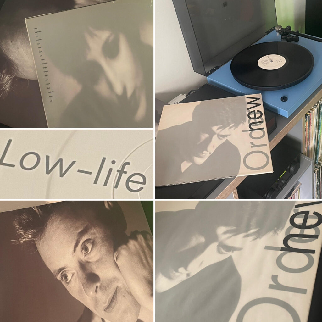
A Retrospective Look at New Order’s “Low-Life” (1985)
In the polarised Great Britain of the mid-Eighties New Order’s “Low-Life” arrived like a sonic manifesto that bridged the chasm between post-punk’s introspection (see Unknown Pleasures) and the hedonistic pulse of the Eighties synth pop ‘pre-Rave’ dance floor. Forty years on, Fact 100 their beautiful and innovative Saville Associates designed third album stands as the moment when the long shadows of Joy Division were replaced by high hopes and their own distinctive path.
From the opening salvo of “Love Vigilantes,” it’s abundantly clear that Bernard Sumner and company had left behind the transitionary austere monochrome of “Movement.” Here was a band finally comfortable in their own skin, marrying melancholy with euphoria in a manner that imitators have never managed to replicate.
The record’s crown jewel remains “The Perfect Kiss,” a glorious collision of Stephen Morris’s metronomic percussion, Hooky’s high-slung bass melodies, and Sumner’s deceptively simple lyrical confessionals. A band now operating at the zenith of their powers, an unforgettable riff, unconventional and essential. I cannot move on without mentioning the epic and lauded ten minute Jonathan Demme close up music video of this single.
“Sub-culture” and “Face Up” showcase Gillian Gilbert’s increasingly vital synth work, while the hauntingly beautiful “Elegia” demonstrates that the band could still conjure the spectral atmospherics of their previous incarnation, aka Closer side 2, when the mood took them.
What’s most striking about “Low-Life” now is how modern it still sounds. While their contemporaries were mired in the production excesses of the mid-Eighties multi-tracking electronic new toys, Factory Records’ finest were crafting a blueprint that would inform alternative dance music for decades to come. There’s a directness and humanity to these tracks that transcends the often clinical, technology-obsessed approach of the era.
Sumner’s vocals, once derided as weak, off-key and amateurish by the more unforgiving critics including the mighty NME now seem perfectly pitched, vulnerable yet determined, the voice of a reluctant frontman who discovered he had plenty to say after all – the aforementioned humanity perhaps.
“Low-Life” captures New Order at the precise moment they became truly indispensable, the exact point where they ceased to be a fascinating curiosity and blossomed into genuine innovators. It’s the sound of a group of working-class northerners reinventing pop music on their own gloriously idiosyncratic terms.
Forty years on, and where has that disappeared? “Low-Life” towers over the landscape of British music like the Haçienda’s rugged concrete pillars once dominated Manchester’s skyline. Essential listening and definitely in my Top 20 albums of all time.