ART POP / POP ART: Jarvis Cocker, Life Study

Art School Confidential: How Life Study Shaped Jarvis Cocker’s Lyrical Lens

In the dimly-lit environs of Sheffield’s musical underbelly, where Northern realism collides with kitchen-sink dramatics and the dole queue stretched as far as the eye can see, Jarvis Cocker emerged as our most unlikely pop star; gangly, bespectacled and armed with a deadly arsenal of observation that would make a CCTV operator blush with inadequacy.

The secret weapon in Cocker’s considerable arsenal? The eventual fine art education that taught him to observe, document and dissect the mundane with surgical precision before transforming it into pop gold.

While lesser mortals merely glanced at their surroundings, young Jarvis perched behind those NHS specs like some kind of sociological bird-watcher was learning to truly see. Central Saint Martins wasn’t just teaching him how to sketch life study; they were training him in the art of unflinching observation that would later define Pulp’s greatest moments.

“The art school experience fundamentally changed how I wrote, You’re taught to notice everything – the way light falls across someone’s face, how people hold themselves when they think nobody’s watching, the telling details that reveal who someone really is.”

Life study teaches you to notice fine details; how people smile or frown, hold themselves, details of dress and undress, it’s this heightened state of awareness that bleeds into every aspect of Pulp’s peak-era output. Those magnificently detailed character studies populated by horny teenagers, bored housewives, and suburban libertines didn’t emerge from thin air, they were sketched from life with the same attention to detail that Cocker once applied to his drawing pad.

The Saint Martins influence manifests most powerfully in Cocker’s ability to render the most microscopic details of class, desire and desperation in photographic clarity. Where other songwriters might paint with broad strokes, Jarvis works with a fine-tipped pen, capturing the exact shade of someone’s disappointment, the precise angle of their social climbing, the specific temperature of their desire.

Consider the gallery of characters populating Pulp’s Nineties breakthrough albums each rendered with such specific detail you can practically smell their aftershave and perfume. From the minutiae of architecture to the psychological implications of furniture choices, nothing escapes Jarvis’s artistic gaze. These aren’t just songs; they’re life studies set to music.

The art school influence extends beyond mere observation into the realm of presentation. Cocker’s stage persona – part awkward lecturer, part deranged librarian, part suburban Casanova – is performance art disguised as pop stardom. Those infamous hand gestures, like some demented semaphore system, transform him into a living sculpture, his lanky frame carving modernist shapes against the backdrop of Britpop excess.

At art school he learned that context is everything and he took that lesson and applied it to pop music. He understood that the stage was simply another gallery space, and he was the exhibit.

This approach elevated Pulp beyond their contemporaries. While Oasis was content to recycle Beatles licks and Manchester swagger, while Blur played artful dress-up with British archetypes, Cocker was creating something more lasting, documentary evidence of a Britain caught between aspiration and reality, dressed in charity shop polyester and food bank desperation.

The irony, of course, is that the very institution that gave Cocker his observational superpowers would later become the subject of his most scathing critiques. The class tourism, the voyeuristic slumming, the commodification of experience, all art school staples that Jarvis would later dissect with forensic precision on the band’s landmark Different Class album.

Three decades on from their commercial peak, what remains most striking about Pulp’s output is its documentary quality those perfectly preserved specimens of British life, pinned under glass like butterflies in a natural history museum. Each character study, each social observation, each domestic drama unfolds with the precision of a well-composed photograph. We see how Ray Davies now had real competition.

Without those formative years spent learning to really look at the world, Jarvis Cocker might have been just another indie also-ran albeit a committed one given the extreme length of time between the first and second Peel Session . Instead, art school gave us pop’s most brilliant observer – a gangly, bespectacled Baudelaire of the British suburbs, sketching studies that capture the extraordinary hidden within the ordinary.

In the end, that may be Cocker’s greatest achievement – teaching a generation of listeners to see what he sees, to notice what he notices, to find poetry in the prosaic. Isn’t that what great art is supposed to do?​​​​​​​​​​​​​​​​ Yeah!

Art Pop / Pop Art: a study of the influences of art school, famous artists and movements on pop and rock music. Those institutions where failure is motivation, where the eccentric and pretentious emerge into the fascinating space where art and music meet.
ART POP / POP ART: Brian Eno & Tom Phillips

Or ‘Two Brain’ Brian Eno’s Art School Daydreaming

In the pantheon of rock’s cerebral mavericks, Brian Peter George Jean-Baptiste de la Salle Eno AKA Brian Eno or just plain Eno stands as our premier egghead-in-residence, the boffin who turned knob-twiddling into an art form, and made the recording studio a canvas rather than a mere tool. While lesser mortals bang away at their instruments with workmanlike dedication, Eno approaches music as just another colour on his palette.

The roots of Eno’s glorious dilettantism lie not in the cramped smoky clubs of London but in the rarefied air of art school conceptualism. Before he became the feather-boa’d synth wizard of Roxy Music, before he produced landmark albums for everyone from Talking Heads to U2, before he invented ambient music while flat on his back after being walloped by a taxi, young Brian was just another paint-splattered art student at Ipswich’s Suffolk College, soaking up ideas that would later transform rock music.

“Art school didn’t teach me how to paint, it taught me how to think about why I might want to paint in the first place.” – Brian Eno.

This intellectual approach, questioning the very foundations of why we make art became the cornerstone of his musical methodology, a perpetual askance glance at rock’s tedious conventions.

At Ipswich, Eno fell under the spell of teacher and mentor Tom Phillips, a walking encyclopedia of avant-garde approaches whose influence on our hero cannot be overstated. Phillips; painter, composer, translator, and all-round Renaissance gadabout introduced the young Eno to the work of John Cage, to the mind-bending possibilities of chance operations and indeterminacy. Phillips’ own masterwork, “A Humument,” in which he transformed a Victorian novel into a series of visual poems by painting over the text, leaving selected words visible, demonstrated how one might create new meaning by obscuring the old, a strategy Eno would later deploy in his oblique collaborations with David Bowie.

“Tom showed me that art wasn’t about technical skill, it was about context, about framing experiences.” This revelation liberated the technically limited Eno, allowing him to approach music as conceptual art rather than a craft to be mastered. When he later joined Roxy Music, he proudly proclaimed his musical illiteracy as a virtue rather than a handicap.

The conceptual art movement that dominated British art schools in the late ’60s provided Eno with his intellectual toolkit. Here was an approach that valued ideas over execution, process over product, and systems over virtuosity, catnip for a mind as restlessly curious as Eno’s. From conceptualism came his fascination with self-generating systems, with setting up musical experiments and then stepping back to see what might happen. His famous Oblique Strategies cards (created with artist Peter Schmidt) with those cryptic injunctions like “Honour thy error as a hidden intention” or “Emphasise differences” are pure conceptual art, placing process above outcome.

While most rock musicians have historically treated their art school past as a brief bohemian holiday before getting down to the serious business of power chords and stadium tours, Eno has remained defiantly committed to the art school perspective. His collaborative approach, turning musicians into components in his sonic experiments derives directly from the workshop methodologies of art school. When he produced Talking Heads’ “Remain in Light,” he was essentially running the band through a series of conceptual exercises, treating David Byrne and company as materials rather than auteurs.

Even Eno’s celebrated ambient works, gossamer soundscapes made for the comedown room, can be traced back to the “expanded cinema” experiments he witnessed as an art student. These multimedia environments, combining film, light shows, and sound, were attempts to create immersive experiences rather than discrete works of art. When Eno later described ambient music as being “as ignorable as it is interesting,” he was channeling the art school notion that art need not demand attention but might instead modify an environment.

What separates Eno from the legions of other art school graduates who’ve strayed into rock’s territory is his ability to translate rarefied conceptual approaches into works that connect emotionally. His productions for U2 may have been informed by systems thinking and process art, but they also made the Irish bombast merchants sound bloody enormous. His solo works might be exercises in cybernetic theory, but they’re also strangely moving, capturing melancholy and wonder in their abstract washes.

In an age when rock has largely abandoned its art school flirtations in favour of earnest authenticity or technical showboating, Eno remains our most eloquent reminder that popular music can be a laboratory for ideas as well as emotions. The art school influence that formed him, that combination of intellectual rigour and playful experimentation continues to inform his work, whether he’s producing pop stars or creating video installations.

As we face another decade of dreary singer-songwriters emoting over acoustic guitars, we need Eno’s art school sensibility more than ever. With Eno, thinking about music can be as revolutionary as playing it.

Brian Eno attended Ipswich Art School, Winchester College of Art 1964-66 & 1966-69.

Art Pop / Pop Art: a study of the influences of art school, famous artists and movements on pop and rock music. Those institutions where failure is motivation, where the eccentric and pretentious emerge into the fascinating space where art and music meet.

ART POP / POP ART: Brit Pop & The YBAs

Or How The ‘Young British Artists’ Shaped Brit Pop’s Visual Punch

In the crestfallen capital of post-Thatcher Britain, a gang of art school chancers were regurgitating ideas from Duchamp, the Sixties pop artists and sculptors and flogging them to Charles Saatchi. Simultaneously a surge of British Indie and alternative sounding guitar bands were getting more airplay on the radio, particularly the BBC under the reformational stewardship of Matthew Bannister who had recruited a number of new DJs to reboot Radio One in an edgier style.

What nobody predicted was how the parallel universes of art and pop would once again collide to create the defining visual grammar of 90s British music.

Dance Moves, Dead Sharks & Unmade Beds

The romance began, as these things often do, in a pub. The Groucho Club, to be precise, where Damien Hirst, not yet the multi-millionaire formaldehyde merchant fell in with Alex James and the Blur contingent. Before long, Hirst was directing their “Country House” video: a technicolor romp through English eccentricity that matched the band’s own savage pastiche of national identity.

But it was Hirst’s work for The Fat of the Land that truly codified the YBA-pop connection. That fluorescent green crab on The Prodigy’s 1997 album wasn’t just a cover it was a declaration of intent. Like Liam Howlett’s sonic assaults, Hirst’s visual sensibility took the familiar and made it menacing. Both operated in the sweet spot between attraction and repulsion. Both understood that England’s green and pleasant land had mutated into something altogether more radioactive.

Flat People Deep Impact

If Hirst brought biological horror to pop’s visual palette, Julian Opie brought clinical detachment. His now-iconic portraits of Blur for their “Best Of” compilation reduced the band to cartoon glyphs a style later ripped off by every advertising agency with a MacBook and a deadline.

“I wanted something that looked like it could be a road sign” – Julian Opie.

What he delivered was the perfect visual metaphor for Britpop itself: simplified, bold, immediately recognizable, yet somehow hollow at its core.

The genius of Opie’s approach wasn’t lost on other acts. When Pulp needed artwork that captured their own arch commentary on British life, they turned to Blue Source and Peter Saville designers who shared the YBA knack for elevating the everyday to art status without sacrificing its essential seediness.

White Cubists

The cross-pollination went beyond album covers. Rachel Whiteread’s concrete casts of negative spaces found their musical equivalent in Radiohead’s OK Computer both capturing the uncanny valley between the familiar and the alienating. Meanwhile, Gavin Turk’s bronze sculptures disguised as trash bags offered a perfect visual companion to Elastica’s brief, brilliant dissection of punk’s corpse.

What united the YBAs and their musical counterparts wasn’t just postcodes or drug dealers. It was attitude, that peculiarly British talent for elevating amateurism to high concept. Both scenes took working-class signifiers, ran them through an art school mangle, and sold them back to the middle classes as an authentic experience.

The Britpop bands, like the YBAs, understood that in post-Empire Britain, nostalgia was the most profitable natural resource. Both mined it ruthlessly while pretending to critique it. Both ended up with Turner Prizes, front covers, and country houses. Both eventually collapsed under the stellar weight of their own contradictions.

Pickled For Posterity

If art is about preservation, then the YBA-Britpop alliance succeeded wildly. While the music industry was still trying to shift plastic discs, artists like Sam Taylor-Wood (who would later direct videos for The Pet Shop Boys) and Tracey Emin (whose neon scrawls would adorn countless indie venues later London train stations) were already thinking about legacy.

The ultimate YBA contribution to British music wasn’t aesthetic but commercial, they taught bands that provocation plus self-mythologising equals longevity. When Albarn and Hirst finally opened their short-lived restaurant Pharmacy in Notting Hill, it wasn’t just a business venture but a perfect symbol: both scenes had transformed from rebellion to institution, from outsider art to investment opportunity.

Two decades on, as YBA works and fetch obscene sums at auction, the true legacy emerges. What seemed like a movement was really just a moment when Britain briefly convinced itself that its cultural decline could be repackaged as ironic ascendancy. The artwork remains, like Hirst’s shark, suspended in time not quite dead, not quite alive, but impossible to ignore.

Art Pop / Pop Art: a study of the influences of art school, famous artists and movements on pop and rock music. Those institutions where failure is motivation, where the eccentric and pretentious emerge into the fascinating space where art and music meet.

ART POP / POP ART: Ray Davies – The Hogarth Of Hornsey

Or How Hornsey Art College Shaped The Kinks’ Visual and Lyrical Identity

In the pantheon of British rock’s great observers, Ray Davies stands alone the sharp-eyed chronicler who transformed the mundane into the magnificent. While lesser songwriters gazed at the stars, Davies kept his feet firmly planted on the pavements of London, his artistic eye capturing the minute details that others missed. This exceptional perspective didn’t materialise from thin air it was cultivated in the crucible of Hornsey College of Art, where the reluctant art student would develop the visual literacy that would later define his career.

Before becoming rock’s preeminent social commentator, young Raymond Douglas Davies spent a brief but formative period at Hornsey in 1962-63, studying commercial art and graphic design. The institution, a celebrated hotbed of creativity and radical thinking would prove more influential than the aspiring musician might have imagined when he reluctantly enrolled at his father’s insistence.

“I was never really a committed art student,” Davies once confessed. “I’d already caught the music bug.” But while his attention may have been divided, the education he received seeped into his consciousness nonetheless. The fundamentals of composition, perspective, and the framing of subjects became second nature and skills that would later manifest in his extraordinarily cinematic approach to songwriting.

A Visual Composer.

Hornsey College was renowned for its innovative approach to design education, emphasizing keen observation and the thoughtful arrangement of visual elements. Under the guidance of tutors steeped in modernist principles, Davies absorbed lessons about colour theory, spatial relationships, and the power of juxtaposition, concepts that would later find expression in both The Kinks’ album artwork and his meticulously constructed narratives.

The Kinks’ visual identity evolved dramatically throughout the 1960s, mirroring Davies’ growing confidence as a conceptual thinker. From the straightforward pop group portraits of their early years to the increasingly sophisticated designs that accompanied albums like “The Kinks Are The Village Green Preservation Society” and “Arthur,” one can trace the development of a distinct visual language that complemented the band’s musical evolution.

“Face to Face” (1966) marked a crucial turning point, featuring cover art that reflected the album’s themes of perception and appearance. The band members’ faces, fragmented and reassembled in a modernist collage, visually echoed Davies’ growing preoccupation with identity and social masks, concepts that would have been extensively discussed in any respectable art school of the period.

By the time of “Village Green” in 1968, the integration of visual and musical concepts had become seamless. The pastoral imagery and nostalgic typography perfectly complemented Davies’ elegiac ruminations on a vanishing England. The composition showcased principles of balance and harmony that harked back directly to foundational design theories taught at institutions like Hornsey.

The Artful Detail

But it’s in Davies’ lyrical approach where the influence of his art education truly shines. At Hornsey, students were taught to observe meticulously, to notice what others overlooked. This training fostered in Davies an almost painterly attention to detail that would become his songwriting signature.

His lyrics function as verbal snapshots, vignettes populated by precisely observed characters and settings. When Davies describes a “little tin soldier with his little tin car” or a “misty morning” on the village green, he’s employing the visual precision of an artist selecting exactly which elements to include in a composition. The economy of detail, the careful selection of the telling particular these are hallmarks of both good design and great songwriting.

Davies’ characters are rendered with the careful attention of a portraitist, from the “dedicated follower of fashion” to the “well-respected man about town,” each is brought to life through carefully chosen visual details and environmental context. It’s the songwriter as street photographer, capturing fleeting moments with unerring precision.

His ability to evoke entire social worlds through carefully selected imagery owes much to the art student’s training in visual shorthand, in communicating maximum meaning through minimal elements. When creating album concepts like “Arthur” or “Lola Versus Powerman,” Davies approached them with the structured thinking of a graphic designer, considering how individual songs functioned within the larger conceptual framework.

Hornsey College in the early 1960s was a crucible for ideas about Britain’s rapidly changing social landscape. Students debated modernism, pop art, and the emerging consumer culture, themes that would later dominate Davies’ songwriting. The art school environment encouraged questioning of established values and critical observation of society essentially training Davies in the analytical perspective that would later make him rock’s most astute social commentator.

While fellow art school graduates like Pete Townshend channeled their training into explosive stage theatrics and conceptual grandiosity, Davies took a different approach. His was the art of miniaturism crafting perfect small-scale observations that, when assembled, revealed profound truths about post-war British society.

What Hornsey gave Davies was not just technical training but a way of seeing a framework for processing and interpreting the world around him. The college’s emphasis on both traditional skills and radical thinking produced in Davies a unique combination of nostalgic sensibility and critical perspective that would define his artistic voice.

Though his formal art education was brief, its impact resonated throughout his career. Even decades later, on albums like “Low Budget” and “Give the People What They Want,” Davies’ lyrical eye remained as sharp as ever, his compositions as meticulously balanced as any well-designed graphic.

In the end, perhaps Davies never truly abandoned his art school training at all. He simply transferred his visual literacy to another medium, becoming not just a songwriter but a documentarian, the Hogarth of his age, capturing the shifting landscape of post-war Britain with the precision of an artist and the soul of a poet. The reluctant art student from Hornsey College became rock’s master painter of everyday life, transforming the commonplace into the extraordinary through the power of observation and detail.

As Davies himself once put it: “I’ve never stopped seeing the world as a series of pictures.” And for that, we have his brief but pivotal time at Hornsey College of Art to thank the foundation upon which rock’s greatest observer built his enduring legacy.

Ray Davies attended Hornsey College of Art 1962-63.

—-

Art Pop / Pop Art: a study of the influences of art school, famous artists and movements on pop and rock music. Those institutions where failure is motivation, where the eccentric and pretentious emerge into the fascinating space where art and music meet.

ART POP / POP ART: Jerry Dammers’ Multi-Cultural Vision

Or Rude Boy Revolution: Jerry Dammers Two Tone Vision.

In the drab concrete wasteland of late-70s Coventry, while the rest of Britain was busy ripping its clothes and safety-pinning them back together again, a bespectacled keyboard player with a vision was plotting a different kind of revolution. One that would eventually come dressed in sharp suits, pork pie hats and checkerboard patterns.

Jerry Dammers the dentally challenged architect of Two Tone Records, founder of The Specials, and perhaps the most criminally underappreciated musical visionary of his generation didn’t stumble upon his aesthetic by accident. The roots of Two Tone’s striking visual identity and multicultural musical fusion can be traced directly to Room 057 of Lanchester Polytechnic’s art department, where young Dammers spent his days absorbing influences that would later explode into a cultural phenomenon.

The Art School Radical

Lanchester Poly (now Coventry University) in the mid-70s was hardly Central Saint Martins, but what it lacked in glamour it made up for in gritty authenticity. While Malcolm McLaren and Jamie Reid were cooking up the Sex Pistols’ confrontational visuals in London, Dammers was in Coventry, quietly developing his own radical visual language.

“Art school was where I learned about Constructivism and Bauhaus,” Dammers once explained in a rare interview. “That black and white check pattern came directly from studying those movements, simple, bold, impossible to ignore.”

The checkerboard motif that became Two Tone’s signature wasn’t just visually striking, it was loaded with meaning. Black and white squares existing side by side, neither dominating the other. In Thatcher’s Britain, with racial tensions simmering and the National Front on the march, Dammers’ art school education gave him the tools to create a powerful visual metaphor for racial unity.

His tutors recall a serious, somewhat detached student whose sketchbooks were filled with record sleeve concepts years before he had a record label to release them on. While other students were making self-indulgent installations, Dammers was obsessively designing logos, posters, and manifestos for a cultural movement that existed only in his imagination.

The Coventry Sound System

If art school provided the visual framework, Coventry’s streets supplied the soundtrack. The city’s substantial Jamaican community had brought with them a rich musical heritage that fascinated Dammers. He spent countless nights in West Indian blues clubs, absorbing the hypnotic rhythms of ska and rocksteady, watching how the music created community in the dingy basements of a city best known for being bombed to smithereens in WWII.

“The thing about those Jamaican sounds,” recalls Neville Staple, who would later join Dammers in The Specials, “was that they were already fusion music. Ska itself came from Jamaicans late-night listening to American R&B on crackling radio stations and reinterpreting it through their own cultural lens.”

This was the critical insight that Dammers took from those nights, that musical cross-pollination wasn’t appropriation but conversation. The idea that white punks and black skinheads could find common ground on the dance floor became the foundation of the Two Tone philosophy. A near identical philosophy being formed by Joe Strummer, the white man In Hammersmith Palais.

The Poly Basement Tapes

Lanchester Poly’s dingy rehearsal rooms became the laboratory where Dammers conducted his grand experiment. The Automatics (later renamed The Specials) began as a ragtag collective of art students and local musicians, with Dammers as the unsmiling conductor, pushing his bandmates to fuse punk’s energy with ska’s rhythmic sophistication.

It wasn’t always harmonious. Punk purists thought the ska elements were gimmicky; traditionalists found the punk influence sacrilegious. But Dammers, with the single-minded determination of the true art school obsessive, drove the band forward through sheer force of will.

“Jerry would bring these complicated charts to rehearsal,” remembers original Specials guitarist Lynval Golding. “Most of us couldn’t read music that well, but he had this complete vision in his head. Sometimes we’d spend hours on just two bars of a song until it had exactly the tension he was looking for.”

That tension between disciplines, between cultures, between chaos and control became the defining characteristic of The Specials’ sound. It was the musical equivalent of a Bauhaus design: stripped down to its essential elements, each serving a specific purpose, no ornamentation for its own sake.

The Birth Of Two Tone

When Dammers finally launched Two Tone Records in 1979, it emerged fully formed, with an aesthetic coherence that betrayed its art school origins. Everything from the label’s logo to the bands’ uniforms to the stark black and white promotional photos spoke of a unified vision that was simultaneously retro and futuristic.

The label’s first release, “Gangsters” by The Specials, was pressed with an initial run of just 5,000 copies. Dammers personally designed the sleeve, a stark black and white affair featuring Walt Jabsco, the label’s rude boy mascot adapted from a photograph of Peter Tosh. It sold out immediately, and the Two Tone revolution was underway.

What followed was a brief but incandescent moment in British music history. The Selecter, Madness, The Beat, and others joined the Two Tone stable, each putting their own spin on the fusion sound Dammers had pioneered. For a glorious 18 months, these bands dominated the music charts, bringing their message of racial unity to Top of the Pops while the country burned with riot and discontent.

The sad irony is that Dammers’ art school training, which gave him the tools to create Two Tone’s unified aesthetic, also contained the seeds of the movement’s demise. Like so many art school idealists before him, from Brian Eno to Pete Townshend, Dammers couldn’t stop evolving while the movement he’d created crystalized around him.

By the time of The Specials’ masterpiece “Ghost Town” a harrowing sonic portrait of urban decay that hit number one during the 1981 riots Dammers was already restless, pushing toward more experimental sounds that left both bandmates and audience bewildered.

When The Specials inevitably fractured, Dammers formed the jazz-influenced Special AKA, creating the anti-apartheid anthem “Free Nelson Mandela.” It was another masterpiece of political pop, but by then the Two Tone moment had passed. The art student had moved on to new experiments while his classmates were still copying his previous breakthrough.

Legacy

Today, Lanchester Polytechnic is long gone, absorbed into Coventry University. The concrete brutalism of 1970s Coventry has been softened by redevelopment. And Jerry Dammers has become something of a recluse, occasionally emerging for DJ sets of obscure jazz and world music.

But the impact of that collision; between art school theory and street-level reality, between black and white musical traditions, between design and visceral energy continues to reverberate. From the multicultural dance collectives of the 90s to the post-genre experiments of today’s London scene, Dammers’ Two Tone vision has proven remarkably prescient.

Perhaps the most telling testament to Dammers’ achievement is that the checkerboard pattern he adapted from his art school studies has transcended its origins to become a universal signifier of ska music across the globe. From Tokyo to Mexico City, bands still don pork pie hats and two-tone suits to pay homage to the vision of a serious young art student from Coventry who dared to imagine that black and white could create something more powerful together than apart.

In an age of algorithmic playlists and frictionless fusion, it’s worth remembering that Two Tone wasn’t just about mixing musical styles. It was a complete artistic statement; visual, musical, political and crafted with the disciplined vision of a true art school radical. And somewhere in a dusty archive at Coventry University, there may still exist the student sketches where Jerry Dammers first dreamed it all up, years before the first needle dropped on “Gangsters” and changed British music forever.

“The thing about Jerry, is that he was never just a musician. He was always creating this whole world with its own rules and values. That’s what you got from him being an art student he saw the big picture while the rest of us were just trying to get a gig on Saturday night.” Neville Staples.

In that sense, Two Tone was perhaps one of the greatest art school movements in British pop, marginally less famous than the one that gave us the Sex Pistols, but in many ways more enduring. After all, McLaren, Lydon and Pistols told us there was “No Future.” Dammers and his Two Tone multi-cultural vision insisted there could be if only we were brave enough to imagine it together.

Jerry Dammers attended Lanchester Polytechnic, Coventry, 1972-1975

Art Pop / Pop Art: a study of the influences of art school, famous artists and movements on pop and rock music. Those institutions where failure is motivation, where the eccentric and pretentious emerge into the fascinating space where art and music meet.

ART POP / POP ART: John Lennon & Yoko Ono

Or Lennon’s Other Revolution: How Yoko Changed Everything.

When John Lennon first encountered Yoko Ono at London’s Indica Gallery in November 1966, he was still the cheeky, acerbic Beatle, trapped in a suburban existence that was slowly suffocating his rebellious spirit. What happened next fundamentally altered not just Lennon’s musical trajectory but his entire philosophical outlook on life, art, and politics, a transformation that continues to reverberate through popular culture decades later.

Ono wasn’t just Lennon’s lover and eventual wife; she was his artistic conscience, political awakening, and spiritual guide. The sneering British music press – and the majority of Beatles fans – initially dismissed her as the dragon lady who broke up the Fab Four. How simplistic that view seems now. In fact I’ve heard people say since that Yoko didn’t ruin John’s career, he ruined hers.

Lennon, before Yoko, was drifting. The moptop façade had worn paper-thin. The man who’d once proclaimed the Beatles “more popular than Jesus” was living in a psychological prison of his own making in Weybridge, searching for meaning beyond the endless machinery of Beatlemania.

Enter Ono, already an established avant-garde artist, with her conceptual installations and performance pieces that challenged conventional thinking. She didn’t need Lennon’s fame; she had her own artistic vision that predated their meeting. Her work, exploring themes of audience participation, peace activism, and feminist perspectives, provided Lennon with an intellectual framework his previous life had lacked.

The influence was immediate and profound. Listen to “Revolution 9” on the White Album, a sound collage that bears Ono’s experimental fingerprints. Compare early Beatles tracks with the raw emotional honesty of “Cold Turkey” or “Mother.” This wasn’t simply a stylistic shift; it was Lennon finding his authentic voice under Ono’s guidance.

Their collaborative albums, particularly “Unfinished Music No. 1: Two Virgins” and “Wedding Album” shocked audiences expecting conventional pop. Critics howled, but that was precisely the point. Lennon was shedding his moptop skin, and Ono was providing the knife.

Most significantly, Ono awakened Lennon’s political consciousness. Their bed-ins for peace, billboard campaigns, and outspoken opposition to the Vietnam War weren’t mere publicity stunts, they reflected Ono’s longstanding artistic engagement with peace activism, now amplified through Lennon’s platform.

While much attention focuses on how Ono changed Lennon, less discussed is how their collaboration transformed her work. Her avant-garde sensibilities found new expression through pop music’s accessibility, creating a unique fusion that neither could have achieved alone.

Were there missteps? Certainly. The self-indulgence occasionally bordered on narcissism. But their partnership produced something genuinely revolutionary: art that refused to separate the personal from the political, that insisted music could change consciousness.

Decades later, the easy narrative that Ono was some kind of manipulative force still persists in some quarters. The reality was far more complex and interesting, a genuine artistic partnership that pushed both participants toward their most challenging work.

In Lennon’s final interviews, he repeatedly credited Ono with his intellectual and spiritual rebirth. The evidence is in the music from the primal therapy-influenced screams of “Well Well Well” to the tender vulnerability of “Love.” Lennon with The Beatles gave us brilliant pop. Lennon with Ono gave us something harder to categorize but sophisticated and ultimately more human.

Perhaps that’s Ono’s most profound influence she helped transform Lennon from a rock star into an artist in the fullest sense of the term.​​​​​​​​​​​​​​​​

John Lennon studied at Liverpool College of Art 1957-60
Yoko Ono studied art, film making and experimental at Gakushuin University (Tokyo) and Sarah Lawrence College (New York) and a course taught by John Cage at New School For Social Research.

Art Pop / Pop Art: a study of the influences of art school, famous artists and movements on pop and rock music. Those institutions where failure is motivation, where the eccentric and pretentious emerge into the fascinating space where art and music meet.

TESTIMONIAL: Rick Buckler, The Jam.

Is there a better three album run than The Jam’s All Mod Cons, Setting Sons & Sound Affects? Then there’s the singles. A canon of seven inch vinyl to match The Beatles & The ‘Stones. In fact no band released a better collection of B-Sides before or since. The Butterfly Collector is regarded by many as the greatest of all time. Pow

For a few years ‘The best f***ing band in the world’ John Weller’s infamous live introduction, were indeed that. Bang

Honed by constant live gigging at the hottest venues in ‘town, The Jam emerged as ‘straight-tied-Jam-shoed’ Punk Mod Power Pop style icons in 1977 on the crest of the Punk & New Wave Revolution. Danny Baker said it best, there would be no better fledgling Punk & New Wave era film than through the eyes of The Jam. A sonic A-Bomb In Wardour Street their looks, politics and energy made them Immediate darlings of the NME with an easy transition to cathode ray tube and a virtual 1978-82 BBC Top Of The Pops residency. The tightest of three pieces, where there is nowhere to hide.. Wham

Near the end they headlined the first episode of The Tube playing “Ghosts”, “In The Crowd”, “A Town Called Malice”, “This Is The Modern World”, “Move On Up”, “The Great Depression”, “Beat Surrender”, “Precious” a diverse and virtuoso 8 Track performance. Direction

Weller’s rug pull in 1982 meant a beat generation kept a candle alight for a reunion. But we all know the redux is never quite as good as the original. So those memories were never corrupted. Reaction

On the passing of the band’s drummer Rick Buckler, a brief testimonial of one of the most vital bands who have accompanied my life and millions of others having emerged for any child of the Sixties at such an influential teen-age. Creation

Brighton Rocked. RIP Rick.

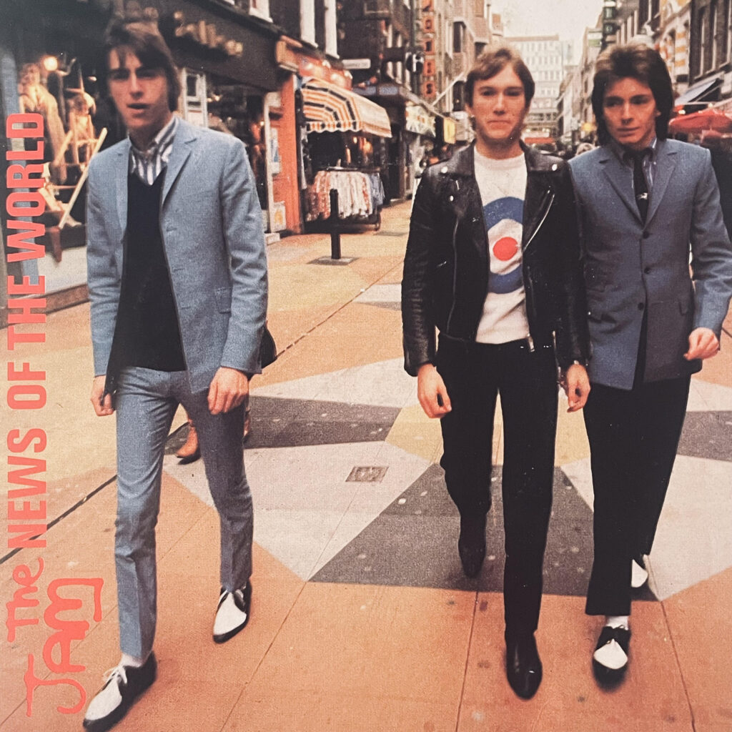
The Jam 1978

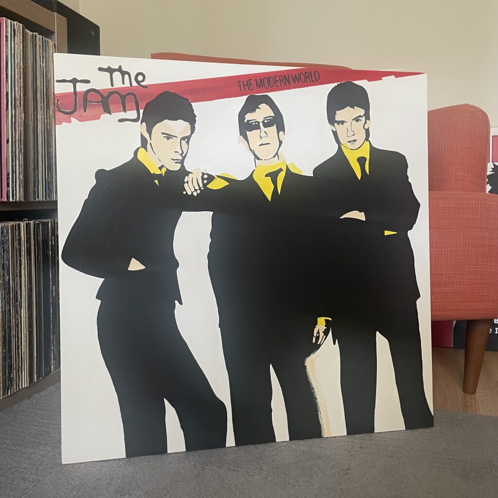
POP ART: The Jam – The Modern World

Another from my series of iconic Seventies & Eighties Punk Rock and New Wave record sleeves reimagined as standout Pop Art to show in an installation or hang in your space.

The Jam – The Modern World (1977)

600mm acrylic painting on MDF with pine former.

The Jam This Is The Modern World Pop Art

Despite reaching just number 36 on the UK Singles Chart, “The Modern World” is a cult classic that exemplifies The Jam’s ability to blend punk energy with mod sensibilities.

The Jam’s 1977 single “The Modern World” is a raw and energetic Paul Weller Modernist anthem that captures the spirit of new wave and the burgeoning punk scene. Released as the lead single from their second album of the same name, the track showcases Weller’s sharp songwriting and the band’s tight musicianship. The song’s defiant lyrics, including the memorable line “I don’t give two f***s about your review” (later sanitised for radio), perfectly encapsulate the rebellious attitude of youth culture in late 1970s Britain. As kids we turned our school ties back to front and wore their signature Mod ‘Jam Shoes’.

The single’s picture sleeve is a prime example of punk-inspired Pop Art design. Drawing inspiration from the Pop Art movement of the 1950s and 1960s, the sleeve features bold figures, collage elements, and imagery typical of the genre. This style, which embraced popular culture and mass media imagery, was perfectly suited to The Jam’s modern aesthetic and their critique of contemporary society.

The artwork for The Jam’s releases was typically created by Bill Smith, Polydor’s Art Director at the time. Smith was responsible for designing five of The Jam’s album covers and sixteen of their single sleeves, including the iconic spray-paint logo that became synonymous with the band. The sleeve image presented in a visually striking and provocative style consistent with the punk ethos of the time.

My large scale 600mm painted artwork emphasises the mass market printing techniques which show inaccurate origination where the face and yellow colours are printed – or was that the designer’s nod to Pop Art?

Stay tuned for my exhibition details scheduled for this Autumn and exclusive behind-the-scenes insights into my creative process. 

You can join me as we celebrate the collision of music, art, and culture in the most electrifying way possible.

Vive Le Punk Rock – Vive Le Pop Art!