ART POP / POP ART: The Art Student Who Became Queen

Before the stadiums, Freddie Mercury was Farrokh Bulsara, a graphic design student in west London. He enrolled at Ealing Art College in 1966 and left in 1969 with a diploma in graphic art and design. He had studied art at Isleworth Polytechnic first, so by the time he reached Ealing he had a trained hand and a habit of drawing everything.

Ealing was a good place to be at that moment. Pete Townshend and Ronnie Wood had passed through. Gustav Metzger, the pioneer of auto-destructive art, had lectured there, and Townshend later credited that influence on the way he smashed guitars. The college treated pop culture as a serious subject for study. A student could draw a record sleeve in the morning and argue about the avant-garde at lunch without anyone seeing a contradiction.

That is the idea at the centre of this book, and Mercury is one of its clearest examples. He did not leave art for music. He took the training with him and applied it to a rock band. The logos, sleeves, costumes and stage sets were the work of a designer, and the singing was the part everyone noticed.

His Ealing friend Tim Staffell sang in Smile, the band that Brian May and Roger Taylor played in. When Staffell left, Mercury took his place and the group became Queen. Around that time he and Taylor shared a stall in Kensington Market, selling second-hand clothes and Mercury’s drawings. The art and the band started from the same bench.

A Victorian in the Tate

Mercury’s taste in art was not what you would expect from a young man in a 1970s rock group. He did not collect pop art or hang psychedelic posters. He admired Victorian painting, and one picture in particular: Richard Dadd’s The Fairy Feller’s Master-Stroke.

Dadd was a gifted Royal Academy student, praised young for his fairy subjects. In 1843, during a psychotic episode, he killed his father. He spent the rest of his life in institutions, first Bethlem and later Broadmoor. He painted The Fairy Feller’s Master-Stroke in Bethlem between 1855 and 1864. George Henry Haydon, the hospital’s steward, commissioned it. Dadd worked on it for nine years and still treated it as unfinished. Siegfried Sassoon gave it to the Tate, where it has hung since 1963.

The canvas is small, about 54 by 39 centimetres, and crammed with figures. A woodcutter fairy stands with his axe raised, about to split a hazelnut that will become a new carriage for Queen Mab. Around him a crowd waits in the grass: a magician, a patriarch in a triple crown, a politician, a dandy, a pedagogue, fairies, elves and creatures that fit no category. Everything is rendered in tiny, patient strokes, close to the way an engraver works. Nobody moves. The moment before the blow is held for ever.

Dadd also wrote a long poem to explain the picture, naming each figure and its role. Mercury read it. His song “The Fairy Feller’s Master-Stroke”, on Queen II (1974), borrows its cast directly from Dadd’s list. He told the BBC he had done a good deal of research, and that is believable. He studied the painting the way a designer studies a brief.

Accounts agree that he returned to it often. He took bandmates to see it, and Taylor and the producer Roy Thomas Baker are named among them. The painting seemed to show him what Queen II could be: dense, theatrical and ornate, with a darkness underneath the decoration.

Why Dadd matters to Pop Art

On the surface, a Bethlem inmate’s fairy picture and a Marshall stack have little in common. Look closer and the links appear.

  • Crowding. Dadd leaves no empty space. Queen’s arrangements, with their stacked vocal harmonies, behave the same way.
  • Theatre. The painting is a stage set with a cast. Mercury treated every Queen performance as a staged tableau.
  • Fantasy as freedom. The Victorians used fairies to say things they could not say directly. Mercury used the same device, and the song plays on the word “stroke” and on a word that sounds a lot like “queer”.
  • Craft. Dadd’s patience is the opposite of the sloppy rock gesture. Mercury had the same respect for finish.

Pop Art borrowed from advertising and comics. Mercury borrowed from the Victorian fairy painting and heraldry, and he made them pop.

The Crest

The clearest evidence of his training is the Queen crest, which he designed himself. It works as a logo, but it is built on the rules of heraldry.

Each band member is placed by birth sign. Two lions stand for Leo, which covers John Deacon and Roger Taylor. A crab stands for Cancer, which is Brian May. Two fairies stand for Virgo, which is Mercury. They surround a large letter Q, and a phoenix crowns the whole thing. The fairies are worth noticing. Mercury put them on the band’s coat of arms, and they are a small echo of Dadd.

The crest was first seen on the back of the debut album in 1973. It became the band’s face on the next two big releases.

A Night at the Opera (1975)

The album came out in November 1975, with art direction credited to David Costa. The cover shows the crest in soft colour, mostly cream with touches of blue, yellow, pink and green, centred on a plain white ground. The early UK sleeve was embossed, so the crest stood up from the card. The script is Filmotype York.

The effect is a bookplate, or the monogram on an old opera programme. It was a bold choice in the year of “Bohemian Rhapsody”. Most rock sleeves of the time shouted. This one stood still and let the crest do the work, in the same way Dadd’s figures wait in the grass.

The white background matters. It reads as a stage before the curtain goes up, and the title, borrowed from a Marx Brothers film, supplies the joke that keeps the pomp from turning stiff.

A Day at the Races (1976)

The follow-up, released in December 1976, takes the same crest and turns the background black. Queen borrowed another Marx Brothers title and kept the visual rule of one emblem, one colour field and no photograph.

That consistency is the design lesson. The pair of sleeves works as a system: the same mark under a different light, white for the opera and black for the races. Brian May later said he saw the two albums as parallel, and the sleeves make that point before the music starts. This is what a brand identity looks like when a trained designer runs it.

Conclusion

It is easy to describe Mercury as a showman who happened to draw. The evidence points the other way. He was a designer first, and he built the persona, the stage and the sleeves as parts of one project. Ealing gave him the discipline. Dadd gave him a model for obsessive, ornate fantasy. The crest gave him a symbol that could sit on a sleeve, a banner or a T-shirt without losing its meaning.

For a book about art and pop, the lesson is simple. The boundary between the gallery and the charts was never as firm as critics claimed, and Mercury walked straight across it.

Farrokh Bulsara (Freddie Mercury) – Ealing Art College 1966-1969

—

Art Pop / Pop Art: a study of the influences of art school, famous artists and movements on pop and rock music. Those institutions where failure is motivation, where the eccentric and pretentious emerge into the fascinating space where art and music meet.
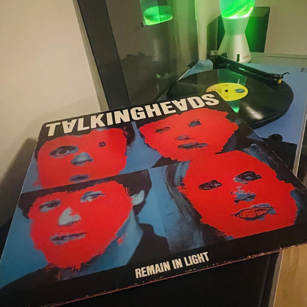
RETROSPECTIVE: Talking Heads – Remain In Light 1980

Some records arrive like a whisper and fade, others crash in like an avalanche and leave you stumbling in their wake. Remain in Light is one of the latter, a slab of paranoia, rhythm, and obsession that still sounds as unmoored and visionary in 2025 as it did in 1980. Forty-five years on, the album hums with the intensity of four New Yorkers trying to rethink the world, their identities, and what a pop record could do. It is both human and alien, cerebral and primal, art-school gone feral. Listening now, you realise Talking Heads did not so much make an album as invent a language for disorientation.

Part One: The Sleeve

Pick up the sleeve and your first impression is confusion masquerading as design. Four faces, distorted and layered, hover in red, black, and white, a simulacrum of identity rendered through early MIT image-processing technology. The work of Tibor Kalman and M&Co, it feels both robotic and living. Your eyes register familiar features, only to be immediately unmoored. Tina Weymouth’s fascination with African masks, refracted through digital manipulation, turns the human face into a machine’s suggestion. It is uncanny, a whisper of the postmodern anxiety that would haunt the next four decades of visual culture.

Every detail matters. The typography is sharp and arresting, suggesting urgency without screaming. Fighter-bomber Avenger silhouettes and ghostly abstractions hover in the margins, hinting at violence, both literal and psychic. The design does not complement the music so much as anticipate it, a visual prelude to the interlocking chaos within. In 1980, it was a statement that identity was mutable, mediated, and constantly under negotiation. Today, that’s the norm.

Kalman’s brilliance was in making technological imperfection a part of the aesthetic. The faces are corrupted, glitched, degraded – human error filtered through a machine. This is not a record cover; it is a manifesto. By the time you slide the vinyl from its jacket, you are already prepared for disorientation. What follows is not just music, it is an ecosystem, a carefully constructed labyrinth designed to engage both body and mind.

Part Two: The Music & Legacy

Recording began at Compass Point Studios in Nassau, a sun-soaked bunker that would become a crucible for genius and frustration alike. The band was joined by Brian Eno, the unofficial fifth Head, whose influence was less about notes than architecture. He arrived with a philosophy: treat the studio as an instrument, treat chaos as composition, and do not flinch at failure. The sessions were famously intense. The band worked long, bewildering hours, layering loops, polyrhythms, and improvisations until something miraculous emerged from the mess.

The foundation was African-inspired polyrhythms, specifically the hypnotic grooves of Fela Kuti. This was not mere imitation; it was a translation of complex rhythmic systems into a New York art-rock vocabulary. Each instrument moves independently, a conversation of contradictions. Drums and percussion interlock but never collide, basslines snake around vocal hooks, and guitars oscillate between melody and texture. Adrian Belew’s guitar is both nervous and ecstatic, Jon Hassell’s trumpet drifts like a mirage, and Eno’s synthesizer textures shimmer in the spaces between. The record is dense yet breathable, controlled yet chaotic, deliberate yet accidental.

Byrne’s vocals are equally layered, a collage of obsessions and idiosyncrasies. He borrows from hip-hop cadences, ritualistic chant, and fragmented narrative, creating a delivery that is more incantation than song. The lyrics often circle existential dread with playful detachment. In “Born Under Punches”, Byrne’s voice is manic and fractured, a protagonist grappling with information overload and identity crisis. “Crosseyed and Painless” is a sermon on anxiety, paranoia, and social collapse, delivered with sharp wit and relentless rhythm.

The album’s architecture is deliberate. The first side, buoyed by kinetic energy, draws you into the labyrinth. “The Great Curve” is an ecstatic frenzy, the band locked in an ecstatic groove that simultaneously propels and destabilises. By the time “Once in a Lifetime” arrives, you are primed for reflection. The song balances existential inquiry with dance floor immediacy, Byrne pondering selfhood and entropy against a backdrop of hypnotic repetition. It is both absurd and devastatingly human.

Side two darkens the palette. “Houses in Motion” jitters with post-industrial dread, a cityscape of anxiety rendered in sound. “Seen and Not Seen” drifts toward abstraction, its protagonist dissolving into observation, a meditation on presence, absence, and perception. “Listening Wind” introduces political undercurrents, a commentary on global turbulence and American complacency filtered through dense polyrhythms and hypnotic motifs. The album closes with “The Overload”, a spectral transmission that hints at collapse and transcendence simultaneously.

The genius of Remain in Light lies in its simultaneity. It is both academic and visceral, cerebral and bodily. It occupies a transitional space where intellect and instinct cohabit uneasily but beautifully. The recording process itself becomes audible: the tape loops, studio experimentation, and improvisational layering are part of the listening experience. You hear the struggle, the trial and error, the moments of panic and revelation. This is music as architecture, as experiment, as living organism.

Culturally, the album is a negotiation of influence. The band’s engagement with African rhythms is complex, filtered through Western ears and art-school sensibility. It raises questions about appropriation, translation, and homage, but the resulting work is undeniably original. It is a fusion of ideas and sounds that challenges the listener to reconsider boundaries, genres, and expectations. The record is not just a reflection of its time, it is a critique of it, questioning identity, technology, and the very notion of pop music as a commodity.

The legacy of Remain in Light is vast. Upon release, it charted modestly, yet critics recognised its audacity. The album influenced generations of musicians, from the electronic experiments of the eighties to the worldbeat experiments of later decades. It bridged punk’s urgency with funk’s elasticity, art-school conceptualism with dancefloor immediacy. Touring the album proved difficult; the complexity and intensity of the arrangements tested the band to their limits. Yet the recordings themselves endure, a testament to ambition, collaboration, and the willingness to confront chaos head-on.

Listening today, the album resonates with a prescience that is uncanny. Byrne’s exploration of selfhood, Eno’s textural interventions, the band’s rhythmic sophistication all speak to an era increasingly dominated by technology and mediated experience. Forty-five years on, the music still feels urgent, still unsettles and energises in equal measure. It is a record that rewards repeated engagement, revealing new facets with each listen. The textures, the contradictions, the obsessive layering, all retain their power to unsettle and illuminate.

In retrospect, Remain in Light is not just an album. It is a blueprint for artistic ambition, a testament to the potential of collaboration and the thrill of experimentation. It embodies the tension between accessibility and difficulty, dance and reflection, humour and despair. Its enduring influence is evident not only in the artists who followed but in the ways it continues to challenge contemporary listeners. The record is a meditation on identity, perception, and creativity itself, an exploration that remains vital and uncontainable.

Four decades on, the album hums with life, refusing to settle into nostalgia or canonisation. It is human, machine, ritual, and meditation all at once. The visual and sonic languages it employs remain radical; the ideas embedded in its grooves still resonate. Talking Heads, at their apex, were not content with simple pop. They sought transformation, and in Remain in Light they achieved it. 

Listening now, the record still demands attention. It insists on engagement, on immersion. The faces on the sleeve, the fractured rhythms, the cascading vocals – all converge to create an experience that is simultaneously exhilarating and disorienting. It is, as ever, a record that challenges, delights, and confounds.

Remain in Light remains a masterpiece because it continues to operate on multiple planes. It is art, it is music, it is philosophy, and it is ritual. It occupies a space that few albums dare to enter, and fewer still manage to navigate successfully. Forty-five years later, it retains its power, its strangeness, and its brilliance. Talking Heads created not just an album but a living organism, one that still breathes, pulses, and disrupts.

For those willing to engage fully, it remains an astonishing journey, a record that refuses to be tamed, a testament to what happens when intelligence, curiosity, and obsession collide. Remain in Light is not simply listened to. It is experienced, interrogated, and felt. It is, in every sense, timeless.