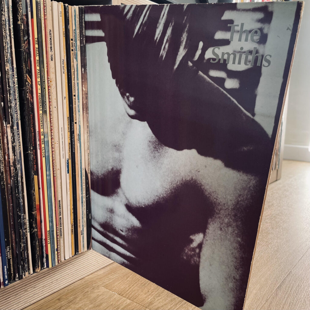
Forged in a Stretford attic, dismissed by its own singer and dogged by controversy, The Smiths’ debut still changed British music forever. Forty years on, its northern jangle, bitter poetry and doomed legacy sound sharper than ever.
The Smiths – The Smiths (Rough Trade, 1984):
Cast your mind back to February 1984 and the brittle landscape of British pop. The charts are drenched in synthesisers and covered with eyeliner, samples and sequencers are elbowing guitars into the wings. Then, out of the drizzle, four skinny lads of Irish descent from Manchester lurch onto the scene; one clutching gladioli, another his Rickenbacker like a bayonet. They call themselves The Smiths, the most ordinary name imaginable. In that choice alone lies the revolution.
The partnership had begun two years earlier with Johnny Marr knocking on Steven Patrick Morrissey’s door in Stretford a moment Morrissey would later recount in Autobiography with cinematic precision: the “handsome stranger in drainpipe jeans” standing on the doorstep, “smiling with the certainty of someone who knew what was next.” In Marr, he found his melodic twin; in Morrissey, Marr found someone who could give his guitar lines a wounded voice.
They began in Marr’s attic, crafting early songs like “The Hand That Rocks the Cradle” and “Suffer Little Children.” Morrissey later wrote of those first sessions as “a new pulse in the dull heart of the city,” though he would remain forever unsatisfied with how their debut finally sounded.
The road to that debut LP was fraught. Morrissey recalled how Rough Trade, “a label without the cash or the courage to lead,” seemed both ally and obstacle. The Troy Tate produced sessions at Elephant Studios collapsed under the heat, guitars going out of tune, tempers fraying. John Porter re-recorded the lot. Morrissey, ever the perfectionist, declared the results “not good enough,” but at a cost of £6,000 Rough Trade said it would have to do.
So The Smiths* emerged: flawed, magnificent, defiantly northern.
It opens with “Reel Around the Fountain” a slow, aching waltz of shame and seduction. Marr’s guitar drips like rain from the rooftops, Rourke’s bass curls around it, and Morrissey sighs, “It’s time the tale were told…” From the first line, it’s less an album and more a confession.
Then comes “You’ve Got Everything Now”, sharp and bitter, a howl from the uninvited. “Miserable Lie” follows, schizophrenic and breathless – part lullaby, part nervous breakdown. And then “Pretty Girls Make Graves”, all glittering guitars and doomed romance, Morrissey cutting through the post-punk fog with a sneer and a sigh.
Side two delivers the anthems that defined the band. “Still Ill”, with its tremulous jangle and weary poetry, reads like Morrissey’s entire philosophy in three minutes “Does the body rule the mind or the mind rule the body? I dunno…” Then “Hand in Glove”, the debut single that started it all, a clattering burst of urgency with the immortal claim that “the sun shines out of our behinds.” It was ludicrous, brazen, brilliant – the ultimate outsider song.
“What Difference Does It Make?” gave them their first true hit, a bruised pop song with its teeth showing, while “I Don’t Owe You Anything” slows the pulse, Paul Carrack’s organ sighing under Morrissey’s rejected torch-song croon. And closing the record, the infamous “Suffer Little Children” the Moors murders rendered as gothic lullaby. Morrissey later wrote that he “could not sing it without shivering,” but Ann West, mother of victim Lesley Ann Downey, came to see it for what it was: sorrow, not exploitation.
The album hit number two, a trend that would follow them around – blocked from the top spot by Simple Minds’ attempt at stadium rock ‘Sparkle In The Rain’. The reviews were split. NME’s Don Watson sniffed at the “lacklustre sound,” calling it “a death of the punk ideal.” Others called it genius. Critic Dave DiMartino said he hadn’t “been as fascinated by an album in years.” Morrissey, impervious as ever, proclaimed it “a signpost in the history of popular music.”
He wasn’t wrong.
In Autobiography, Morrissey remembers the aftermath with mingled pride and exasperation – a record born “out of nothing but belief” yet betrayed by “the poverty of studio time.” That tension is what keeps The Smiths alive. The imperfections are its pulse.
By 1987 the band had imploded, Marr walking away, Morrissey wallowing in resentment. The nineties brought lawsuits and character assassinations that were hard to shrug off. Mike Joyce suing for unpaid royalties and winning, the courtroom exchange finishing off whatever friendship remained. Marr and Morrissey never reconciled, and when Andy Rourke died in 2023 after a long illness, the final curtain fell. The reunion everyone wanted, the one they both secretly feared was gone forever. A relief no doubt.
So this debut remains a flawed masterpiece built on attic dreams, frustration and northern defiance. From “Reel Around the Fountain” to “Suffer Little Children”, from “Still Ill” to “Hand in Glove”, it a rain-streaked declaration that ordinary lives could sound extraordinary.
Born in drizzle and doubt, it still shines like broken glass under the streetlights of Manchester.
Released in 1973, at a point when Pink Floyd had already outgrown their psychedelic beginnings, The Dark Side Of The Moon arrived not as a burst of inspiration but as something carefully distilled. A record shaped on the road, sharpened in the studio, and built around a deceptively simple idea. Not fantasy or escape, but the mechanics of everyday life. Time, money, work, fear, and the slow, often unnoticed strain they place on the mind.
What follows isn’t just a review of a classic record. It’s a look at how that idea was constructed, why it connected so deeply, and how a band once defined by experimentation ended up making one of the most precise and enduring statements in modern music.
1. Sleeve
Before a note is heard, The Dark Side of the Moon has already made its point.
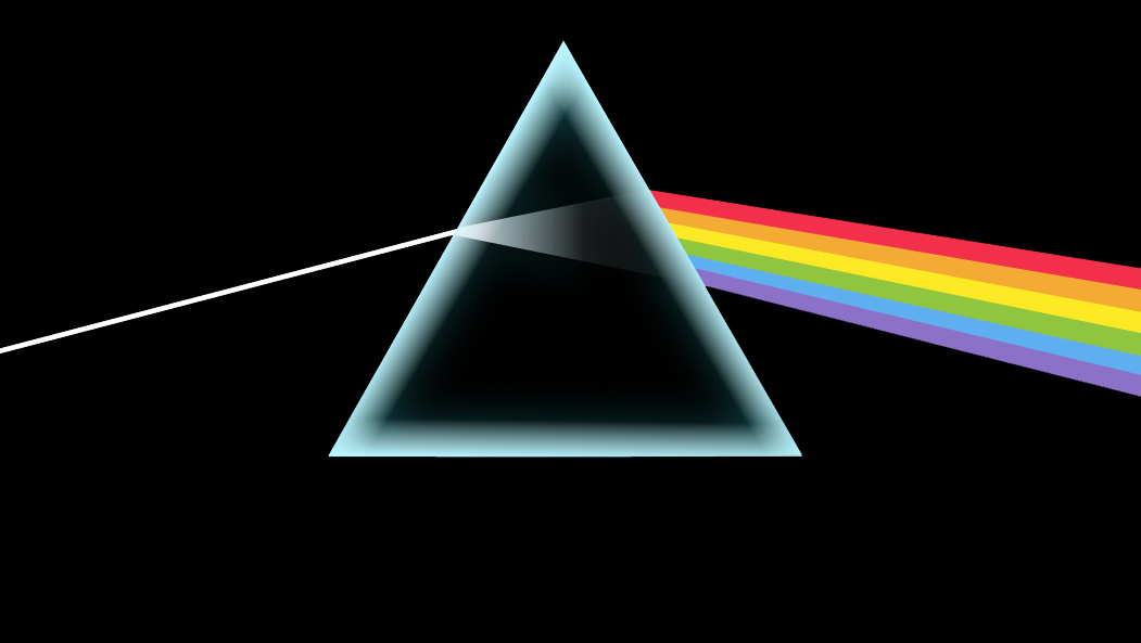
The cover, conceived by Storm Thorgerson and realised through his design partnership Hipgnosis, is almost aggressively simple. A beam of white light enters a prism, fractures into colour, exits as a spectrum against a black field. No band photograph. No title. No explanation. Just an image that feels at once scientific and faintly metaphysical.
That restraint was deliberate. Pink Floyd wanted distance from the visual clutter surrounding progressive rock. Something cleaner. More exact. Thorgerson, working alongside Aubrey Powell, drew from a physics textbook illustration of light refraction, but also from the band’s live shows, where beams of light cut through darkness with precision. The prism became a convergence point. Science, performance, and something just beyond explanation.
It also mirrors the record’s internal logic. A single source broken into its component parts, then reassembled. White light into colour. Experience into fragments. The idea of pressure refracted into time, money, fear, and mortality. It’s the concept made visible without spelling itself out.
What made it radical in 1973 was what it refused to do. Sleeve design still leaned on photography, collage, personality. Even Hipgnosis themselves were known for elaborate, often surreal imagery. Here, they stripped everything back. The result is sharper because of its absence. Nothing distracts. Nothing dates it.
The physical sleeve extended the idea. Early pressings included posters and stickers, allowing the prism to migrate beyond the record itself. Onto bedroom walls, into shared spaces, into everyday life. It stopped being packaging and became part of the culture around it.
Over time, it’s settled into design history as one of the most recognisable images in popular music. Not because it announces itself, but because it doesn’t need to. Like the album it houses, it’s controlled, precise, and quietly permanent.
2. Album
It arrived in March 1973 with the quiet confidence of a band who’d stopped chasing the ghost of Syd Barrett and instead turned their attention to something far less abstract and far more exacting. This isn’t a space record. It’s about pressure. The small, constant, grinding pressures of ordinary life and the way they accumulate until something gives.
Time slipping away without ceremony. Money warping instinct into appetite. Work becoming routine, then trap. The slow creep towards breakdown. Death as the only fixed point in the distance. Roger Waters didn’t construct a narrative. He mapped a system. Each element feeding the next, each strain bleeding into another, forming a loop that never quite releases.
By the time Pink Floyd committed it to tape at Abbey Road Studios with Alan Parsons, it had already been road-tested under the title Eclipse. That matters. This wasn’t assembled in fragments. It was honed in front of audiences until it functioned as a single, continuous piece. Even on record, it doesn’t really stop. Themes return. Voices echo. The heartbeat circles back. You’re not moving through songs. You’re contained within them.
There’s a discipline to it that still feels unusual. No indulgence. No excess. Waters provides the conceptual spine, but it’s the interplay with David Gilmour, Richard Wright and Nick Mason that gives it shape and depth. This is where the record’s quiet virtuosity sits. Not in showmanship, but in control.
Gilmour’s guitar work is exact without ever feeling clinical. His phrasing stretches time, bends it, gives it weight. Wright, often the least discussed member, is arguably the album’s tonal architect. His use of chords, space and early synthesisers creates the emotional temperature of the record. There’s a jazz sensibility to his playing, something understated but essential. Mason, too, is more than timekeeper. His drumming is economical, precise, allowing the material to breathe rather than driving it into excess.
The sound feels engineered rather than performed. Parsons’ use of tape loops, found voices and emerging studio technology binds it all together. The EMS Synthi and VCS3 systems, still relatively new at the time, aren’t used for novelty but for texture and continuity. The cash registers become rhythm. The clocks feel like impact. Even the segues, often taken for granted now, were painstakingly assembled using analogue tape, physically cut and rejoined. You can hear the craft in the joins, if you listen closely enough.
There are details that have come into sharper focus over time. Early mixes reveal alternative approaches, including longer instrumental passages and different vocal takes. The quadraphonic version, largely overseen by Parsons, shows just how ambitious the spatial design really was, with sound moving around the listener in ways that standard stereo could only hint at. Later remasters have exposed the physicality of the recordings, breaths, tape hiss, the friction of performance against machine.
The human elements remain some of its most telling. The interview snippets, gathered almost casually, now feel like a form of documentary embedded within the music. Gerry O’Driscoll’s offhand comment about death has become one of the album’s defining lines. Clare Torry’s improvised vocal, initially treated as session work, has since been recognised as a central compositional element, her later legal recognition only reinforcing how much of the album’s power lies in moments that weren’t fully understood at the time.
In the arc of Pink Floyd, this is the pivot. The point where experimentation became structure, where abstraction became communication. Earlier records hinted at ideas. Later ones, particularly Wish You Were Here and The Wall, would expand and harden them. But this is the moment where everything aligns. Concept, execution, accessibility.
Its place in popular culture is difficult to overstate. It moved beyond the usual boundaries of rock audiences and settled into everyday life. It became a staple of record collections, hi-fi demonstrations, late-night listening. It crossed generations without ever being repositioned or repackaged to do so. The longevity isn’t just commercial, it’s habitual.
And yet, for all that reach, it never feels overstated. That’s the achievement. A record built on control, on restraint, on the refusal to overplay its hand, becoming one of the most pervasive pieces of music in the modern era.
It’s often called timeless, but that misses the point. It’s rooted in its moment, shaped by post-sixties disillusionment and the creeping sense that success carries its own pressure. What’s remarkable is how little that cycle has changed.
Fifty years on, it doesn’t feel distant. It feels ongoing.
3. Urban Myth
Somewhere along the way, The Dark Side of the Moon picked up a shadow narrative. An after-hours theory that refuses to disappear.
The idea is simple. Start the album in sync with The Wizard of Oz, usually on the third roar of the MGM lion, and the two will align. Music and image falling into step. Moments of coincidence accumulating into something that feels intentional.
People point to the shift from black-and-white Kansas into colour matching the music opening out. Rhythms lining up with movement. Lyrics brushing up against scenes in ways that feel just close enough to register. It’s persuasive, in the moment. Given time, coincidence starts to feel like design.
The band have always dismissed it. There’s no evidence, and no real possibility, that it was planned. The record was built as a live piece, shaped over time, refined in the studio. It wasn’t written to picture.
What the myth reveals is something else. The way the album behaves. It’s continuous, structured, almost cinematic without attaching itself to a narrative. It invites projection. It loops, it echoes, it leaves space. Enough space for people to impose their own patterns onto it.
There’s a loose thematic overlap if you want to find it. The Wizard of Oz pulls back the curtain on illusion, revealing something ordinary behind the spectacle. Dark Side does something similar in its own way, stripping life down to its underlying pressures. But that connection is accidental, not engineered.
The myth persists because the album allows it to. It’s controlled, but open. Precise, but not closed off. People keep trying to map it onto something else, films, experiences, entire lives.
It doesn’t quite work. But it keeps working just enough to stay alive.
4. Post Script
I’ve been thinking about my own relationship to this album, and possibly other people’s. I’ve concluded that if you were aged 9 in 1971 it was an album you’d be aware of if you had an older sibling, probably a brother. Or a father with a proper stereo, the Garrard Turntable with a Shure cartridge, brushed ally 60 Watts Per Channel RMS Rotel Amp and Celestion Ditton loudspeaker set up beloved of Comet who advertised weekly in the local newspaper classifieds. Pink Floyd didn’t appear on Top Of The Pops, their band members didn’t side-hustle for other bands – so many superstars in the early seventies seemed to crop up in other bands, band swap or have solo hits, Ronnie Lane, Rod Stewart, Elton John and Roger Daltrey come to mind. Even the beloved late night DJ John Peel mimed to Maggie Mae on a mandolin for Rod Stewart on Top Of The Pops. So how would you hear any ‘Floyd tracks? I don’t even remember them being played on Alan Freeman’s Saturday Rock Show.
Another odd thing. In the period from release to when in 1977 Johnny Rotten told 15 year olds that Pink Floyd were boring, the distinctive sleeve never entranced me to by the album, nor the amazing statistics that appeared on each week’s Album Chart which was always on display behind the counter in the record shop, ‘Weeks on Chart – 310’ compared to the average of about 12.
Somewhere along the line there were enough people older than 9, with or without an older sibling or a technical father to keep this album in the U.K. album charts throughout the Seventies. And that seems to be a unique set of circumstances in my universe.
Another from my series of iconic Seventies & Eighties Punk Rock and New Wave record sleeves reimagined as standout Pop Art to show in an installation or hang in your space.
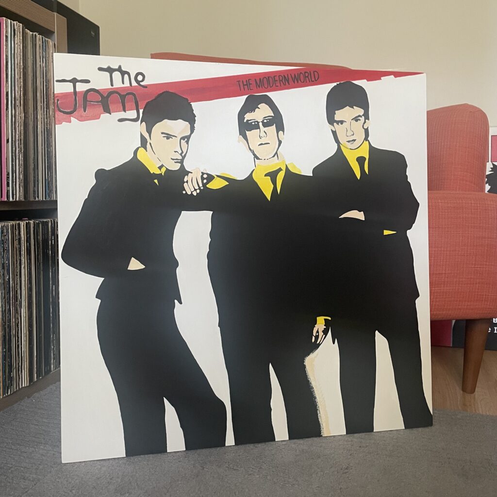
The Jam – The Modern World (1977)
600mm acrylic painting on MDF with pine former.
Despite reaching just number 36 on the UK Singles Chart, “The Modern World” is a cult classic that exemplifies The Jam’s ability to blend punk energy with mod sensibilities.
The Jam’s 1977 single “The Modern World” is a raw and energetic Paul Weller Modernist anthem that captures the spirit of new wave and the burgeoning punk scene. Released as the lead single from their second album of the same name, the track showcases Weller’s sharp songwriting and the band’s tight musicianship. The song’s defiant lyrics, including the memorable line “I don’t give two f***s about your review” (later sanitised for radio), perfectly encapsulate the rebellious attitude of youth culture in late 1970s Britain. As kids we turned our school ties back to front and wore their signature Mod ‘Jam Shoes’.
The single’s picture sleeve is a prime example of punk-inspired Pop Art design. Drawing inspiration from the Pop Art movement of the 1950s and 1960s, the sleeve features bold figures, collage elements, and imagery typical of the genre. This style, which embraced popular culture and mass media imagery, was perfectly suited to The Jam’s modern aesthetic and their critique of contemporary society.
The artwork for The Jam’s releases was typically created by Bill Smith, Polydor’s Art Director at the time. Smith was responsible for designing five of The Jam’s album covers and sixteen of their single sleeves, including the iconic spray-paint logo that became synonymous with the band. The sleeve image presented in a visually striking and provocative style consistent with the punk ethos of the time.
My large scale 600mm painted artwork emphasises the mass market printing techniques which show inaccurate origination where the face and yellow colours are printed – or was that the designer’s nod to Pop Art?
Stay tuned for my exhibition details scheduled for this Autumn and exclusive behind-the-scenes insights into my creative process.
You can join me as we celebrate the collision of music, art, and culture in the most electrifying way possible.
Another from my series of iconic Seventies & Eighties Punk Rock and New Wave record sleeves reimagined as standout Pop Art to show in an installation or hang in your space.
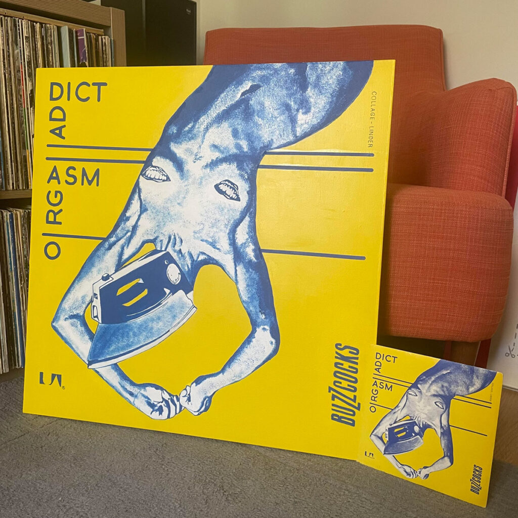
Buzzcocks – Orgasm Addict (1977)
Description: 600mm MDF with Pine Former. Acrylic Paint & Collage.
Orgasm Addict, Buzzcocks’ incendiary 1977 debut single, was more than just a punk anthem, it was a statement. It shattered taboos with its audacious lyrics and set the tone for a generation rebelling against conformity. Now, over four decades later, a reimagining of this punk rock milestone through a Pop Art lens, celebrating its raw energy, wit, and cultural significance.
This large-scale reinterpretation pays homage to the trailblazing visual language of Malcolm Garrett and Linder Sterling, whose iconic sleeve design remains as daring and provocative as the song itself. Sterling’s photomontage, a surreal collage of household appliances and fragmented bodies captured the disruptive ethos of punk while challenging traditional notions of sexuality and consumerism. It’s a masterpiece of subversive design, as relevant today as it was in the late ’70s.
From Punk Rock Icon to Pop Art – This reimagining amplifies the anarchic spirit of the original artwork, blending Sterling’s cut-and-paste aesthetic with the vibrant color palettes and bold forms of Pop Art. Think explosive neon hues, oversized textures, and recontextualized imagery that celebrates the song’s chaotic humor and uncompromising rebellion.
Malcolm Garrett’s typographic precision, those angular fonts and stark compositions also informs the design. This Pop Art transformation incorporates his graphic sensibility into a modernized framework, honoring his pioneering approach to blending music and bold , visual graphic art .
Why Orgasm Addict? Buzzcocks’ debut single isn’t just a punk classic; it’s a cultural landmark. The song’s tongue-in-cheek critique of excess and its frenetic energy feel tailor-made for a Pop Art transformation. This piece reexplores the tension between the song’s themes of desire, addiction, and liberation, bringing its provocative message to a new audience through a visual medium.
Experience the Rebirth. This reimagining isn’t just an homage it’s a conversation between past and present, punk rock and Pop Art, rebellion and reinvention. Whether you’re a lifelong Buzzcocks fan or a lover of bold, boundary-pushing art, this art piece invites you to rediscover Orgasm Addict as you’ve never seen it before. This may be the only large scale reinterpretaion of the single sleeve art as a painting worldwide.
Stay tuned for my exhibition details scheduled for this Autumn and exclusive behind-the-scenes insights into my creative process.
You can join me as we celebrate the collision of music, art, and culture in the most electrifying way possible.
Another in a series of classic album reviews, with a sprinkling of intel that may be new to you. So whether you are a lifelong music fan or new to vinyl and want clues, grab a coffee.
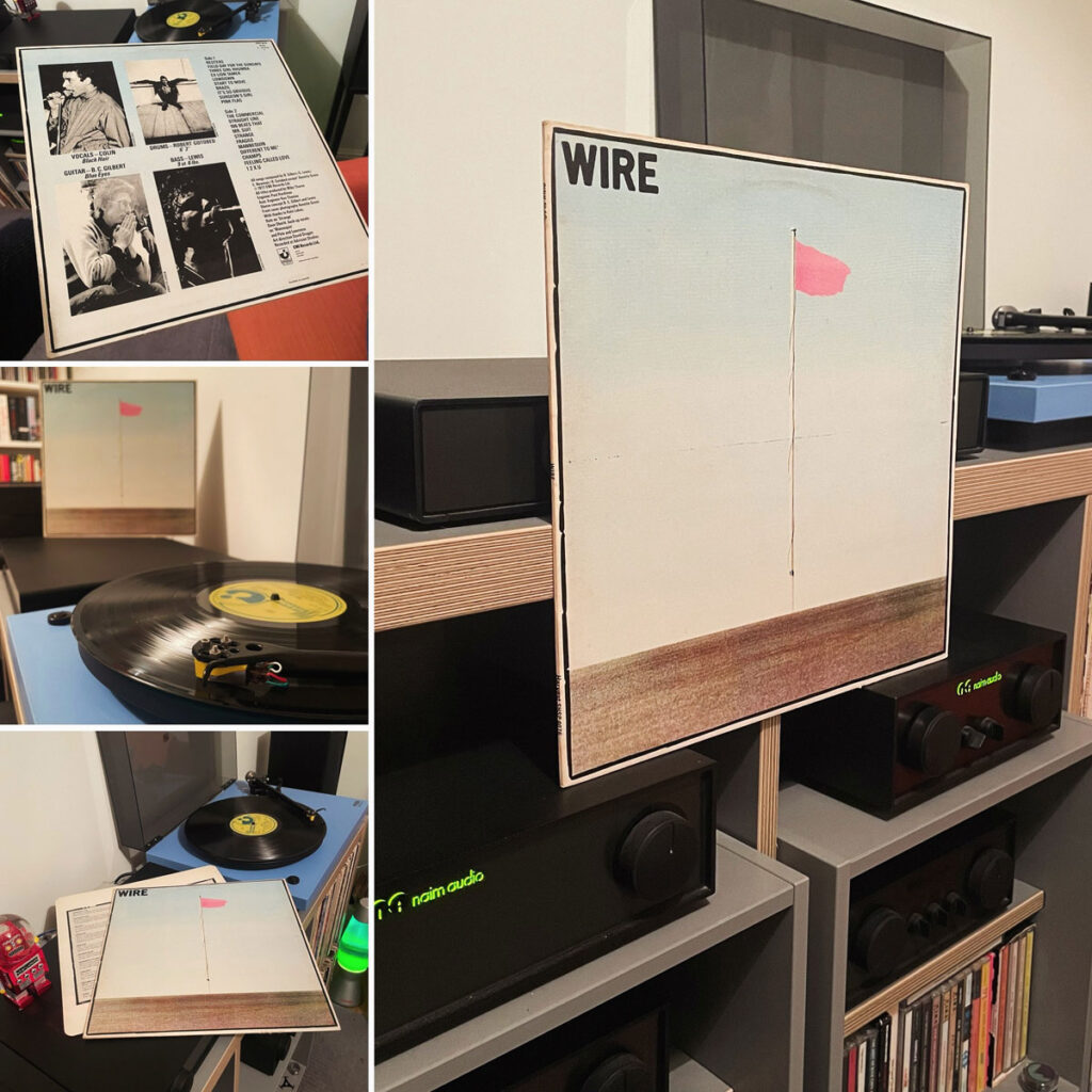
Pink Flag isn’t just an album; it’s a surgical strike against the bloated corpse of rock ‘n’ roll. In a year when punk was spitting fire and sneering at the establishment, Wire delivered a record that wasn’t just a fistful of rebellion but a blueprint for how to burn the whole house down and start again.
From the moment the jagged riff of “Reuters” punches through the air, you know you’re not in Kansas or even the King’s Road, anymore. Wire took punk’s stripped-down ethos and stripped it even further, eschewing the cartoonish fury of their contemporaries for something cooler, sharper, and frankly, more dangerous. This isn’t music that demands you pogo; it demands you think.
Wire’s influences are etched into every angular note: the raw energy of The Ramones, the art-school ambition of early Roxy Music, and the austere minimalism of krautrock bands like Can and Neu!. But Pink Flag isn’t a mere patchwork of borrowed sounds. It’s a distillation of those ideas into something startlingly original.
With 21 tracks clocking in at just over 35 minutes, Wire redefined what a punk song could be. Take “Field Day for the Sundays,” which explodes in just 28 seconds, or “12XU,” a proto-hardcore missile that set the template for bands like Minor Threat years down the line. But it’s not all speed and aggression. “Strange” oozes unsettling menace (later covered by R.E.M.) while “Ex-Lion Tamer” balances its nervous energy with an almost robotic precision.
The genius of Pink Flag lies in its contradictions. It’s minimalist but densely packed with ideas. It’s confrontational but avoids punk’s chest-thumping clichés. It’s detached, yet every note bristles with intent. Bruce Gilbert’s angular guitar riffs, Graham Lewis’s churning bass lines, and Robert Gotobed’s taut drumming provide the perfect backdrop for Colin Newman’s deadpan delivery, which cuts like a scalpel through the chaos.
In 1977, Pink Flag stood apart from the punk explosion. It wasn’t chasing the charts like the Sex Pistols or indulging in rock ‘n’ roll mythology like The Clash. It was smarter, artier, and infinitely more subversive. This wasn’t music for the masses; it was music for those ready to tear down the old order and imagine something new.
Wire’s influence rippled out far beyond the grimy clubs of ’77. Post-punk, hardcore, indie rock, all owe a debt to Pink Flag. Bands like Joy Division, Sonic Youth, and even the aforementioned R.E.M. took cues from its skeletal structures and refusal to play by the rules. Decades later, it still sounds like the future: terse, taut, and utterly uncompromising.
Wire didn’t just wave a pink flag; they planted it defiantly in the ground and dared anyone to follow. Most couldn’t. Some didn’t even try.
Essential Tracks: “Reuters,” “Ex-Lion Tamer,” “12XU” “Mannequin” “Fragile” Oh, the whole album.
Verdict: A razor-sharp manifesto that shattered punk’s mold and laid the foundation for the avant-garde edge of rock.
The iconic Jamie Reid designed Punk Rock vinyl single sleeve reimagined here as a Pop Art Installation with ‘Now Playing’ plinth and period 79p price sticker. The Sex Pistols were the trailblazers of the scene in the UK with their groundbreaking first few singles and shambolic tour which inspired so many to emulate them and start their own bands adopting the style, guerrilla marketing, anyone can form a band mantra and low cost punk ethic.
Description: 600mm MDF with Pine Former. Acrylic Paint & Collage. Now Playing Plinth and Period Price Sticker.